Newborn Intensive Care Unit (NICU) Waiting Room
-
Hi folks!
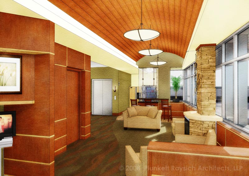
Here's another Kerkythea/SketchUp/Photoshop tag-team combo... it's nothing new... but it's kind of fun to do these.this utilzes the MLT rendering after only a few passes to give some life and light to a SU model. 2mins of pshop.

-
Absolutely lovely!
@fletch said:
...utilzes the MLT rendering after only a few passes...
What's that mean...? I need now to pursue a more realistic effect for one of my other clients...and this is just the right "wet". Help please.
-
Hi Tom!
well, I set up all my materials and lights for a photorealistic rendering of the space.
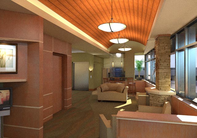
then I rendered it in Kerkythea using the render preset called "Metropolis Light Transport" (MLT: aka Mutton Lettuce and Tomato)... this normally takes a long time to clear up... it will look very grainy as it renders progressively. It's usually clear enough for a client after 100 passes or so depending on the scene. All I did was after 2 or 3 passes (very grainy and unpresentable) I saved the render in progress and overlayed it in pshop... converting it once to a blurry/soft light blend layer and once to a blurry/diffuse glow/soft ligh blend layer... hope that makes sense. This gave me my light and my metals and specular reflections... and translucent materials.
then I did the little famous 'paint pockets' effect from the old digiwatercolor tut.
Meanwhile, It's still rendering the MLT for the client to see later... which by the way is looking something like this now. but still grainy in the high res.

-
Wonderful...thanks very much! I'll have to do some playing (and learn K :`) before I get back to more questions.
-
 Beautiful fletch! I love your use of the technique, and I think it is great that more people are using Kerky in different ways. I have convinced several @ my office that this "loose" effect is best for most of our proposal / schematic level work.
Bytor
-
This is very inspiring. I really like this hybrid outcome. Thanks for the little "how to" explanation.
-
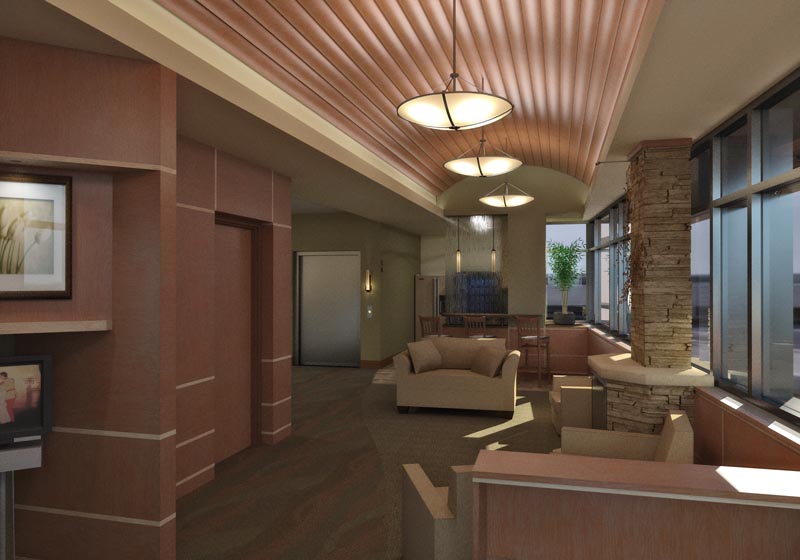
thanks guys, after a few final tweaks/model fixes here's my 'final'.
only bad thing from my opinion is the really low-poly couch and chair models... but hey, it's proof it's sketchup all the way.

this was rendered in MLT overnight at 2200px wide, on a quad core.

-
Fletch,
Great work as usual. Love to see Your images.
Hello! It looks like you're interested in this conversation, but you don't have an account yet.
Getting fed up of having to scroll through the same posts each visit? When you register for an account, you'll always come back to exactly where you were before, and choose to be notified of new replies (either via email, or push notification). You'll also be able to save bookmarks and upvote posts to show your appreciation to other community members.
With your input, this post could be even better 💗
Register LoginAdvertisement


