Latest WIP, using SketchyPhysics....
-
Thankyou Jon.
Big fan of the post-apocalyptic stuff too
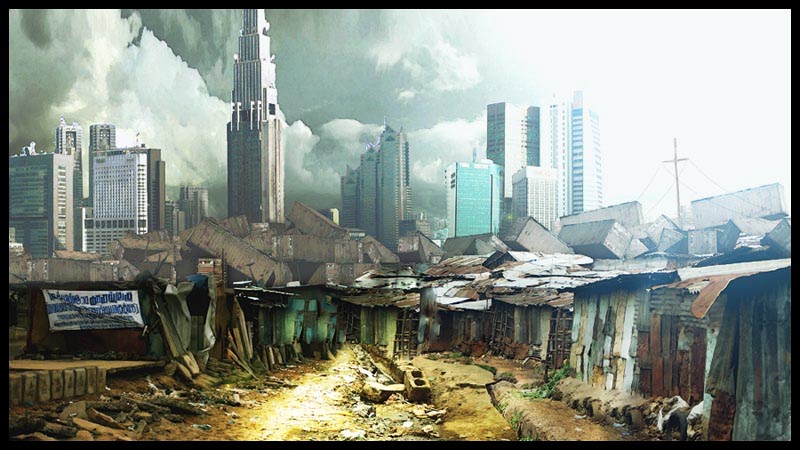
 This is part of a series I'm working on. The idea is a near-future scenario where rich and poor are forced into ever-closer proximity, shiny super-skyscrapers being built in the middle of, even on top of slums... A city of shocking contrasts.
Andy
-
wow.. speechless was exactly what i was going to say..or not say..haha.. that is awesome andy... cant wait to see the finished product + the rest! love this stuff..
-
Really cool idea, sweet execution as well. A bit more depth wouldnt go amiss though, to me it looks like the shacks and containers are all about the same distance away.
-
Very nice.
-
@andyc said:
Big fan of the post-apocalyptic stuff too
This is part of a series I'm working on. The idea is a near-future scenario where rich and poor are forced into ever-closer proximity, shiny super-skyscrapers being built in the middle of, even on top of slums... A city of shocking contrasts. Andy
Andy,
I like that image a lot!! It reminds me of some Latin American cities where the tall buildings are, really, built nearly on top of the slums. When I worked in Caracas, I used to keep blinds closed my modern office because the view was so depressing.
Tom
-
Thanks Guys.
Tom: Caracus was one of the places I looked at when collecting reference material for this - must have been quite an experience.
Remus: agree totally about the depth issue. I've added a quick atmosphere layer to the image below, which I think helps a little....
Andy
-
@andyc said:
Tom: Caracus was one of the places I looked at when collecting reference material for this - must have been quite an experience.
Andy,
Yeah, living in Caracas was a real experience. I worked there on and off from 1976 to 2000 and lived there for five years from '78 thru '82.
Are the two towers in you scene (left side, background) the ones from Caracas?
Tom
-
Tom: embarassingly
 I'm not sure. Will check back through my reference images...
A.
-
a great image - I think you captured exactly the dark, sinister and dirty mood, you wanted to.
I am looking forward to see more of it!
-
That is a really nice start. you have a lot of nice things going on in the painting and i love the idea. The shipping containers are great. they are a nice device to separate the two distinct areas of the painting.
from an illustration point of view i see a few things you could fix that would improve the piece.
-
Pick a consistent eyeline and make sure everything adheres to it. Right now, it appears that the horizon/eye line is right in the middle of the page (a little bland for such a cool idea, if the eyeline was lower the city in the distance would seem more looming) so the roofs of the shanty on the left would be visible. Also, if you look at the recession of the path in the middle of the frame it is receding to a different horizon line. In addition the buildings all seem to be inconsistent in terms of perspective. just use the transform tool for the building photos and paint over them. Maybe you could create an image from the point of view of someone in the shanty town...dropping the horizon line lower, thus putting you in the painting and the story even more.
-
I like the warm/cool seperation of the foreground and background. I think you could reduce the contrast of the city in the bg to create more distance and make it seem farther away. If you add some fog, mist between the layers of the foreground and background (on a new layer) it will help the separation even more. I think the fg is a little too yellow. the light color is extremely white, while the the light on the ground is extremely warm and yellow. try and even this out a bit. I would also desaturate the bg more.
-
The edges of the clouds are a little sharp. Run a Gaussian blur on the sky layer so the edges are not so sharp. The eye is drawn to hard edges, so use them selectively to guide the eye around the image.
-
the lighting on the shanty area is a little off. the light is coming from the right, but all the faces on the left side are dark and there is an intense highlight on the dirt ground. I would darken the ground value a tad and maybe show more light hitting the shanty structures on the left.
study some work form digital matte painters. a great guy to look at is dylan cole.

Dylan Cole Studio
Production Design - Matte Painting - Concept Art
Dylan Cole Studio (www.dylancolestudio.com)
i hope this helps and its coming along nicely.
-
-
Gaganraj: thanks for such a thorough critique - genuinely appreciated

You're absolutely correct. Initially this was going to be a very rough layout for a more finished piece, but I liked the way it was going, and so worked it up a little more than I originally intended. The original horizon was about a third of the way up the frame, but kind of crept up as I worked more on the shanty town. Likewise, the perspective got a little messed up along the way
I'll probably go back to the origial reference images and work up a more polished version.Thanks again,
Andy
-
Coen, if you haven't found them already, http://www.mattepainting.org andhttp://www.conceptart.org are great sources of inspiration
Andy

Hello! It looks like you're interested in this conversation, but you don't have an account yet.
Getting fed up of having to scroll through the same posts each visit? When you register for an account, you'll always come back to exactly where you were before, and choose to be notified of new replies (either via email, or push notification). You'll also be able to save bookmarks and upvote posts to show your appreciation to other community members.
With your input, this post could be even better 💗
Register Login


Advertisement