Illustrator Rendering Style
-
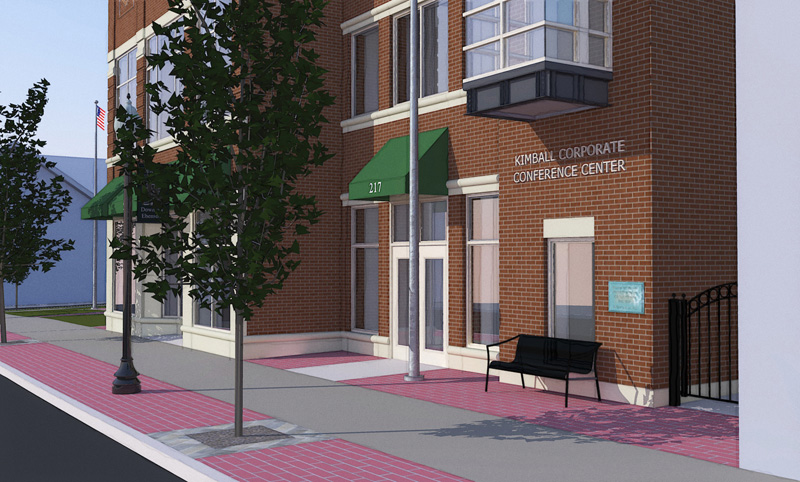
1 image in a series of 8 prepared for the owner of the firm I work for. The style is something I have been working toward for a while - it combines layers of output from Kerjythea and native SU styles. A little post work to achieve ouput you see here.
Please tell me what you think - we are considering it as an alternative to photo-real images on some exterior projects.
Thanks,
Bytor
-
I really like the nice and clean cut way that this image is put together, but I would suggest a couple things:
-A new angle might be better, that tree is taking up way too much of the image,
-Re-colour that bench, it appears to be black, I think that it could be a much better draw towards the building with a much lighter colour.just my opinion, but as far as the actual style is concerned, it looks really professional!
-
Bytor, I like it a lot...SU+ is my big fav!
The architectural details are quite nicely portrayed/matched to the brick representation and all the elements of the building and its surround blend quietly and professionally...naturally. I also really like the rhythm and song of the verticals dancing across the page...a lively counterpoint.
To heighten the image perspective a bit, check out the "SideMerge" filter from DC...you can merge a less focused, less contrast, layer to intensify the feeling of depth.
On the otherside, the first thing that hit me was the color of the pavers...a touch too pink? Then the vertical mortar joints on the closest building corner (this is just wrong :`) Then yes, the center tree...especially as it matches/obscures exactly that corner of the building.
Again, well done...and more please (I got things to learn from you)!
-
Thanks for the quick feedback guys! It really helps me with my list of what I need to fix when back at the office next week.
@will03 said:-A new angle might be better, that tree is taking up way too much of the image,
-Re-colour that bench, it appears to be black, I think that it could be a much better draw towards the building with a much lighter colour.Will03 - yes, I didn't pick the best angle for this shot. It was the last one in the series and I wanted to get close and show the owner the entrance / name / plaque on this portion of the building. I will try and adjust to throw the tree to the left side of the image a little. The bench actally had an opacity map that I noticed had a problem with scaling at the last min. - so I fudged by turning it off and only using the colour - I will fix that as well.
Tom - you are too kind...
 ...... I actually learn from your work posted here!
@tomsdesk said:To heighten the image perspective a bit, check out the "SideMerge" filter from DC...you can merge a less focused, less contrast, layer to intensify the feeling of depth.
On the other side, the first thing that hit me was the color of the pavers...a touch too pink? Then the vertical mortar joints on the closest building corner (this is just wrong :`) Then yes, the center tree...especially as it matches/obscures exactly that corner of the building.
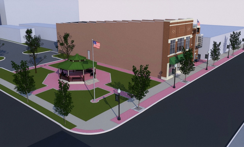
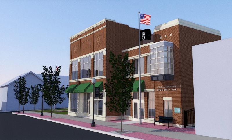
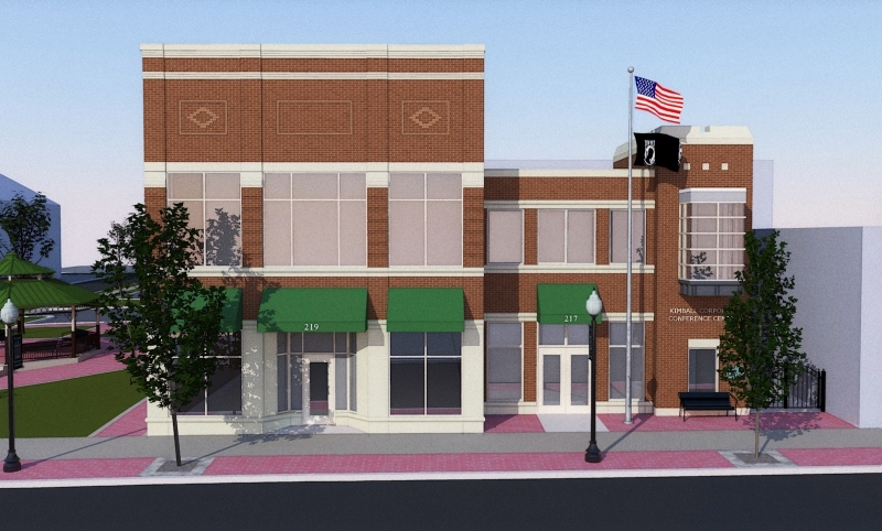
I will have to look into that filter - sounds quite interesting. I already have the pavers (actually stamped / colored concrete) identified to be re-colored. They are pretty close to this pink, but need more of a clay (orange) tone to be accurate. I didn't notice the mortar joints until you mentioned it - now it bugs the hell out of me so I will have to fix that. I have attached 3 more views that explain the project a little better. The elongated more tradition structure on the left is the existing (100+ years old) structure that is being rehabbed. All of the stuff to the right is to house an entrance / stairs / elevator which will serve as a seperate access to the second floor - which is being converted to meeting / training rooms.
Thanks for the feedback - keep it coming!
Bytor
-
%(#FF0000)[Post removed by Solo.
Troll!]
-
anyone else majorly confused by the above post?
very nice work by the way bytor, it's certianly a very nice alternative to photoreal.
pav
-
-
ah, cunning.
he is right though about the creatine though.
i still use it. lol
pav
Hello! It looks like you're interested in this conversation, but you don't have an account yet.
Getting fed up of having to scroll through the same posts each visit? When you register for an account, you'll always come back to exactly where you were before, and choose to be notified of new replies (either via email, or push notification). You'll also be able to save bookmarks and upvote posts to show your appreciation to other community members.
With your input, this post could be even better 💗
Register Login


Advertisement