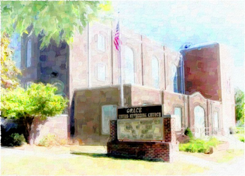
New match photo composite...
-
...thought it came out ok:
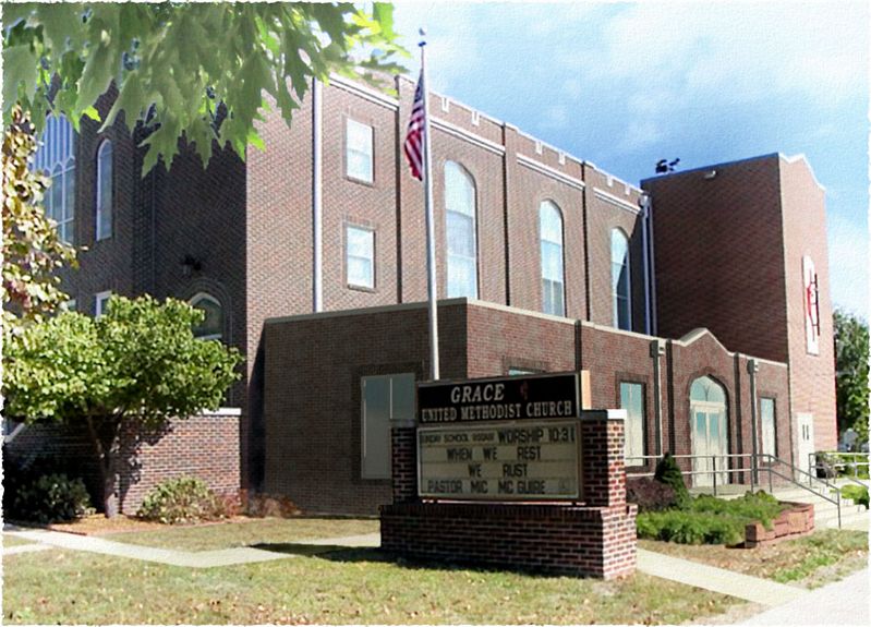
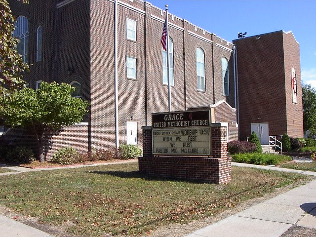
...here's the original photo (added some to the top in PSP, then imported into SU6 as a background):
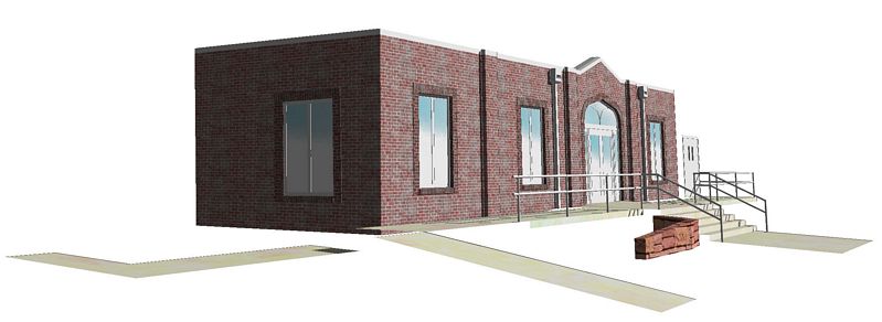
...here's the skippy (I used correctly placed elev's of the existing church to match the perspective as near as I could...still had to fudge some of the verticals):
...back in PSP I layered the sign and a larger flagpole (it moved) in front of the skippy, built the landscaping with cuts from the background photo and added some shadows, then softened up the edges, merged, and hit it with a couple of filters to make it "dream-y" :`)C&C, please and thank you.
-
impressive, your demonstration what is possible with a pure SketchUp render (and PS of course) - no additional renderer needed.
I really had to look twice to notice that you added something. it simply looked so "in place". compliment as well for the architecture; perfectly blends in to the context.
-
@unknownuser said:
impressive, your demonstration what is possible with a pure SketchUp render
I totally agree, couldn't believe that this is pure sketchup. Well done.
Only minor criticism is the foreground tree. Not sure if it is really convincing or necessary.
-
Thanks guys: even on spec (marketing package for another church) for free (which I don't usually do) it was fun to play with...for money I would have done a little better job with the pixel wavy around the new door (I'm trying to learn some un-anal skills :`)
Jakob, yes...this architect client is pretty savvy and sensitive: simple and elegant, but when he does go wild he's usually spot on!
Joe, (welcome btw) I agree some about the tree...would have done it better for bucks: but I did think the original image needed some more sky...and I definately did not want fake in the top of the existing church :`)
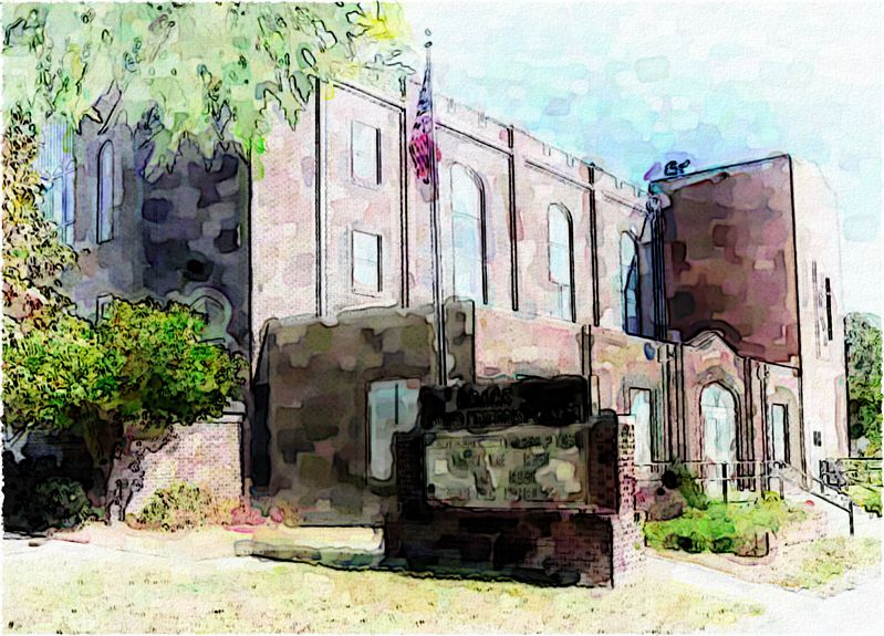
Here's a DWC to finish off the week:
-
Tom you always show a really good level of skill with these compositions you create.
As usual, this one looks great
-
Great job Tom!
-
Thanks for posting that example Tom, excellent crafting
Mike
-
Once again you have nailed it Tom. What I like best is how the color of the brick is just a tad different than the original. Which in reality is what will happen as it is impossible to match brick exactly. I also like the foreground tree, it makes me feel as if I am in the shade looking at the building.
-
Outstanding, Tom.
-
I had to look carefully to see what the differences was between both images, nicely integrated.
-
neat.. i like this kind of work, I think it is what sketchup does best. Any more than that and you are pushing the purpose of the program. I noticed that the light/dark contrast in your addition is not as extreme as in the original photo (might account for the bricks looking a little off color and the parapet looking duller)
-
Thanks again all...this kind of discussion helps a bunch with the learning curve!
Eric, I'll only take credit for deciding not to fix it when I noticed the difference in the new brick...glad to hear a vote as the right decision. Mirjman, I think you may have the reason for the difference nailed; I was thinking it was the saturation of the SU brick material (which is hard to fix in PSP without screwing up the other model materials)...thanks for the tip!
Thought the DWC needed work so here's another version:
Hello! It looks like you're interested in this conversation, but you don't have an account yet.
Getting fed up of having to scroll through the same posts each visit? When you register for an account, you'll always come back to exactly where you were before, and choose to be notified of new replies (either via email, or push notification). You'll also be able to save bookmarks and upvote posts to show your appreciation to other community members.
With your input, this post could be even better 💗
Register Login


Advertisement