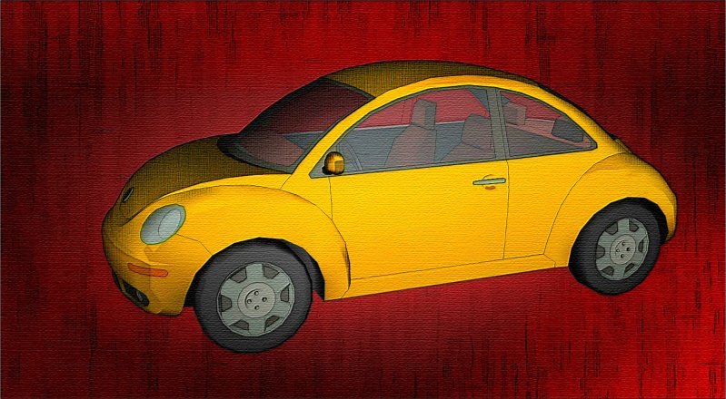
VW Bug Painting
-
It's been a while since I posted any images. Today I was fooling around and made the attached 'rendering'. It features an old low-poly bug model. Unfortunately I don't remember the source but it could be FormFonts. I was playing with the model using Adam's LightUp plugin and decided to try its export feature. It created a huge 124mb tga image file that I resized in Xara Xtreme (vector illustration software). In Xara I manupulated by combining it with other exports from SketchUp -- ones that used a styles I developed for FormFonts. Those exports were processed in Xara with filters and transparency effects to build up the final look. The hatching for instance was created by applying the Sketcher plugin from Little Ink Pot to a SketchUp export that used my 'Barked Monochrome' style with the edges turned off.
If you tried to do something similar in Photoshop or Piranesi, I'd suppose brushes would be used. That would be too hard for me. In Xara the image was created by overlaying several images, most with some filter processing and all with various transparency effects that combine to build up the effect. I finished it off with some sharpening and application of texture.
Regards, Ross


-
It's the car time of year

I like the appearance as the colors of subject and background make a nice match.
The cross hatch you applied diminishes the reflectiveness one would expect from carpaint though. Maybe you could add some highlights? -
Okay, here it is with some highlights added...

The highlights & shadows are just vector shapes added in Xara and given transparencies.
Regards, Ross
-
Yeah...
 That looks very good.
Are you providing Coen with a company car?

-
He deserves one! Sorry Coen - I can't afford a luxury car.
-
Very nice indeed, wondering if this output can be obtained as a style?
Caption for last image " bug in sketchup found'
-
@solo said:
wondering if this output can be obtained as a style?
It would be possible to have the red background and sketchy lines as a style. An export using it could then be combined in an editor (or Xara of course) with, say, a corresponding Podium export to arrive at a similar result.
Regards, Ross
-
I just had an idea (ouch!)...
I wondered what the 'SketchUp Bug' would look like if I just deleted the original LightUp export from the stack of images that was making up the rendering. That LightUp image was what was providing the red & yellow colours. All my other exports from SketchUp were monochromatic.
Anyways, here's the effect when the coloured 'layer' is removed. I did have to edit a few of the shadow shapes I had added before because I had given them a red tone. I think what this experiment shows is you could always swap out (or eliminate) your colour layer to achieve multiple illustrations from the same exercise.

This image actually is much closer in spirit to the style I had used in making it -- my 'Barked Monochrome' style available to FormFonts subscribers. The main difference is the various highlights & shadows I manually added help create a metallic look that isn't part of the original style.
Regards, Ross
-
Looks good Ross, especially with the additional highlights and shadows. I will have to check out how you can create those in PS.
-
I love the monochrome look of the image, brightened up by the coloured scf-logo.
that is really nice, because it leads the spectator's eye directly to the most important: SCF!

-
And how 'bout a sepia version...

-
Mmmmm...chocolate

-
If you just put a real SketchUp logo onto it, Ross, you could even sumbit it for the bugsplat logo of SU 7!

-
very good pictures on all the last three, good job!!!
Hello! It looks like you're interested in this conversation, but you don't have an account yet.
Getting fed up of having to scroll through the same posts each visit? When you register for an account, you'll always come back to exactly where you were before, and choose to be notified of new replies (either via email, or push notification). You'll also be able to save bookmarks and upvote posts to show your appreciation to other community members.
With your input, this post could be even better 💗
Register LoginAdvertisement


