Uni Project SU output / Renders
-
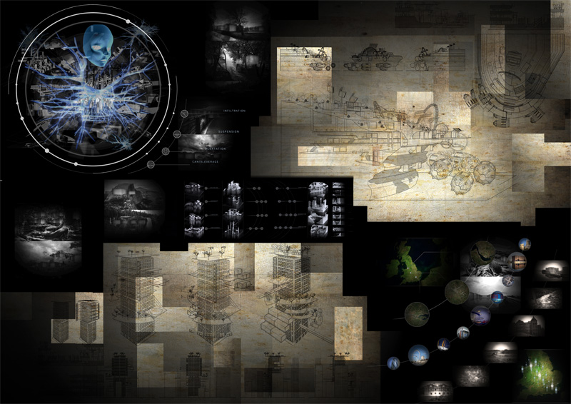
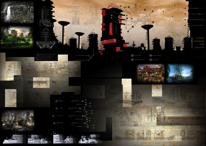
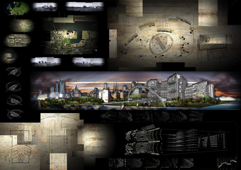
Cheers guys, slightly less relevent but i thought it would be nice to show my final presentation boards, all done using SU, photoshop and autocad (for lineweighting)


-
Beautiful work. Some of the best presentation boards I've seen around here in a long while

A.
-
wow, very impressive.
these look rahter than artistic paintings than architectural plans... wonderful!
-
wow, amazing.
what yeah are you in at university? i can't get over how good this all looks.pav
-
@plot-paris said:
these look rahter than artistic paintings than architectural plans... wonderful!
Funnily enough i printed onto canvas for my exibition which was kinda cool but got it cheaply done and the black went green from the sun.
ive just finished my third year of uni, so will be nice to have a break from it
-
I love futurist architecture and this one is "one of the ten" that should be mentioned, even if it's two year old.
Fantastic work, so detailed, I can see the idea of the future urbanism in the pictures
 .
.
Hello! It looks like you're interested in this conversation, but you don't have an account yet.
Getting fed up of having to scroll through the same posts each visit? When you register for an account, you'll always come back to exactly where you were before, and choose to be notified of new replies (either via email, or push notification). You'll also be able to save bookmarks and upvote posts to show your appreciation to other community members.
With your input, this post could be even better 💗
Register LoginAdvertisement


