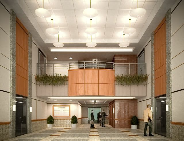
Lobby - WIP
-
The image is a bit CG, but nice.
I didn't know Maxwells shift lens was that hard to control.
In Vray you set a value for shift lens (0.1 or 0.2 does the trick most of the time) and it will correct the perspective, but it's also a trial and error to get it completely parallel. -
much easier workflow for me is to use transformation tool in photoshop and skew or distort the image til it appears "vertical". just my 2 cents worth

-
Chavinkee blast oven,
This is some Jack bird action wood... Like the wood looks very real...
I would buff that action with some honey butter.
Bring it, bring the mass.
Durant "fire in the bucket" Hapke
-
@kwistenbiebel said:
The image is a bit CG, but nice.
I didn't know Maxwells shift lens was that hard to control.
In Vray you set a value for shift lens (0.1 or 0.2 does the trick most of the time) and it will correct the perspective, but it's also a trial and error to get it completely parallel.awwww... fine.. haha..the people definitely dont help the realism..i need to invest in some high poly peoples..
i might have exagerrated a bit.. its pretty much the same thing.. just that everytime you change the value, your viewpoint changes..
-
The new one's surely an improvement.
 Might be good to turn on ML and tweak the lighting when the rendering's done. Looks a tad "over lit" now. Although, come to think of it, lots of light may be better to sell a design, as less light produces a moodier feel. Dunno ... that's your area of expertise!
-
I think the people aren't the thing that made me use the word CG.
You are using a lot of indirect light which as a consequence won't give you distinct shadows.
Actually,it has nothing to do with being CG, it's about the architect having chosen the light fixtures .
.Same thing happens in a lot of office buildings, where architects choose indirect light fixtures and very little directional light. Very good for working (homogeneous spread light on PC screens etc..), but it flattens out the mood . Sometimes even a real photograph of certain office spaces can look 'CG' to me as the lighting is unnaturally diffuse.
Don't get me wrong here: the image looks good but I can't help thinking the half baked version looked more 'real'.
Leveling the light in Photoshop and enhancing the midtone contrast can give it a different look and can give it the appearance that the light produces more shadows.
I hope you don't mind me tangling with your image in Photoshop(I can take it off if you like):
-
no no.. tangle away..haha.. i'm constantly in need of assistance...lol.. it also doesnt help that i tend to oversaturate everything in pshop.. and that neither of my monitors are calibrated..so god knows what it looks like on everyone else's monitors..
totally agree wtih both you and anssi about the indirect light..there's a hell of alot of it.. unfortunately, have to work with what you're given, right? haha..
thanks for the comments.. always appreciated..
-
Ah yes...monitor calibration.

I also should buy a Spider (calibration hardware) to hang on my monitor, but these things cost an arm and a leg. It's on my wish list. I know Solo uses one. -
one of my friends has one and i'm always supposed to grab it when i'm up in nyc.. but always forget.. i'm tying a ribbon on my finger next weekend!
Hello! It looks like you're interested in this conversation, but you don't have an account yet.
Getting fed up of having to scroll through the same posts each visit? When you register for an account, you'll always come back to exactly where you were before, and choose to be notified of new replies (either via email, or push notification). You'll also be able to save bookmarks and upvote posts to show your appreciation to other community members.
With your input, this post could be even better 💗
Register LoginAdvertisement


