Render #22 (animation test bottom page 8)
-
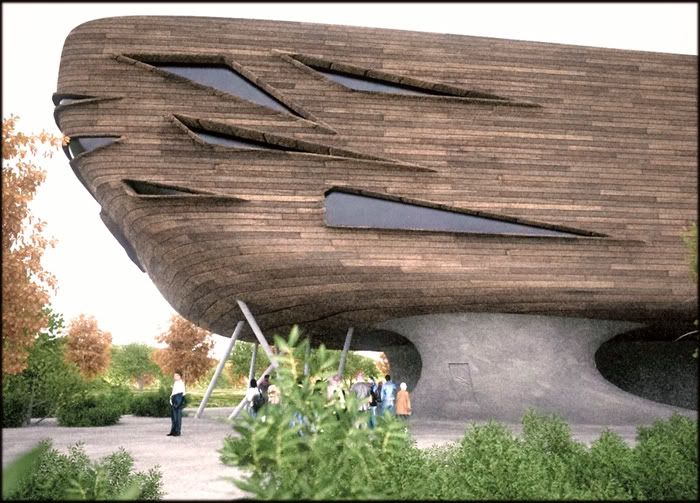
A quickie (noisy) using only background light (white):
-
how did you get such beautiful wood paneling? i mean in terms of projecting it onto the building (a really good building btw). did you project it at an angle (set up a face at a 45 degree angle instead of flat front or back)? like this:
../ __________
./ |.building.|
/ .|________|the three slashes on the left = face from witch the texture is projected
box = you guessed it, is the building.
little tiny dots = nothing, just ignore them.am i right?
-
hey kwist, this is another fabulous render and concept. is this Biebel's ark or tower of Biebel?

-
Thanks Nomer ...An Ark, didn't think about that

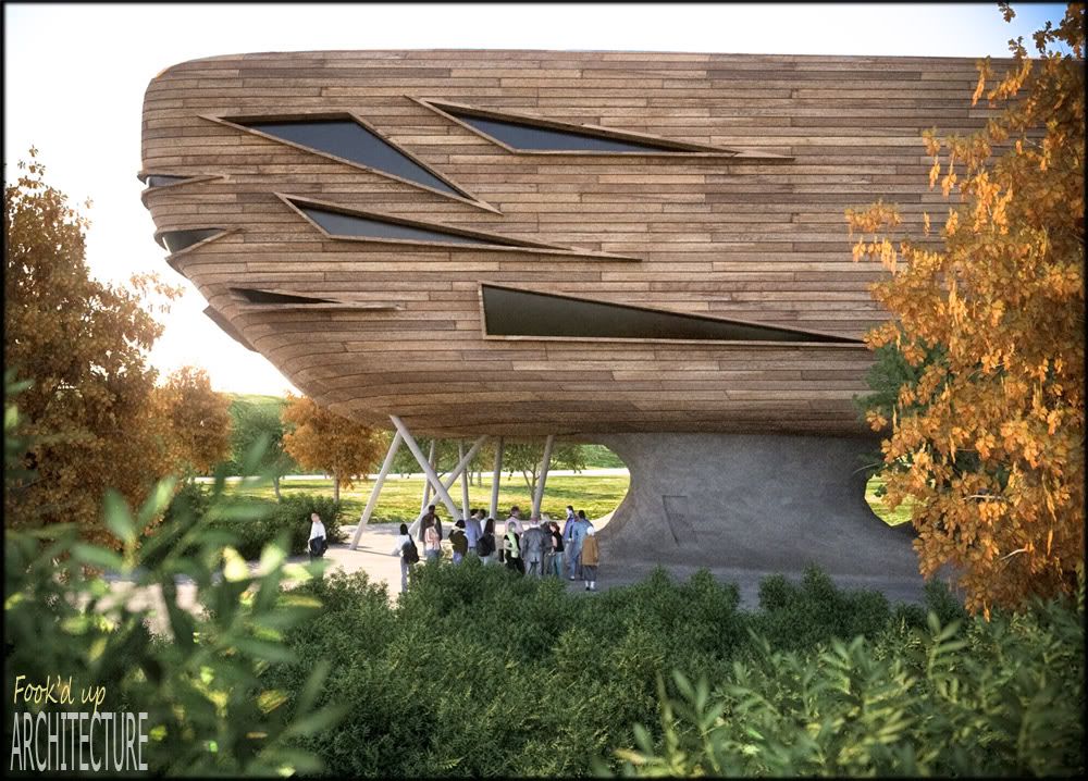
I re-rendered the last view using Physical sky. (Indigo render)
The subtle glare is added 'internally' in the Violet tonemapper.
The glass should have had a little less roughness...To view full size: (Firefox:right click- view image) (IExplorer:right click - image save as)
-
Thank you Fred and Igor.
@Igor: You are correct. I projected the image almost perpendicular to the 'corner' of the building (as in your scheme).
I must admit the projecting is view dependant. Choose another viewpoint and the projecting needs to be redone. -
Thanks for the answer regarding the texturing, Chris..!!

It looks as 3D trees... Xfrog..??

And the people in the scene...
These are for sure some really excellent reders..!!

-
Gracias senor Frederico

The trees are Xfrog, the people Axyz as they look ok seen from a distance.
When in close-up, the Axyz guys look a bit like melted E.T.'s though
-
Chris, Nice work. I like where these seem to be heading. Zaha watch out indeed. Fred
-
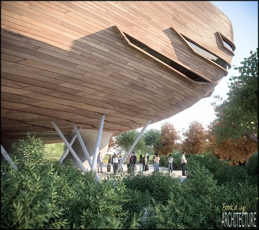
Some more:
Ouch....distorted texture alert
To view full size: (Firefox:right click- view image) (IExplorer:right click - image save as)
-
Is it for the fun or for real or hypothetic project

Is it the new Noe's Arche?
-
Well this one is for sport ...
I was thinking that modeling something realistic (I know it is not though ) was a good way to get to know the new organic rubies and to practice them.
Besides, I consider it also a bit as portfolio filling ...Play becomes work becomes play
-
Wonderful work Chris, as usual. I really enjoyed "exploring" from you different views!
-
Chris, Great work, thanks for sharing.

-
That last one looks like a giant 70s spaceship just landed in someones back garen during a bbq (and no one noticed.)
-
Thank you Tinanne and Mateo,
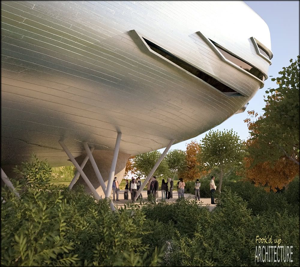
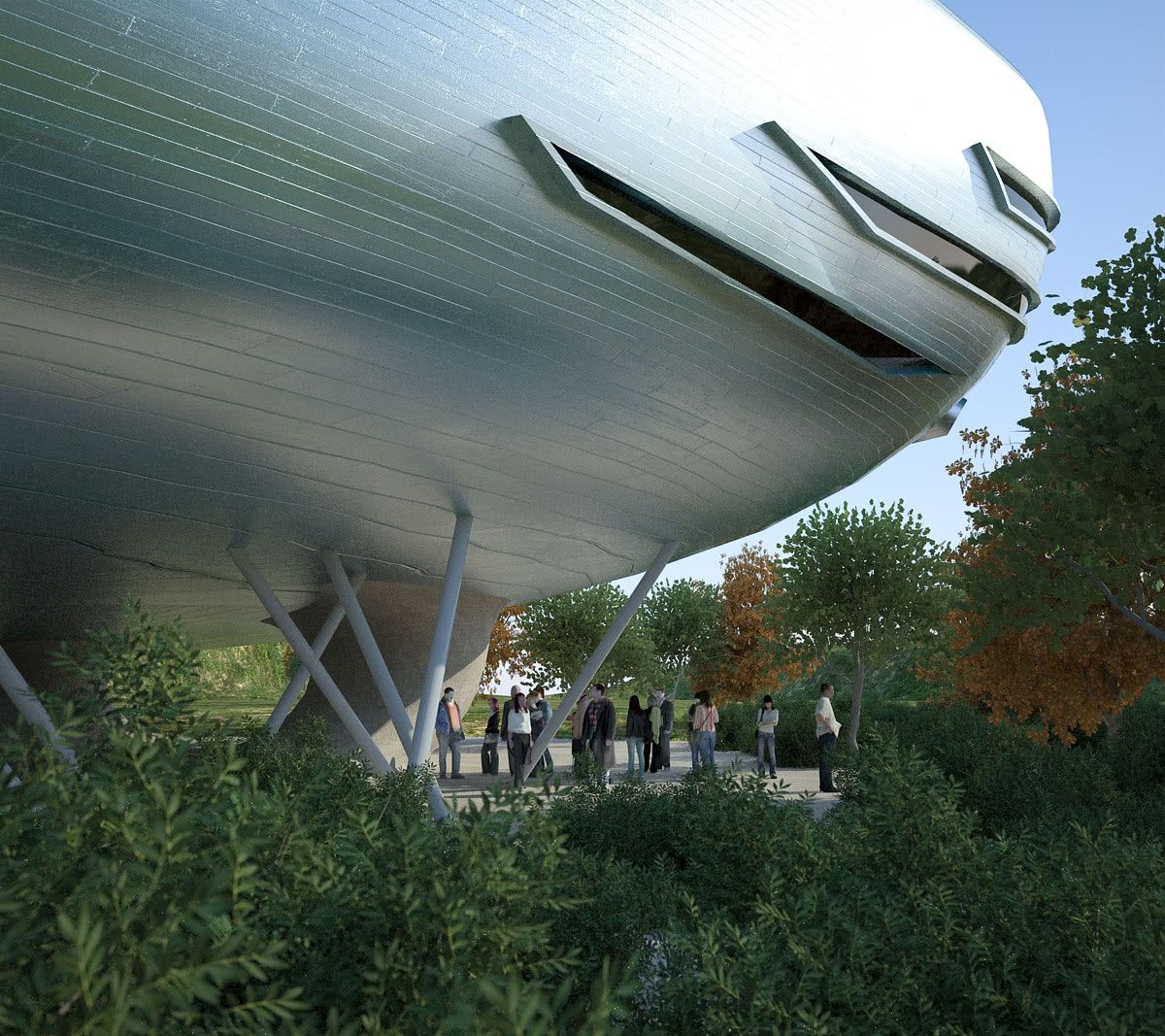
Let me finish with the same view but different material use. Quite a different appeal:To view full size: (Firefox:right click- view image) (IExplorer:right click - image save as)
-

-
This is how the RAW Indigo output looked like as a reference, before I unleashed the postprocessing artillery...
It had a cooler tonality...maybe better than the post processed one?
What do you guys think? (some .jpeg artifacts because of web compression)To view full size: (Firefox:right click- view image) (IExplorer:right click - image save as)
-
I like the cooler one slightly better. Cool plants, btw.

@remus said:
That last one looks like a giant 70s spaceship just landed in someones back garen during a bbq (and no one noticed.)
Look at the color of their skin, man. They're zombies! They don't care!
-
nitpickers!

-
By the way....the animation is cooking

Hello! It looks like you're interested in this conversation, but you don't have an account yet.
Getting fed up of having to scroll through the same posts each visit? When you register for an account, you'll always come back to exactly where you were before, and choose to be notified of new replies (either via email, or push notification). You'll also be able to save bookmarks and upvote posts to show your appreciation to other community members.
With your input, this post could be even better 💗
Register LoginAdvertisement


