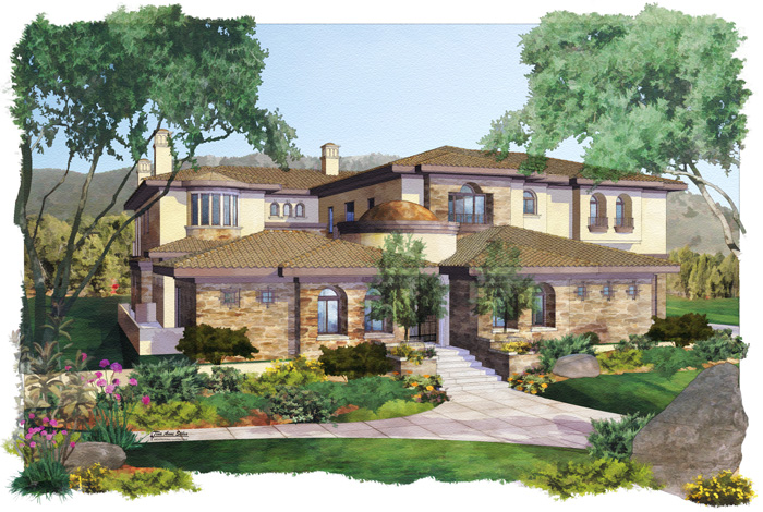
sketchucation logo sketchucation
    • Login
    ℹ️ Licensed Extensions | FredoBatch, ElevationProfile, FredoSketch, LayOps, MatSim and Pic2Shape will require license from Sept 1st More Info

    New Residential

    Scheduled Pinned Locked Moved Gallery
    26 Posts 19 Posters 1.3k Views 19 Watching
    Loading More Posts
    • Oldest to Newest
    • Newest to Oldest
    • Most Votes
    Reply
    • Reply as topic
    Log in to reply
    This topic has been deleted. Only users with topic management privileges can see it.
    • Mike LuceyM Offline
      Mike Lucey
      last edited by

      ..... I'll add my voice the the Tina Fan Club. I really like
      the first imaage and thanks for explaining the process.

      Mike

      PS: This is really excellent work for a woman πŸ˜‰ (before anyone
      says anything, this is an ongoing joke between Tina and I)

      Support us so we can support you! Upgrade to Premium Membership!

      1 Reply Last reply Reply Quote 0
      • R Offline
        richcat
        last edited by

        Spot on images πŸ‘

        1 Reply Last reply Reply Quote 0
        • A Offline
          andyc
          last edited by

          Just when I think I've got my act together, you go and post this Tina!!

          Beautiful work. It's not about the software - this is artistry, pure and simple.

          Inspiring. Thankyou!!

          Andyc

          1 Reply Last reply Reply Quote 0
          • majidM Offline
            majid
            last edited by

            really nice ....WWWWWWWWWooooooooooWWWWWW you are a great Digital Watercolorist... thanx 4 sharing

            My inspiring A, B, Sketches book: https://sketchucation.com/shop/books/intermediate/2612-alphabet-inspired-sketches--inspiring-drills-for-architects--3d-artists-and-designers-

            1 Reply Last reply Reply Quote 0
            • spenceS Offline
              spence
              last edited by

              WOW! This is sooo nice. This is excellent work Tina. Your style is so effective.

              Spence

              1 Reply Last reply Reply Quote 0
              • tinanneT Offline
                tinanne
                last edited by

                Thanks everyone, I really appreciate your comments πŸ˜„

                Executive Director : American Society of Architectural Illustrators
                AIP 30 Competition opens soon. ASAI.org

                Architectural Rendering

                1 Reply Last reply Reply Quote 0
                • S Offline
                  ScottPara
                  last edited by

                  Fantastic work. My only comment would be I am not so sure of the trees at the door. I think they (due to size) take away from the entry. Other than that this is some of the best watercolor I have seen in quite some time.

                  Scott

                  Love the fact that some HATE my avatar.....

                  1 Reply Last reply Reply Quote 0
                  • allanxA Offline
                    allanx
                    last edited by

                    WOWWWWWWWWWWWWWWWWWWWWWWWWWW! 😍

                    allanx

                    [Portfolio](https://www.coroflot.com/designers/work-stream?id)

                    1 Reply Last reply Reply Quote 0
                    • S Offline
                      sorgesu
                      last edited by

                      Tina, these are really amazing. They have such a wonderful quality.
                      If you are looking for critique, in search of perfection, it is possible to push one's self and try and find something.
                      I have to agree with Mike's comment about the surrounding trees. They are too bright a colour and contrasty and steel from the focus of the building.

                      I also agree about tree in front of the doorway. It does obscure. Being semi-transparent really doesn't change that and I have a personal problem with semi-transparent trees anyway. I know it is done in architecture, but I really don't think it is necessary and frankly, its a weird convention. If the tree is really going to obscure something important, use a skimpier tree. Otherwise, if it is just more brick, we get the idea and there is no reason to go transparent.

                      In this one the tree actually obscures the doorway and 90 percent of the time the focuse of these renderings should be the doorway. Inviting one in so to speak. Therefore the greatest area of contrast should always be arranged to be at the door. This door is a little too dark and obscured. In fact the window to the left is more contrasty.

                      But that was just pushing an academic critique. The overall execution is masterful, the moode delightful the technque wonderful.

                      Susan Sorger
                      Former Seller Hand Rendered Entourage
                      Former Canadian Authorized Training Centre, SketchUp

                      1 Reply Last reply Reply Quote 0
                      • N Offline
                        Nick W
                        last edited by

                        brilliant! love the color, love the detail.

                        ps - susan, great critique. I learned a lot from that. πŸ˜„

                        http://www.nrwiesneski.com

                        1 Reply Last reply Reply Quote 0
                        • T Offline
                          tomislavm
                          last edited by

                          Nice and warm job Tina!

                          1 Reply Last reply Reply Quote 0
                          • B Offline
                            bytor
                            last edited by

                            Tina!

                            Absolutely wonderful work - I so enjoy your style. πŸ‘ πŸ‘ I think Susan's critique is right on, and I benefitted from looking at you images again to see what she was describing. I hope it was received well because it was very helpfull.

                            Bytor

                            Find the Cost of Freedom.....

                            1 Reply Last reply Reply Quote 0
                            • tinanneT Offline
                              tinanne
                              last edited by

                              @mike lucey said:

                              PS: This is really excellent work for a woman πŸ˜‰

                              Mike, good thing you live so far away πŸ‘Š kisses

                              Executive Director : American Society of Architectural Illustrators
                              AIP 30 Competition opens soon. ASAI.org

                              Architectural Rendering

                              1 Reply Last reply Reply Quote 0
                              • tinanneT Offline
                                tinanne
                                last edited by

                                @sorgesu said:

                                I have to agree with Mike's comment about the surrounding trees. They are too bright a colour and contrasty and steel from the focus of the building.

                                Yes, I agree... I should have made those darker. Thanks for reminding me of that, both of you πŸ˜„

                                @sorgesu said:

                                I also agree about tree in front of the doorway. It does obscure. Being semi-transparent really doesn't change that and I have a personal problem with semi-transparent trees anyway. I know it is done in architecture, but I really don't think it is necessary and frankly, its a weird convention. If the tree is really going to obscure something important, use a skimpier tree. Otherwise, if it is just more brick, we get the idea and there is no reason to go transparent.

                                In this one the tree actually obscures the doorway and 90 percent of the time the focuse of these renderings should be the doorway. Inviting one in so to speak. Therefore the greatest area of contrast should always be arranged to be at the door. This door is a little too dark and obscured. In fact the window to the left is more contrasty.

                                I totally agree, in this case it was specified by the client that these trees were there and the he would not agree to a change in angle, so..... darn clients πŸ˜‰

                                @sorgesu said:

                                But that was just pushing an academic critique. The overall execution is masterful, the moode delightful the technque wonderful.

                                Thank you Susan, you know how much I appreciate your input. It is always so valuable!

                                And thank you to everyone else as well!!

                                Executive Director : American Society of Architectural Illustrators
                                AIP 30 Competition opens soon. ASAI.org

                                Architectural Rendering

                                1 Reply Last reply Reply Quote 0
                                • 1
                                • 2
                                • 1 / 2
                                • First post
                                  Last post
                                Buy SketchPlus
                                Buy SUbD
                                Buy WrapR
                                Buy eBook
                                Buy Modelur
                                Buy Vertex Tools
                                Buy SketchCuisine
                                Buy FormFonts

                                Advertisement