Recent SU images
-
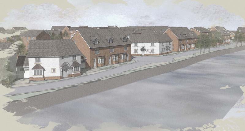
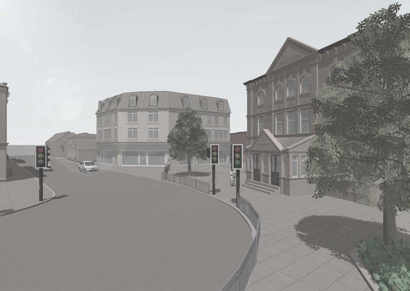
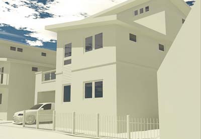
Here's a few images of some work completed recently, SU with a little PS adjustment.

-
ooops, sorry, here they are.
-
I really like the technique on the first one.
One comment I have is the buildings look so flat. I think they would really "pop" with some dark and lights added.
-
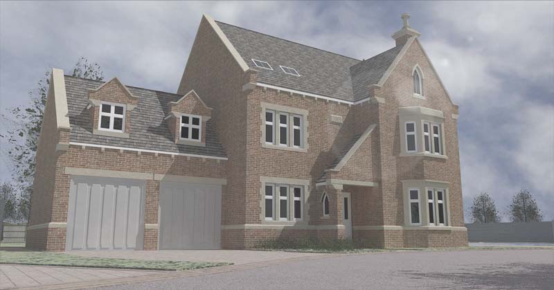
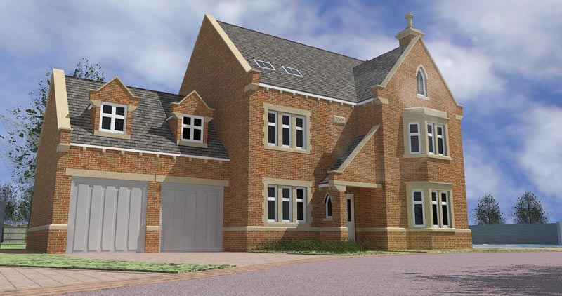
Really like the first one. The second and third appear washed out. Also, on the second image, if you rotated the view to the right a bit more, you'd be able to hide the end of the road that abruptly stops.
-
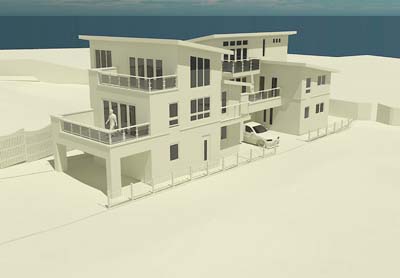
Thanks for the comments folks, Totally agree bout the washed out look, I'm not a big fan myself, but you know how it is when the clients there next to ya picking views and asking to drop the contrast back, heres a couple more I'm more happy with, rendered in Kerky
-
I like the modeling you have done but I think you are taking away from that with these faded out images. IMO. I think they need to "pop" a little more! Show it off... don't hide it!
-
A bit more like this perhaps
-
Damn those clients! (and engineers, and contractors, and building inspectors, and...)
That last image looks much better, but I'd get rid of the lens glare - I don't think it adds anythig to the presentation. If faced with a client like that, I'd make two sets of images - one for them, and one for me. -
I like that one much better!
-
Thanks for the input, I'll take it on board.

Hello! It looks like you're interested in this conversation, but you don't have an account yet.
Getting fed up of having to scroll through the same posts each visit? When you register for an account, you'll always come back to exactly where you were before, and choose to be notified of new replies (either via email, or push notification). You'll also be able to save bookmarks and upvote posts to show your appreciation to other community members.
With your input, this post could be even better 💗
Register Login


Advertisement