Burger King
-
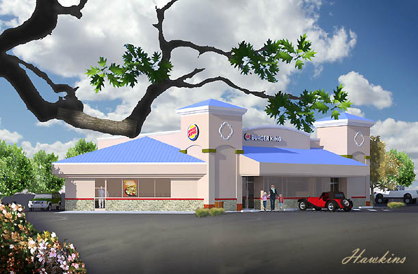
The King of Fast Food.
Really proud of the branch, It was just a silhouette and as such looked too harsh. I found a little piece of oak bark and faded it into the branch as if a little drop of sunlight was peeking through the rest of the tree. Also a little dust in the parking lot grounds the image.
I forced myself to go out and shoot some clouds. As summer comes to Arizona the clouds disappear under the merciless sun. Every year I promise myself to shoot some clouds and every year I wait to long. They will now disappear until the advent of the monsoons when we get some magnificent cloud displays.

-
Thats a nice one. I'd like to see some more pics.
-
Dear Roger,
In all conscience, how can you make a Burger King look so attractive. Okay, so they pay the mortgage, but in this day and age with healthy eating...., and yes, this is a wind-up.
I think you should change the image slightly to make it look more like Dracula's lair. Perhaps a few tomb stones and black funeral cars in the parking lot might set the scene.
Nice render.
Bob -
Roger,
As nice as the branch is. I think it is too much a focal point and takes away from the main subject matter. Maybe bring it farther out of the scene would work better. I think it is nicely done though.
Scott
-
I agree with Scott.
I would like to see the image with less of the branch as I find it really takes my eye away from the rest of the shot. -
Perhaps apply some gaussian blur to the branch and the plants at the bottom left - to fake a depth-of-field effect, and de-emphasise the branch...? Regardless, really nice work.

A.
-
All I can say in my defense is that it is a "branch office."
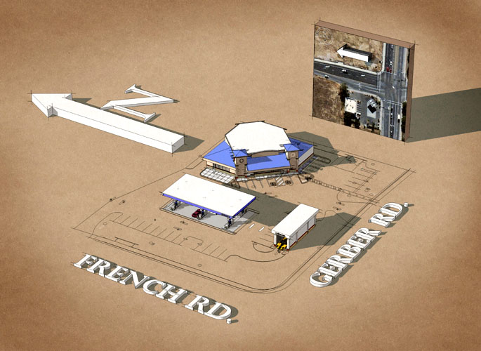
Here is the layout of the entire complex.

-
Goodness gracious - I LOVE the creativity in the presentation! That sketched up site plan would be a sure seller for one of my laborious ARB Town Approval hearings! I'm in the retail biz and use SU often for city permit presentations and such.
Very nice work - thanks!

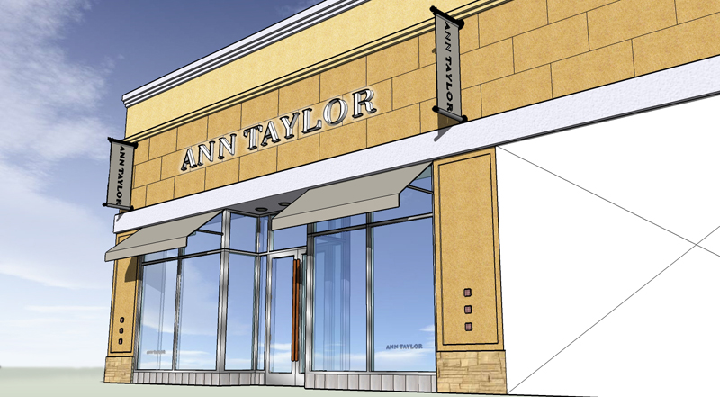
Here's one of the storefront I did for a client:

-
i like it, very nice work, keep going.
-
These were done for the city planning commission. I am used to doing art for marketing reasons rather than planning commissions. I guess it is marketing but just to a much smaller target.
I would like to do more work where I am the designer as well as the renderer.
Hello! It looks like you're interested in this conversation, but you don't have an account yet.
Getting fed up of having to scroll through the same posts each visit? When you register for an account, you'll always come back to exactly where you were before, and choose to be notified of new replies (either via email, or push notification). You'll also be able to save bookmarks and upvote posts to show your appreciation to other community members.
With your input, this post could be even better 💗
Register LoginAdvertisement


