My recent tries
-
Keep going! i enjoy looking at your stuff, its all very good

-
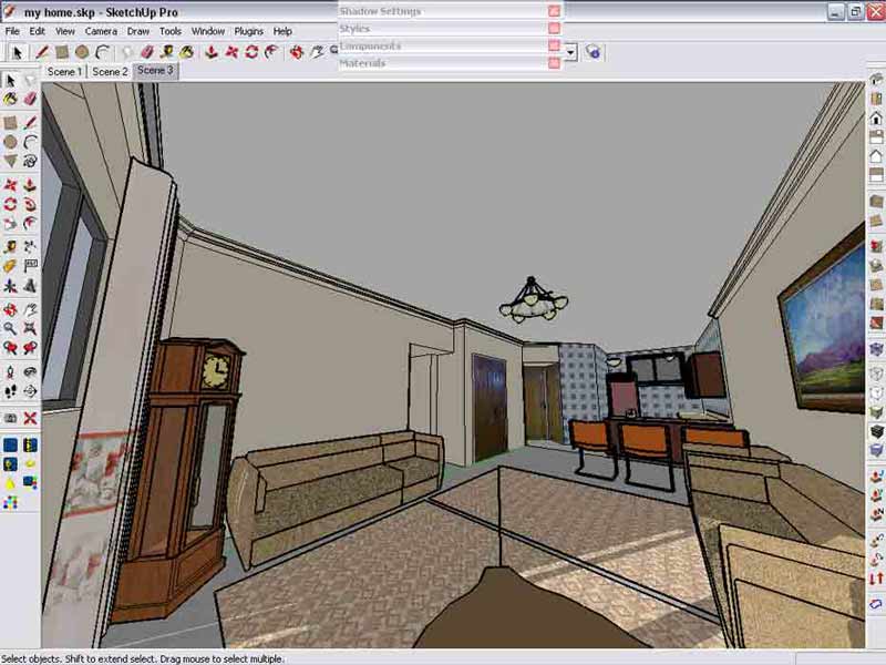
what if all were digital camera pictures.... i imagine if sombody shows such pictures to me it would be hard to recognise the reality.... btw they are just renders and the whole scene is too simple , and it shows the power of KT to simulating the reality.. here is the scene i made , and then changed it to HDRI file for kt ( the scene is my flat in fact , but simplified)
 yours
yours
-
hi folks ... as i promised i wouldn't hang the model anymore , ( because another hang up is being started
 ) ...
) ...
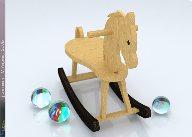
horse model is from 3dwarehouse ,, and the small glass balls takes me to my childhood ... pure kt render
cheers -
i love your renders majid!
-
@ Julius : thanx, you make me feel shy

and this is tha last try ... have you ever had little glass balls ? lovely toys from childhood . i tried to simulate the photoghraphy by only 2 lights and a simple scene
-
Yea Majid... we called them marbles but I guess you called them "glass balls."
-
it's nice chance for me to improve my English too
 @ Bubalove : thanx
 -
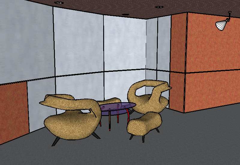
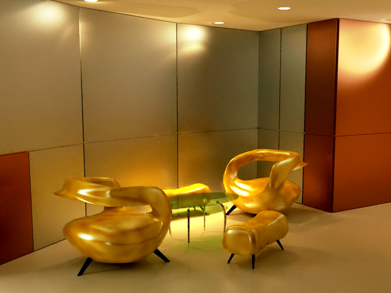
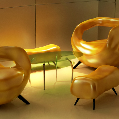
its my latest model and render , a detail of hotel kosar lobby , rendere is usink KT...and i tried to simulate warm color effect of lighting
-
Really like the form of the chairs (subd?) but i tihnk they could do with a different material, they look very surreal at the moment, almost non chair like
 perhaps a leather texture?
nice work on the lighting as well

EDIT: and perhaps another subd and smooth iteraation on those chairs, you can see the polys in the closeup

-
i ike the chairs a lot too, though their material gives the sensation to be something hard and uncomfortable...
-
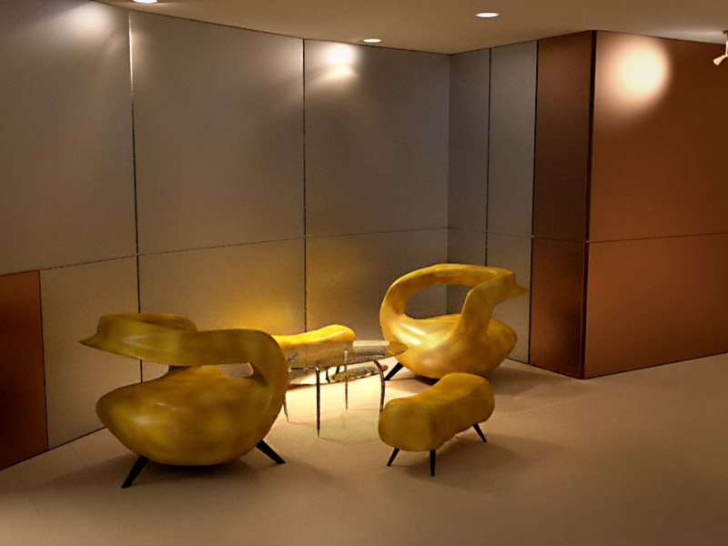
Nice rendering, Majid. My only crit to add is the brown wall texture - is it supposed to be wood? Looks like it in the SU image, but doesn't come out as such in the rendering. You might want to try a texture with a larger grain.
I like the chairs. I think the texture is okay, but it looks like taught vinyl, and doesn't look comfortable.
-
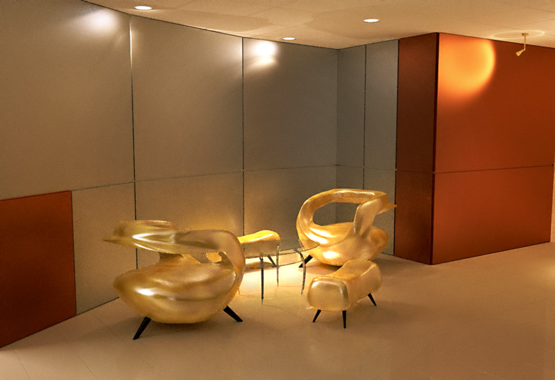
walls are alluminoum composite panels... you are right about the chairs i think...and i'd render the scene whit a better floor material... soon i'll be back
-
here is a better render i think , more shinness on floor.... less on chairs...
-
i am a bit lazy to rerender this scene

-
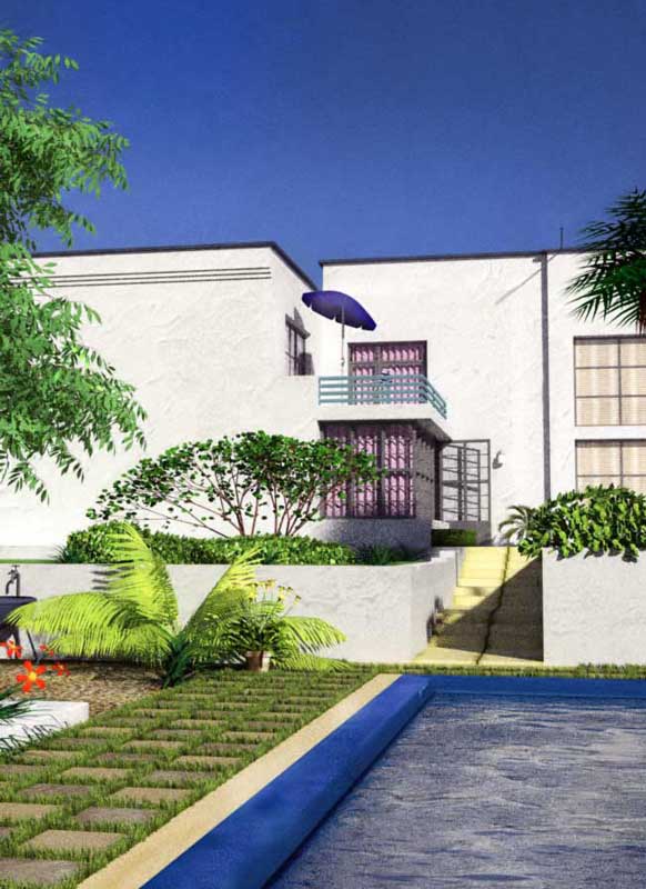
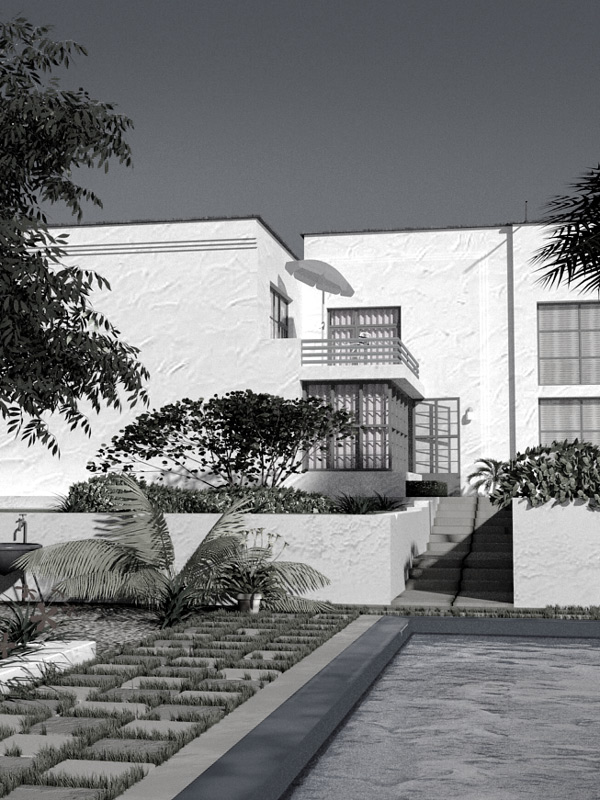
in this render i tried to move close to photoghraphy so i choosed a high contrast lighting... it's a work in progress and i am too lazy to comlete it ( it's just 4 fun) ..i guess i must change the left tall palm ...and review the fore grounf tree color... c&c r welcome

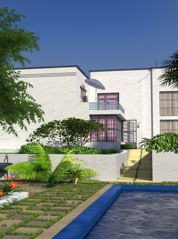
-
a close up view of the villa!all renderes are using BELOVED KT!!!
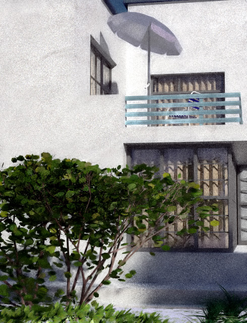
-
hi folks! last night i kept my computer on working all night ..and here is the result .. cheers
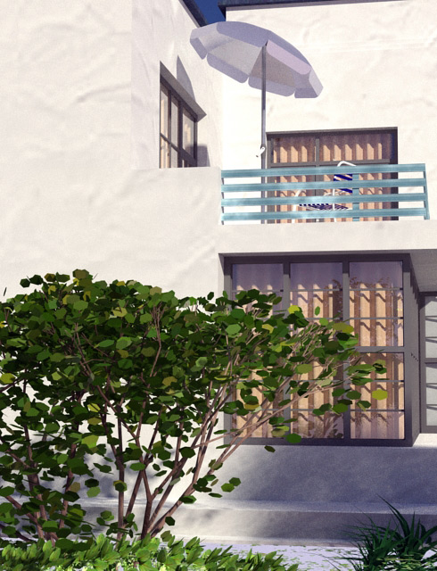
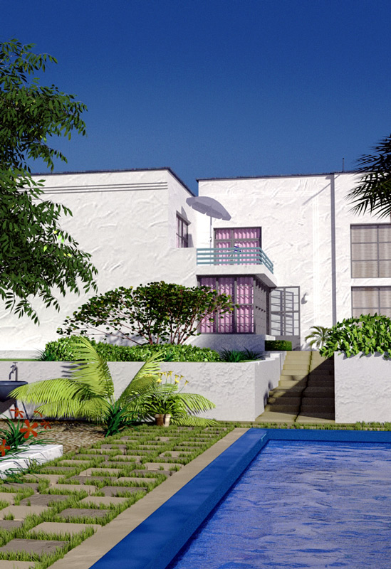
-
kerky's output is just getting better and better.
-
It's not justKerky's output but also Majid's (and the fact that there are more and more experts among its users).
I wish I could achieve this quality! I just don't really have the time - not only for Kerky (or any other renderers as a matter of fact) but even for modeling nowadays!

-
after a bit of play whit materials here is the result :
http://tinypic.com/view.php?pic=a0e4wi&s=3
http://tinypic.com/view.php?pic=dp8r45&s=3
http://tinypic.com/view.php?pic=2qdwxe8&s=3
Advertisement


