Minimalism (?)
-
Quick brainstorm for a logo:
Design:
Familiar colors, shapes, and styles were used to unite different elements of the site into a coherent theme.Next Up: Slightly more definition for the U.

-
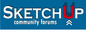
SketchUp version of previous design...
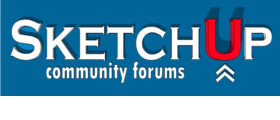
-
prefer the second one, but more noticeable than the first. And it thikn youve got the level of detail about right. It's pretty easy to go overboard with logos.
-
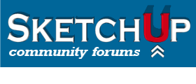
Few more variations on the same theme.

Hello! It looks like you're interested in this conversation, but you don't have an account yet.
Getting fed up of having to scroll through the same posts each visit? When you register for an account, you'll always come back to exactly where you were before, and choose to be notified of new replies (either via email, or push notification). You'll also be able to save bookmarks and upvote posts to show your appreciation to other community members.
With your input, this post could be even better 💗
Register Login


Advertisement