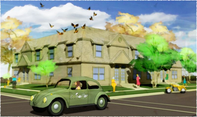
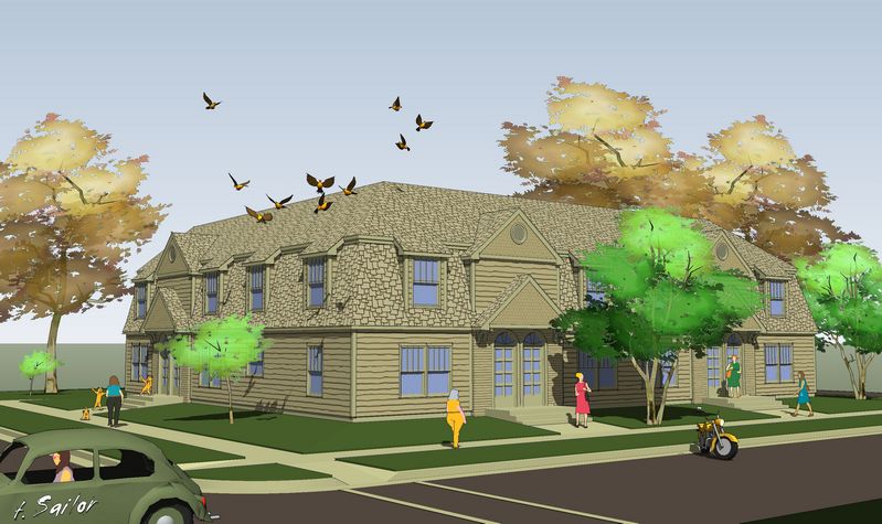
Found that '67 Bug...so traded in the van:
-
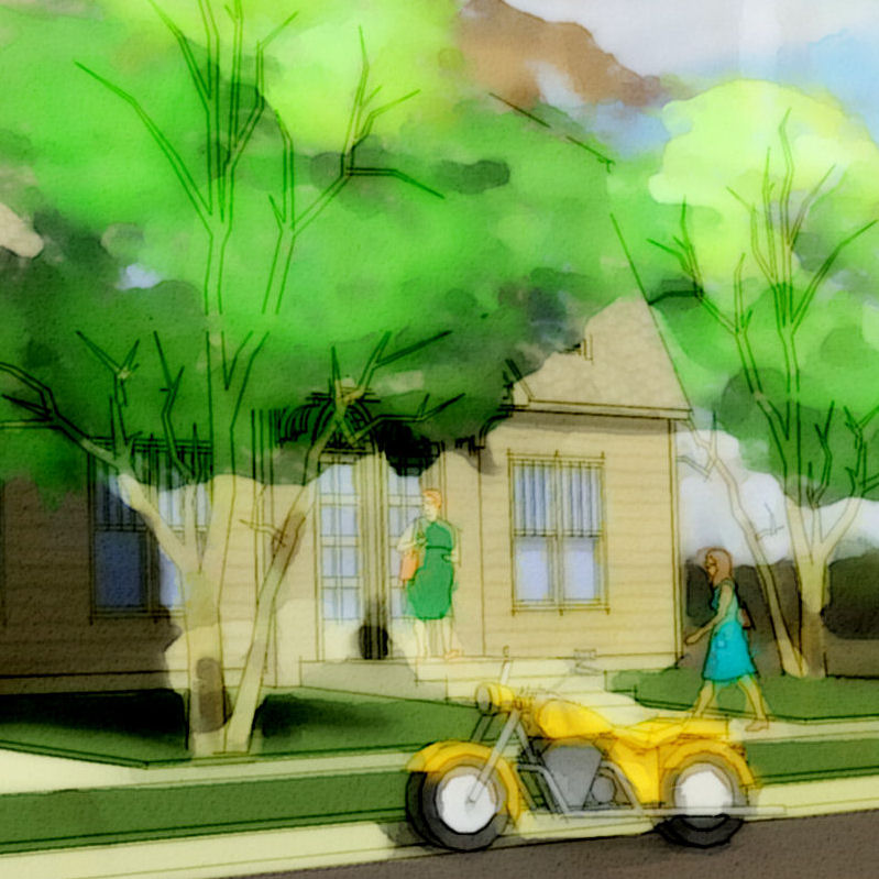
whadaya'll think? (I think the rearend of the motorcycle needs to be turned another 15deg into the street so the eye moves into the building rather than across the frontyard.)
-
i agree tom...something is not quite right about the motorcycle..i think right now it looks like its a mistake since it happens to end up being parallel to 'our' view (hopefully that makes sense..its early and cant think how to say it)
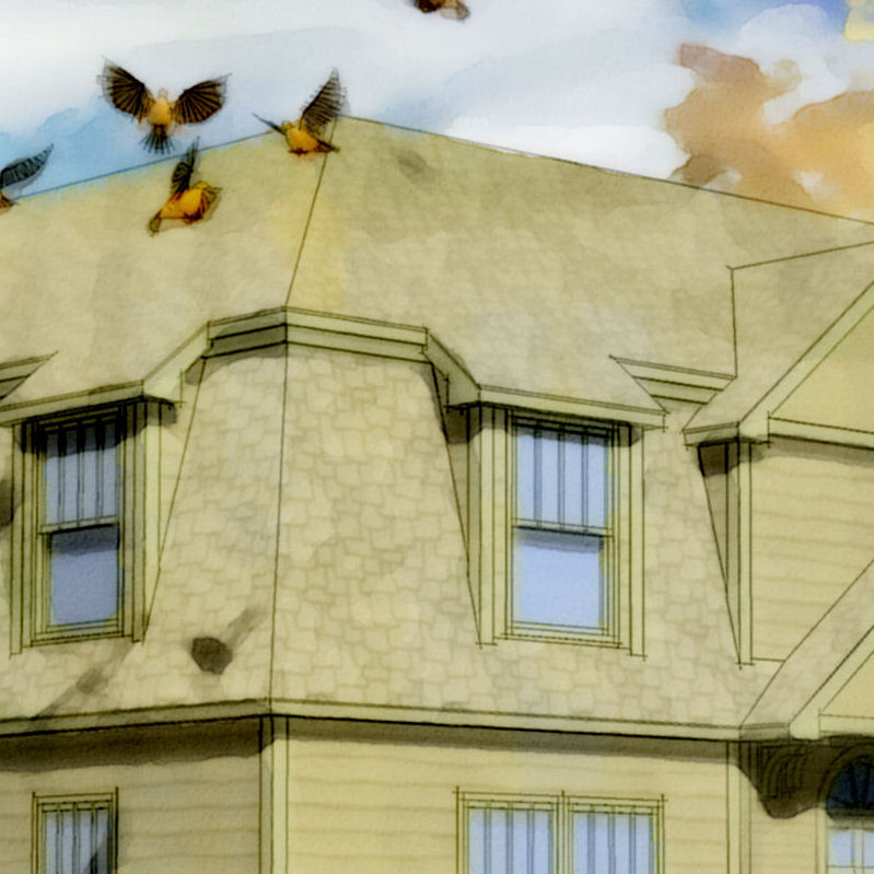
love the simiulated depth of field

-
I like the bug - much less distracting now than the van was (and you can at least see the building).
Align will be the word, Jason, I guess.
 It stands there like a face-me component and not aligned to the kerb/curb but to our viewpoint - true. Also, Tom, for me that second picture is a bit too blurry - as if you had merged two images together but slightly moving one aside (or how to say that).
All are very impressive however and really "tomsdeskish" if I may put it this way


-
Tom, I really have to question whether that is the right placement for a vehicle? My eye always go to the car first and not the building and what I really love about the rendering is the placement of the birds. It's so beautiful why muck it up with the focal point landing an a car rather than the building. Just my $.02
-
Tom,
I agree with Tina. I would delete the car entirely and the image would be improved. The bike is not nearly the distraction the car is.
Everyone is a critic.
Allen
-
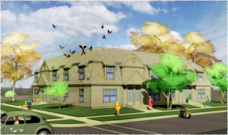
Point taken...and agreed to! too = too much! :`) The attached is a better rendering of a worse composition (and the SU only export, as promised elswhere). It is worse for two reasons: first...generally just is!, eye movement thru it is whack; second...because it fails my concept of focusing first on the feel of the "neighborhood", then on the building (the only "real" detail of "said-same" given, and since new to "it" gives the punch).
But obviously, that feel here is coming all from my back-shadows, so I will think some more and try same on a more real project: but the concept is that the real use of a render is to express (and sell) the aura of a proposed project, and hopefully how that interacts with what's already there...?
Hello! It looks like you're interested in this conversation, but you don't have an account yet.
Getting fed up of having to scroll through the same posts each visit? When you register for an account, you'll always come back to exactly where you were before, and choose to be notified of new replies (either via email, or push notification). You'll also be able to save bookmarks and upvote posts to show your appreciation to other community members.
With your input, this post could be even better 💗
Register LoginAdvertisement


