ECKERT RESIDENCE
-
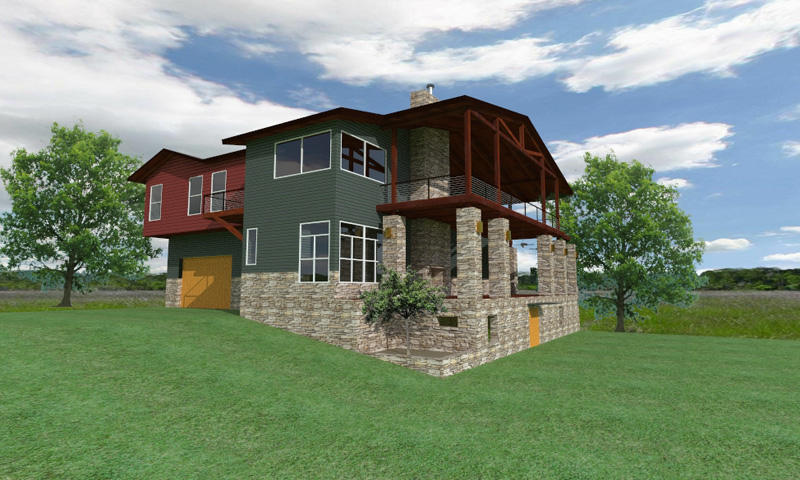
Kerkythea render WIP.

-
Gosh, I love the use of primary/secondary colors in architecture. The only thing I would change is the bad stone. That repeating tile is killing it. Other than that, what a fantastic render.
-
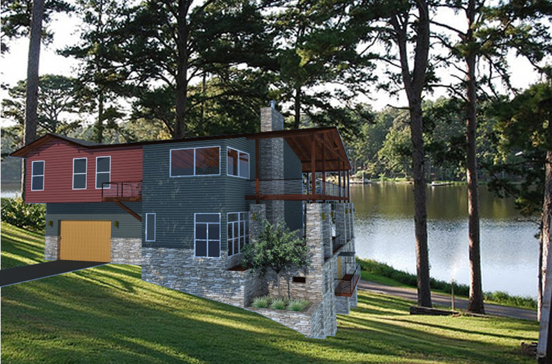
Here's a different approach to the background. Found the background on the internet first try. I'm sure there are better ones.
@unknownuser said:
what is that WIP i found this name in more sites....the thwo big trees are from the pictore behind the house aren t they?
WIP or "work in progress". The trees are separaet from the background, they are clip mapped with an alpha mask.
Render in Kerkythea Path Trace Progressive.
Thanks,
lapx

-
Thanks Ely,
Do you have any suggestions how I can fix this. I saturated both the background and su images just slightly.
-
Looks great. I think the first rendering looks best. Have two comments about your model, for what they're worth: Visually, the thick stone columns look odd with the lighter wood structure above, they look like overkill; and, the stone work will be thicker than your wood siding above it, so should project out beyond it.
-
Hello Daniel,
Your right about the tapered columns, Maybe I should keep them straight

@unknownuser said:
the stone work will be thicker than your wood siding above it, so should project out beyond it.
In the model there is a stone ledge that projects about 3" or so, it just doesn't show up well in the model. I am thinking about how to solve this one.
-
@unknownuser said:
xxxxxxxxxxxxxxxxxx?
If you stare at it long enough, it starts to show you a hidden picture.

Anyway, looking at this again, I think architecturally speaking, the stone is fighting with the bold siding. The stone has an "olde world" feel to it whereas the siding is more modern contemporary. The two combined seems to have an unusual marriage that may not necessarily work. Personally, I would almost be tempted to try something like Stonemill TundraBrick by Eldorado Stone, but that's just me.
So is this something that is actually going to be built or just for fun?
-
Thanks xxx...
@unknownuser said:
Anyway, looking at this again, I think architecturally speaking, the stone is fighting with the bold siding. The stone has an "olde world" feel to it whereas the siding is more modern contemporary. The two combined seems to have an unusual marriage that may not necessarily work. Personally, I would almost be tempted to try something like Stonemill TundraBrick by Eldorado Stone, but that's just me.
This is not my design although I would have to disagree with the stone comment. I love this look, however I just failed to pull it off in the rendering. Here are the original architects. They have some simply beautiful stuff IMHO.

http://www.hatcharch.com/whatwedo/residential/eckert/eckert1.htm
I've looked all over for this stone image.
If someone can help me find that stone I would be very happy
-
Ah yes, I see. What pulls it together is especially evident in the first image on that website. The surrounding landscape matches the stone that is being used on the house. It almost looks like limestone rather than a stacked stone. I have over 40 different limestones, so I have included a few for you to try.
Limstone 1
Limestone 2
Limestone 34I agree, they do have nice stuff and you did a great job at matching it.
-
thanks xxx.....

I think when I get the time I will go back and try to replicated the landscape.
I will need good textures for these as well. Oh, does anyone have a tree like the one in the photo. I love how it's shaped. BTW what is the name of the tree? -
Speaking of trees...

I can see that you've used 2D trees (cut outs) in your render...
Have you tried some of the free 3D Xfrog trees available..??Check out the Xfrog Sweet Birch, the Xfrog Public Trees and finally Xfrog Chestnut threads at the KT Forum...

Looking forward to see the progress on this...

-
xxx....
I'm usinig the #4 texture that you were so kind to give. It looks better than what I have at least so far in the sketchup model.
@ Frederick,
I try lately to use 2d trees with clipmap to keep polycount down.
Btw, I only have 3 trees from xfrog. Where did get all the other green trees that show up on your K menu? Are they in the depository also? I need some good conifers
I prefer this work flow for landscape trees:
1.place png or jpg file in su. (maybe png does not work in k can't remember )
)
2.explode and make faceme component with origin at center of component.
3.export to k
4.make tree material diffuse
5.insert accompaning blacknwhite image for clip map.
What is your preference. I sure it depends on situation. -
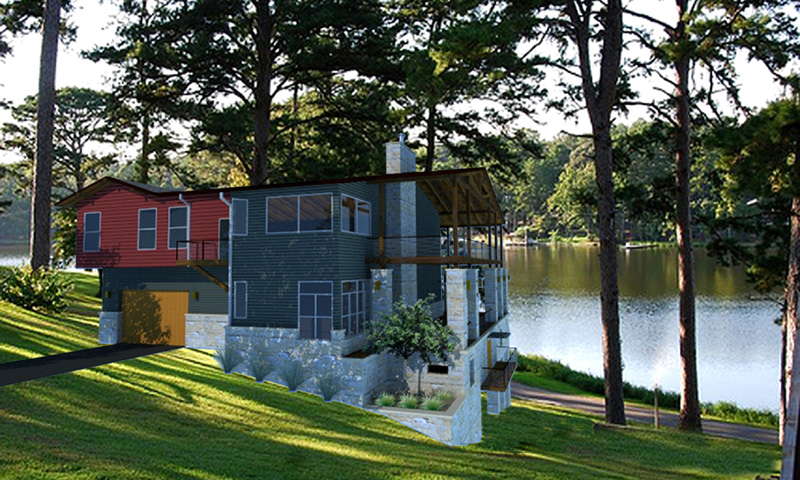
Made some slight color and material changes. Adjusted landscape. Update stone to siding transition. Fredrick, I followed your instruction on the mask and still get the halo. I also used the masking tutorial from Fletch to do the mask. The first render was at same resolution of the mask, This time I rendered the mask at 2x resoultion and resized smaller in photoshop. What resolution should I make the original ie for 11x17 format at worst and computer display at best. I am look for a standard work flow. I know it will have finally have to be resized for this board as well unless I provide link.

-
nice job!what is a little unusual is the difference between the stone and the wood from up part or brick . Of course u re the master,this is just an opinion,....what is that a WIP ?
-
thx,this is really nice. U cut the house and insert it into image. This is great but the image is too sunny,i think,
-
i wish i can give u some tips but unfortunately i m not even good as u are,srry, here are lot of people who know to work with renderings,they ll give u some tips
Hello! It looks like you're interested in this conversation, but you don't have an account yet.
Getting fed up of having to scroll through the same posts each visit? When you register for an account, you'll always come back to exactly where you were before, and choose to be notified of new replies (either via email, or push notification). You'll also be able to save bookmarks and upvote posts to show your appreciation to other community members.
With your input, this post could be even better 💗
Register LoginAdvertisement


