First attempts with digital watercolours
-
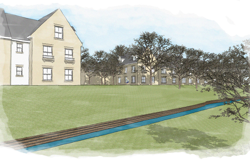
I like the angles of your views. I think your Sketchup models are very good. I like the style of the post processing, it's very pleasing. I think you could use some more white around the perimeter, especially on the first image to draw you in on the middle.
@unknownuser said:
Here's a quote from Grant Marshall's "Digital Watercolour Effects on Sketchup Images": "Watercolour artists often don't cover all the paper with paint. White paper can be an important part of the composition and help give life to the image. If your SketchUp images are edge-to-edge colour you'll have missed out on one of the easier 'tricks' and you can run the risk of the end result looking overworked and muddy. Generally speaking, larger areas of white will give the image a quick, sketchy, suggestive feel, while less white might be appropriate if you are simulating a more detailed, more 'finished' painting."
Best,
-
@pkast said:
I like the angles of your views. I think your Sketchup models are very good. I like the style of the post processing, it's very pleasing. I think you could use some more white around the perimeter, especially on the first image to draw you in on the middle.
@unknownuser said:
Here's a quote from Grant Marshall's "Digital Watercolour Effects on Sketchup Images": "Watercolour artists often don't cover all the paper with paint. White paper can be an important part of the composition and help give life to the image. If your SketchUp images are edge-to-edge colour you'll have missed out on one of the easier 'tricks' and you can run the risk of the end result looking overworked and muddy. Generally speaking, larger areas of white will give the image a quick, sketchy, suggestive feel, while less white might be appropriate if you are simulating a more detailed, more 'finished' painting."
Best,
Thanks for positive feedback all, ver grateful
Where can i find Grant Marshall's "Digital Watercolour Effects on Sketchup Images" ?
Kind regards
-
Try this website for the complete (unfinished) tutorial:
Best,
-
Sintra, I took your first image and ran a quick PS process on it. On one I used a slight textured background, on the other I left it off.
Best,


-
Hi PKast,
Nice to see a different interpretation of the the image, i have actually done some tweaking on them myself lightened the sky and decreased the coverage of the sky.
I am really starting to love these type of images i normally do alot of renders in kerkythea and always will do but these are great to do quick to show clients. The clients for the project really liked the images and thought they were hand drawn
 i took it as complment.
Kind regards
Darren
-
sintra: keep us posted as you refine your technique/use it on different projects. It will be nice to see where you go with this
-
I have another coule of projets i am working on at minute i will post them when finished.
Darren
-
Yes, keep us posted with your latest work.
Best,
-
Hi All,
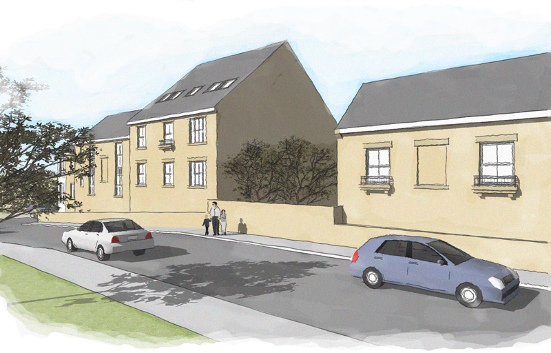
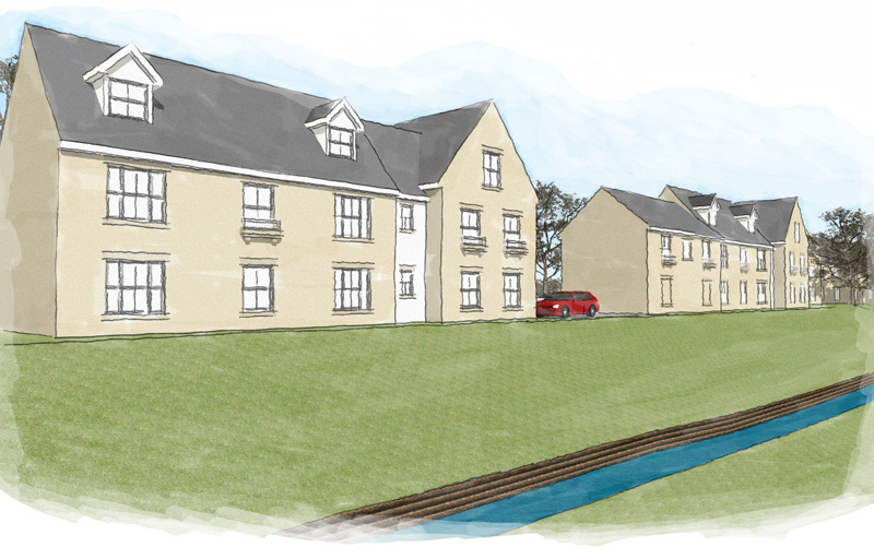
Here are my latest watercolours, there are four different views of the same street scene just from different angles.
Kind regards
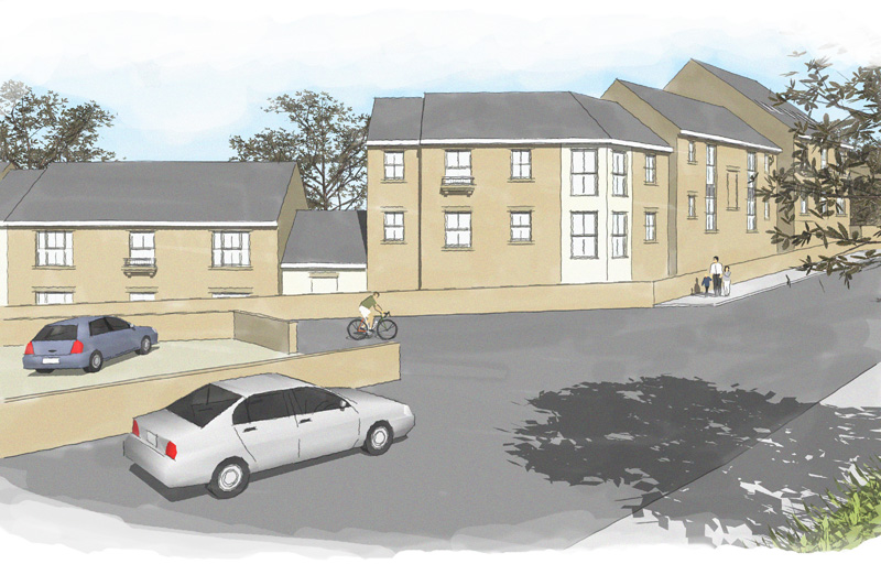
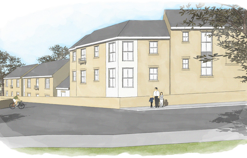
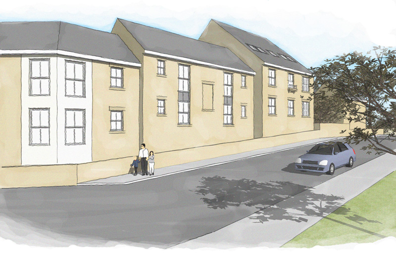
-
And the final one

-
Some more scenes from the above same project.
Darren
-
Darren, these are great...your style is quiet, pleasing, and quite powerful! I like the "final one" the best since the shaded wall adds a good measure of interest and a bit of drama (plus the tree shadow adds so much).
Love to see this one with the bike guy replacing the slightly distorted auto on the right...might "slow down" the road to "pedestrian" make it less of a barrier to be crossed.
-
Hi All,
tomsdesk glad you like them

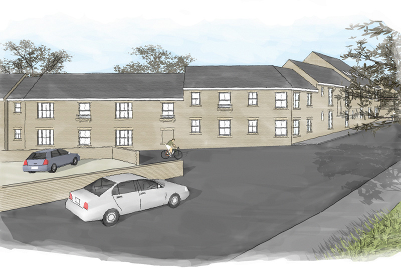
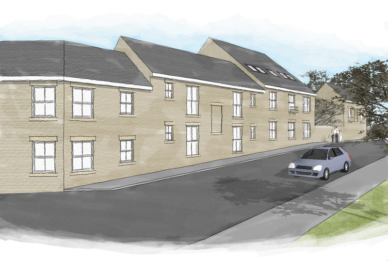
Here are the latest versions of this project, i have added some sketchy lines to the face of the properties and also to the roof.
Kind regards
Darren
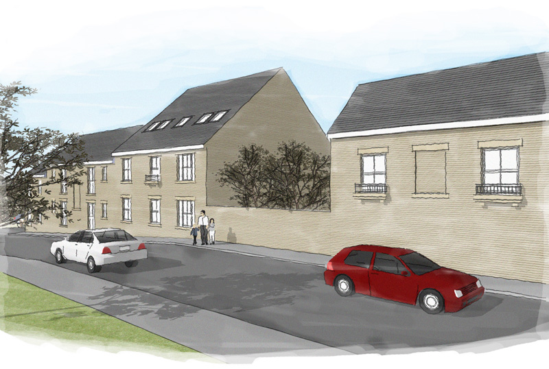
-
and the rest ....
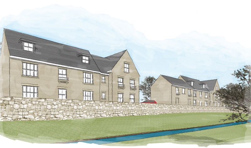
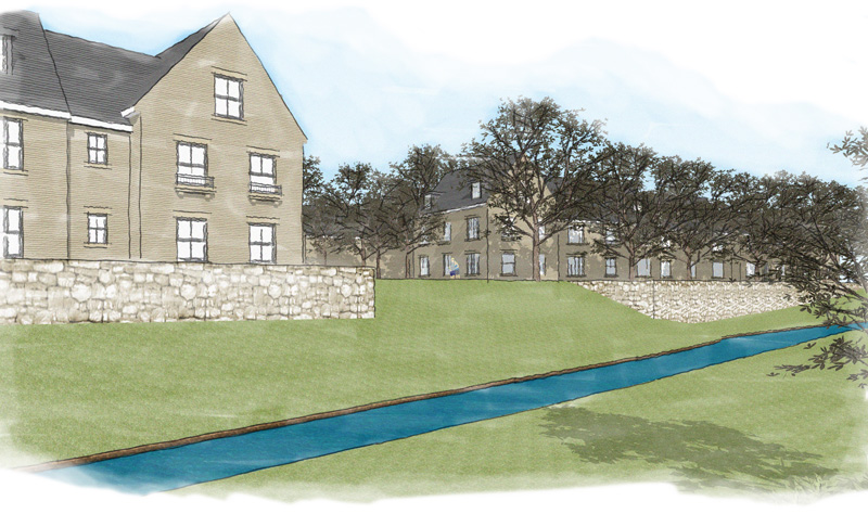
-
Hi Darren, glad to see you are posting on here now since the death of the old SU forums
 . I'm not really much of a fan of water colours either digital or manually painted tbh and there are far more qualified opinions in this area here than mine but my £0.02 worth would be to try outputing without using the tiled SU grass and build it up manually in PS perhaps with the addition of some grass blades/weed at the intersection of the stone wall. At the moment its just too 'clean' and needs a bit of saturation variation in the tones for me to feel as though it is a watercolour.
Be sure to post your updates
Hello! It looks like you're interested in this conversation, but you don't have an account yet.
Getting fed up of having to scroll through the same posts each visit? When you register for an account, you'll always come back to exactly where you were before, and choose to be notified of new replies (either via email, or push notification). You'll also be able to save bookmarks and upvote posts to show your appreciation to other community members.
With your input, this post could be even better 💗
Register LoginAdvertisement


