Condo Clubhouse 2 - WIP
-
a couple months ago i posted some images of the first proposal for this job. the clients found it ok but, "well, y'know, hmmmmmm....., a bit too modern for us, mate".
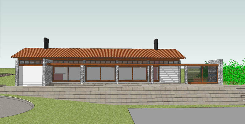
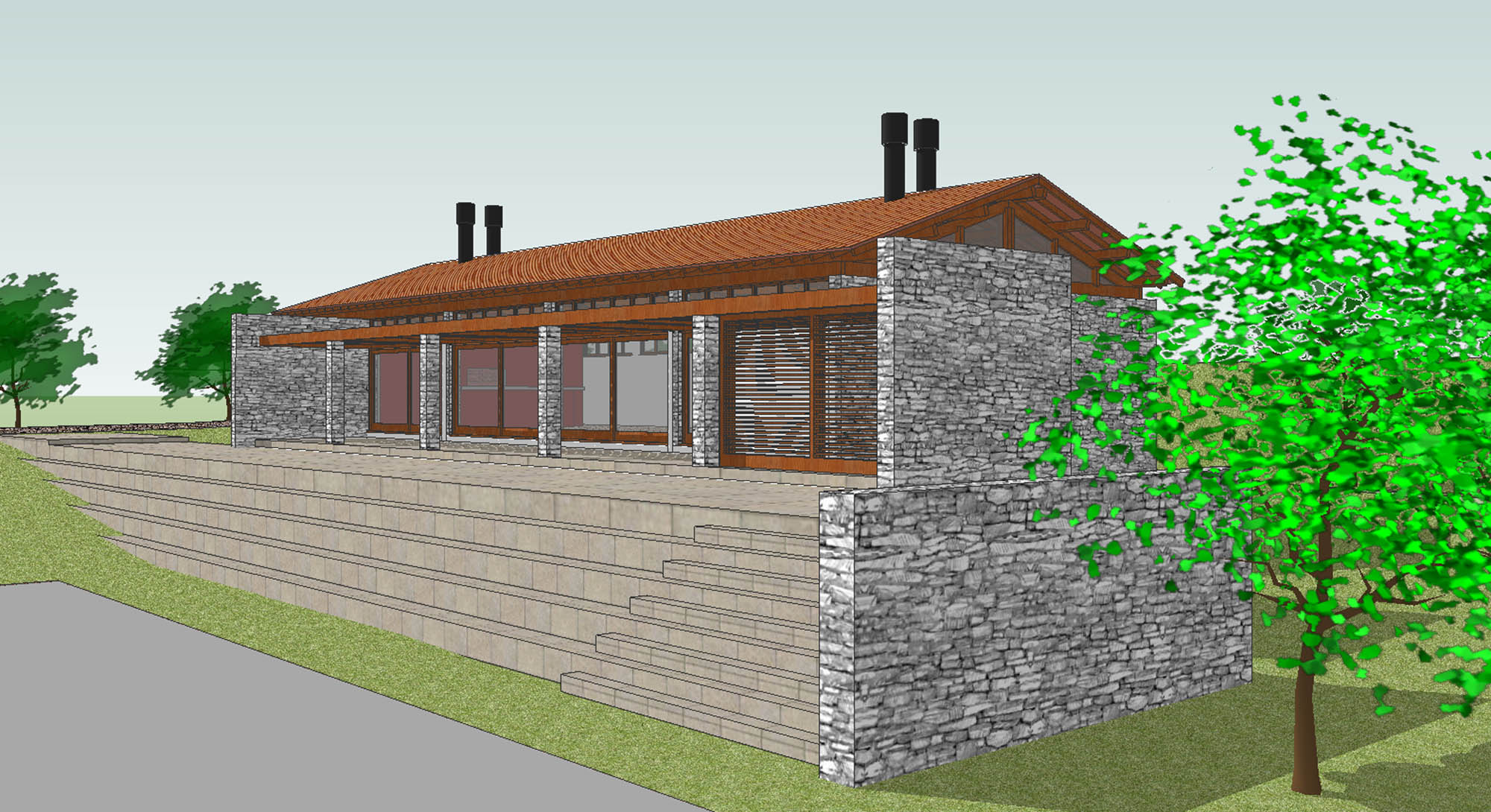
so i gave in and came up with a totally new solution, this time with clay tiles. the only thing i kept is the terrace and the steps to the courts.

-
Wait till he realises that he called in an
Architect only to choose the tiles.
Then He will think- Hell I could have done that myself.
It happens to me all the time. -
bruce,
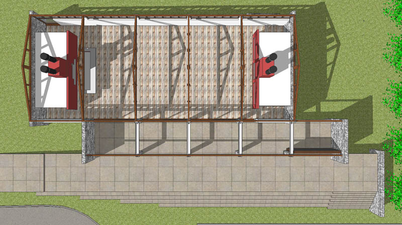
this the clubhouse, for social gatherings: it will be used for parties that people from the condo do not want to hold in their own houses. the top view should give you an idea of its plan: basically a big room with a porch attached to it. to left is the barbecue (mandatory in this part of the world) with a backup kitchen; to the right a fireplace with lavatories behind). the stacks are for the fireplaces and for the ventilation of the rooms behind them.
this is a very conservative part of the country: modern architecture has no chance there. they say people want a specific thing, traditional looking buildings. of course, how can they choose something they do not know? if they would at least show the prospective buyer more alternatives...
mateo,
in our latest meeting i asked them why did they hire an architect if they do not trust my knowledge? in the end they gave up pushing for a specific look and asked me to provide something that is made in stone, wood and has a pitched roof. this is my response to them.


-
edson
look really nicemike d
-
It looks really nice like this,I would really
like to see Your original version.
I am a tradition fan myself but there are allways times when one can combine modern and traditional styles. -
Like it Edson, especially now you have posted this last image so I can see it better.
I would be interested to see how it looks with a bit of horizontal timber cladding on a few walls.
-
-
@unknownuser said:
I would be interested to see how it looks with a bit of horizontal timber cladding on a few walls.
well, me too, but the clients seem to have a thing about stone walls. since i do not mind it i am not pushing for something else.
another thing to be said is that here you have to design keeping in mind that people almost never maintain their buildings, let alone a building that will not have a specific owner. being the condo's clubhouse it is everyone's (optimistic view) and noone's (realistic view). the timber cladding would be left to rot and then the architect --me-- would be the culprit, of course.
-
Now that i have seen the original I must say that I prefer the
original concept but as You say sometimes one can push as far as one
can. -
I can see why you favor your first design, but this design is rather nice too. It still has the clean lines of more contemporary work.
Your comment about lack of maintenance (which I've found to be universal for all building types and clients) makes me wonder about the restrooms and kitchen. If I am reading your plan correctly, the main vaulted space extends over their flat ceiling structures; wouldn't that create two large dust shelves?
-
thanks for the contribution. you are quite right, daniel. i am not sure yet about what to do with it.
the alternatives: giving the restrooms and kitchen the same ceiling height of the main room, which seems a bit weird, to say the least, or make the two ancillary spaces small additions to the main volume which seems to me even worse (it would turn the whole into a collection of smallish pieces --thus breaking the elementarity of the scheme-- and would call undue attention to service areas of the building).
perhaps making those slabs accessible would help. putting plants there would also run into the maintenance problem.
any thoughts?
-
A few quick thoughts:
Extending those elements to the ceiling, but enclosing the tops with glass to allow borrowed natural light, and possibly maintain the feeling of the main space. Might look too busy, however.
I like the idea of making it occupiable; that was an initial thought I had last night.
Those are just quick thoughts on my part. Perhaps it isn't such a major deal. As designers, I thnk it is incumbent on us to consider how a building is used and take into such mundane aspects, but we can go only so far. I've been renovating fraternity houses for a few years now, and have come to the conclusion there is only so much I can do; we can't make our clients maintain their buildings (nor prevent frat boys from destroying them).
-
Edson,
I noticed in your original that there's a childrens' swingset at ground level off to the right. If that is still part of the plan, the tall stone wall in your revised plan will keep eager children from darting straight for the swings and tumbling from the top of the patio over the wall.
But I'd humbly suggest improving the sight lines from clubhouse, or at least from top of patio, across to the swings, so children can be seen while they play.
Kind regards,
Jonathan
-
jonathan,
it is a genuine worry. i will keep that in mind. thanks.
daniel,
this is a possibility although the original idea was to have the two end volumes as boxes within the main space. i will not do anything for now since the clients have not seen this new alternative yet. there is always the possibility that they do not like this one either...
Hello! It looks like you're interested in this conversation, but you don't have an account yet.
Getting fed up of having to scroll through the same posts each visit? When you register for an account, you'll always come back to exactly where you were before, and choose to be notified of new replies (either via email, or push notification). You'll also be able to save bookmarks and upvote posts to show your appreciation to other community members.
With your input, this post could be even better 💗
Register LoginAdvertisement


