Loose sketchy renders...
-
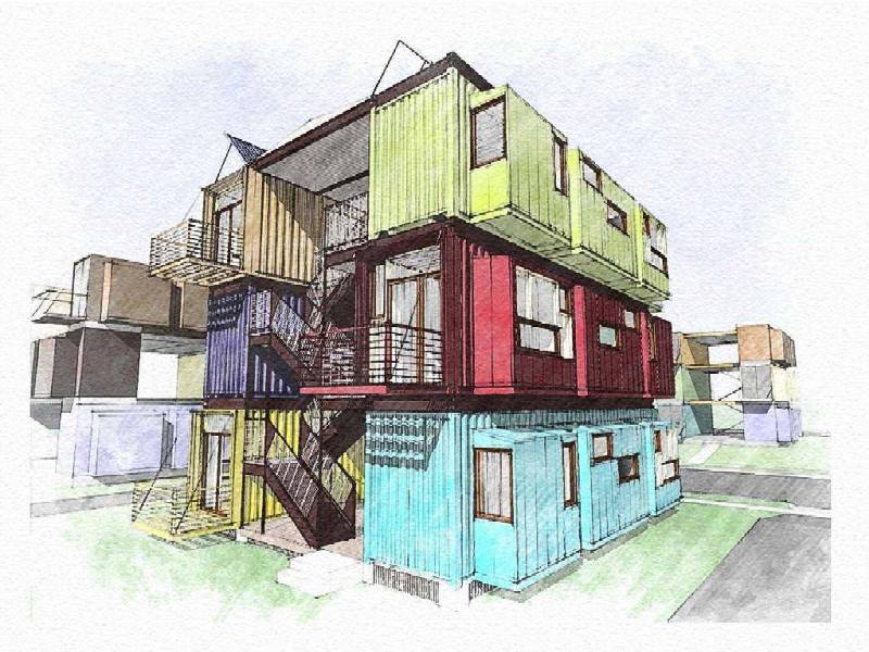
Some of you may know Gregory La Vardera. He is an architect in New Jersey who was an early adopter of SketchUp. He used to participate in the early days of the old @Last SketchUp Forums. These days he uses SketchUp to communicate designs for his modern house-plans website.
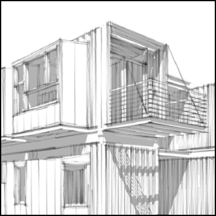
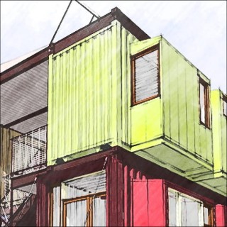
I attach images of one of Greg's designs that uses modified shipping containers as housing. The images feature the style called 'Soft Graphite Sketch' that I developed for FormFonts. I think Greg's design shows off his considerable design skill plus shows off my style to good effect. The grey-scale image is pure SketchUp output. The colour image is one of Greg's exported images that I manipulated. His image used the 'Soft Graphite Sketch' style with flat colours applied to the model. I used Xara Xtreme vector illustration to modify it to give the colour a more sketchy appearance. The manipulations resulted in the sketchy lines looking more inked than graphite.
I hope you like them...
Regards, Ross

-
And here's some zooms...
-
Thanks James!
Of course Gregory's design is what makes the images interesting. On of the minor challenges of using styles is matching the appropriate one with the model and its particular level of detail. Greg's model has lots of detail that seems well suited to seeing it rendered like a pencil sketch. The particular style produces rather soft lines as seen in the monochrome images --- when those soft lines 'bunch' up the don't really become the strong visual blobs that are common problem in many styles.Regards, Ross
-
are those apratments made out of shipping containers?
fantastic... great sketches too...
-
Simply lovely, Ross!
(Your work work with sketchy edges makes their lack of compatibility with transparent images even sadder :~(Nice link, James, thanks.
Best, Tom. -
Thanks for that Ross - I've never looked into formfont styles, I will from now on.
Here's what I did with a container. Mark is a renter and when you want a recording setup you are limited in what you can do to a rented house. So Mark suggested we try this approach. If he moves house, he just calls in a truck and moves the studio.

http://johnlsayers.com/Studio/Mainpage/MP-Mark.htmI might add the pink is not my idea

cheers
john -
@john sayers said:
... I might add the pink is not my idea ...

Thanks for that info, John...

Apart from that, it is a really nice idea. Does it practically work nicely, too? -
@krisidious said:
are those apratments made out of shipping containers?
fantastic... great sketches too...
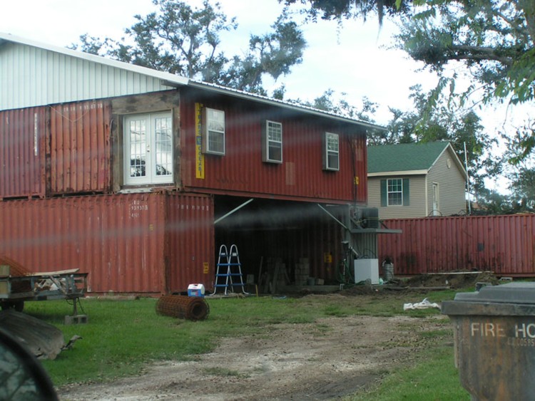
Don't want to get too far OT, but can't resist showing y'all a South Louisiana version of the Container School of Design.. Not a slick as the UK layout, but it did survive Hurricane Katrina.
-
Ross,
what did you do with the colour manipulated picture
is that a SU-style or some PS work
Looks great !! -
@regh said:
@krisidious said:
are those apratments made out of shipping containers?
fantastic... great sketches too...
Don't want to get too far OT, but can't resist showing y'all a South Louisiana version of the Container School of Design.. Not a slick as the UK layout, but it did survive Hurricane Katrina.
[attachment=0:h5dm1jdd]<!-- ia0 -->4805.jpg<!-- ia0 -->[/attachment:h5dm1jdd]I wouldn't mind a house I could weld on. If you put some poles at the corners, and some rings over the poles - it could float up and down with the flood waters.
Hello! It looks like you're interested in this conversation, but you don't have an account yet.
Getting fed up of having to scroll through the same posts each visit? When you register for an account, you'll always come back to exactly where you were before, and choose to be notified of new replies (either via email, or push notification). You'll also be able to save bookmarks and upvote posts to show your appreciation to other community members.
With your input, this post could be even better 💗
Register LoginAdvertisement


