Capri WIP
-
i really love the night rendetion of this series
-
Thank you guys, your comments make me all warm and fuzzy inside, it also makes me want to push myself even harder and do even better.
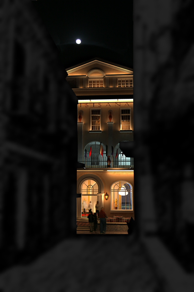
Here is a second light pass for the hotel with some people and a moon added.Enjoy!

[stuckon3d]
-
Cris
Can you link a larger picture?
Looking fantastic, so much detail that gets lost at such a small size.
thanks.
-
@solo said:
Cris
Can you link a larger picture?
Looking fantastic, so much detail that gets lost at such a small size.
thanks.
Thanks solo, the thing is that I dont have the full composite at full res yet (3076x2304), but here is the link to the raw image of the hotel lighting which is (3076x2304). Unfortunately, I cant post the image here, it is telling me the file is too big.

[stuckon3d]
-
I've been having so much fun lighting this shot, I just could not stop this weekend, so here is the first light pass for the yellow zone. Some of the plants and the glass reflections are left out on purpose so that the renders go faster, but as you can see, you can pretty much tell what is going to look like with them anyway. So what Am I going to work on next? Some of my omni lights are creating burn on the window shops and doorways, so this will be fixed of course, also the floor in the foreground is just a temp floor, the way I envision this is having pools of light coming from the window displays. I think it will make the picture look very enchanting.
[stuckon3d]

-
It is already very enchanting!
But I think the too much light in the front distracts the eye from the hotel a little bit - that has so much warmer (thus less) light. But it can also be the "light leak" or something you are mentioning...Really nice!
-
@gaieus said:
It is already very enchanting!
But I think the too much light in the front distracts the eye from the hotel a little bit - that has so much warmer (thus less) light. But it can also be the "light leak" or something you are mentioning...Really nice!
Thank you Gaieus, that was a good observation, and you are correct the green zone is competing with the yellow zone in brightness so the eyes dont know where to look first. What I will end up doing to guide the eyes better is attenuate the lighting as it goes further into the street thus by the time your eyes hit the hotel, it will looked frames in semi darkness, thus making it pop up and show its full spendor. what do you think about that strategy?
[stuckon3d]
-
Someone told me that the human eye (read psychological eye) is drawn first to those parts of an image with the 'warmest' colors/light, as those warm colors are considered to be mentally pleasing.
That's the reason why good photographers often choose to shoot images where the object is lit with warm light while the not so important info in an image is left cold coloured. (the 'Chiarro-scura' effect)
In that perspective, I can understand Gaieus reasoning that one would expect the hotel to be center of focus and thus having the 'warmest' appeal.
Those people you added, walking towards the hotel, point out that you want the hotel to be that attraction point. I would expect lighting to follow the same philosophy, but hey, the image isn't finished yet right?
....First see what the genius will make of it 
-
the goal of this image is not to show off the hotel but to capture the magic I felt when I was walking down that street the first time I saw it during my recent honeymoon
. The weather was warm with a slight breeze, the moon was out, and the street lighting was almost magical. That is what im trying to convey. [stuckon3d]
-
I understand....
and I am sure you will make it greatI quickly tried to photoshop the two different light scenarios we are talking about.
In the right image the focus is on the hotel.

-
I see what you mean by it, it really does make the hotel pop, however... if I pull off what I have in mind, I will take the viewers eyes into a journey, starting on the red zone, then it will make you want to look at the yellow zone and then the green zone and then if you liked the journey it will make you want to step back again and start over. If I can pull this off then I have a good image. Wish me luck.
[stuckon3d]
-
This is the second pass for the yellow zone, I fixed the burns on the shops and made the street go into darkness so that it does not compete with the hotels lighting, I think I went a little too dark so im going to adjust this a little bit on the next pass, I also added the plants on the balconies and glass reflections (but those are stand-ins until I get the lighting on the red zone done). I also added in PS some pools of lights coming from the window, which I will render them properly when I have all the light placements on all the zones.

PS: how often would you like me to post updates, on the other forum they wanted daily updates but if you guys prefer I can post every week or not until it is finished. Just let me know, I don't want to be a bother.

[stuckon3d]
-
I like that darken(e)d part though. It gives you a break when the eye wonders to the hotel finally.
-
looking fabulous stuckon !
Just curious:are the render times still between acceptable ranges? -
@kwistenbiebel said:
looking fabulous stuckon !
Just curious:are the render times still between acceptable ranges?the render times are not bad at all, the last layer I render was 1000 something by 700 something and it was less than four hour with plants(which are thousands of polys) and reflections on the window shops. Oh BTW I started lighting the red zone, heh heh actually all I did was turning the layer on and see how the lighting from the yellow zone would affect it, pretty good start dont you think?
[stuckon3d]

-
RESPECT!!!
phenomenal work ur doin there Stuckon3D... a truly befitting name for u!!! -
I agree, this is really wonderful. My only comment, is the moon. I see the feeling you are trying to acheive with it, but it's not working. It draws my eye away from the architecture. Maybe not so bright, or some cloud cover to dim it down a bit might help...but again, that's just a personal preference.
Overall, simply fantastic.
-
@jenujacob said:
RESPECT!!!
phenomenal work ur doin there Stuckon3D... a truly befitting name for u!!!Thanks J, much appreciated.
Todamgood4u: Thank you for the C&C. I will take that in consideration once I do the final touches to the image.
And now for the red zone lighting: first pass is complete! Now that all the zones have a first and some second lighting pass done, Its time to add the little things that make a good image, a beautiful image. What is that? balancing of all the areas, adding reflections to the glass, adding more detail to textures that are very visible in the image, adding more geometry (like plants, wires, curtains where needed), the list can go on and on. But I will only give one more extra pass to each zone because... me being of course my worse critic, would never be done with it.

So...Now to the tweaking stage, but before I do so I would like everyones feedback and tell me what they like and what they dont like about the image. I have been looking at this image for so long that I could really use a fresh pair of eyes.Thanks for the help,
Cris
[stuckon3d]

-
Now Cris, that's fantastic!
On the left side I really like the horizontal lights (as well as the finely lit row of plants hanging from the balcony) that lead my eyes perspectively towards the hotel while the vertical lights (of the shopwindows or what) are decently "hidden" behind the other plands so they are not too distracting.
Something like this: "leading lights/lines" would be nice on the other side, too, maybe just some decent ones below the balcony (that's something like a shop there too, isn't it? It could use some of these "ads" or something)
On the other hand, that striking shpo window or what at the end of the right building is distracting a bit. Maybe just one or two people in fron of it - they could both "hide" the amount of light as well as add some "life" to the foreground of the image as well.
I don't know. I'm not really an artist. I like it as it is now anyway.
Sorry for the longish crits!
-
@gaieus said:
Now Cris, that's fantastic!
On the left side I really like the horizontal lights (as well as the finely lit row of plants hanging from the balcony) that lead my eyes perspectively towards the hotel while the vertical lights (of the shopwindows or what) are decently "hidden" behind the other plands so they are not too distracting.
Something like this: "leading lights/lines" would be nice on the other side, too, maybe just some decent ones below the balcony (that's something like a shop there too, isn't it? It could use some of these "ads" or something)
On the other hand, that striking shpo window or what at the end of the right building is distracting a bit. Maybe just one or two people in fron of it - they could both "hide" the amount of light as well as add some "life" to the foreground of the image as well.
I don't know. I'm not really an artist. I like it as it is now anyway.
Sorry for the longish crits!
Gaieus,
thanks for the great feedback, that is exactly the kind of comments I was looking for, I hope more people here will do the same.cris
[stuckon3d]


Advertisement