Opinion on these houses
-
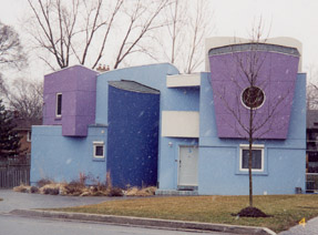
This architect caused such a stir about 15 years ago when these were built. They are the first 2 houses on the block just off of a main street. The rest of the houses in the neighbourhood are pretty suburban normal and the residents were less than pleased about them. The architect lives ( or lived, I don't know any longer) in the first of the houses.
Just curious as to opinions. Do you like them?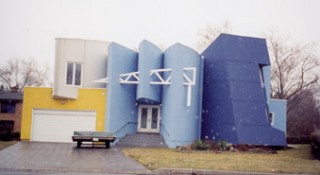
-
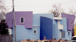
alternate views

-
I have to appreciate their brazenness... but I can't say I think they are necessarily beautiful... the colors really throw me, perhaps if they were more earth tone types maybe I would like it more...
otherwise, my designs and that of my mother, are very "out there" or "abstract" you might say, however we use technology and standard construction methods to create our brand of abstract design, what I mean to say is we have a living space use in mind with all aspects of the home... and try to do it with style and originality while still being efficient.
for instance in this design 2A... what bothers me is waste of money on design with no use. the rotation of the floor trusses on the second floor is nice, but it's expensive and there is no balcony or use...
on the front of 1A the three ellipse ends, are not very useful because they don't cover the front, yet they are very expensive.
on 2A the living area has a great expensive facade but there is not much glass...
I really like the roof arches in 2A...
to me it's standing out just to stand out... not standing out doing what was needed to create unique use able living space...
in image 1B the garage looks far to shallow to hold a real car... are these real homes that someone lives in or at a show?
the room on top of unit 1B also looks too small to live in...
it really looks like a retail video rental store from the fifties...
again I do appreciate their willingness to step out on the ledge and try new things...
-
Hmmm something happened to my post.
I don't like these. Too cold. Wrong colors. I believe architecture should be regionally appropriate. Now that can mean many things, but none of them are satisfied by these designs.
Instead they cry out for attention. And who wants to coddle a spoiled child?
-
Hi Susan,
House are 'living machines'. Its not really possible to
comment on them as 'houses' until we see the layout / plan.All I have to go on at present is the shell!
Mike
-
@unknownuser said:
I wouldn't buy one.
I would, though. They're kind of a mixture of Memphis (the design style, popularized in furniture, not the city) and Eisenman's version of Deconstruction.
My architectural theory instructors at YSOA fried my brain, obviously.
posted by Lewis Wadsworth -
I really like them too Lewis. I like different! My one caveat would be if the living space inside were impossible to use effectively or if it were very dark during the day. I would want to see inside before deciding that. I just love the funkiness. My only complaint would be that they aren't carried off well on the regular sized lot that they are on. I think they require more land and some very "funky: landscaping to match. The property here is just too ordinary to fit the house.
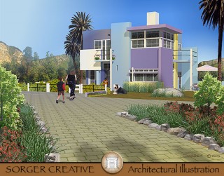
As to the colours, the only colur that has a high enough chroma to be called "garish" is the yellow, and that is used sparingly and all the colours do work together. In fact, I borrowed just these colours in a fun illustration that I did long ago in which I reloctaed Shroder House to California and changed the outside colours.
-
is that yours Susan, ahhh much much much better...
there is light and use there, and also very contemporary...
I'd like to see more of it although maybe in it's own thread...?
-
Kris - My understanding is that Susan created that rendering using a model of the famous Rietveld Schröder House in Utrecht, Netherlands. She suburbanized it and updated its original Mondrian-inspired colours. Seeing it reminded me of my visit to the actual Rietveld Schröder House. When my wife and I were students we bicycled around Holland. I loved Utrecht. When there we did the pilgrimage to the Rietveld Schröder House. I was surprised it had a relatively North-American style suburban setting. I remember there were a couple young Dutch teenagers sitting on the steps of the house next door. They were laughing at us. We imagined they frequently had silly students gawking at the 'weird' house next door.
Susan -- It would be nice to see more images (zoomed views) of that fine rendering.
Regards, Ross
-
Ross looks like "Silent Bob"
it's cracking me up...
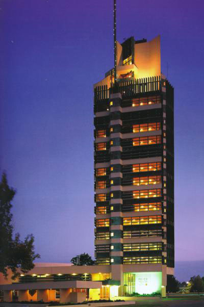
so people fly all the way there to see that house? we go a sky scraper in bartlesville, Oklahoma. the FLW did... it's not really a sky scraper, but it's huge out in the middle of nowhere...
Hello! It looks like you're interested in this conversation, but you don't have an account yet.
Getting fed up of having to scroll through the same posts each visit? When you register for an account, you'll always come back to exactly where you were before, and choose to be notified of new replies (either via email, or push notification). You'll also be able to save bookmarks and upvote posts to show your appreciation to other community members.
With your input, this post could be even better 💗
Register LoginAdvertisement


