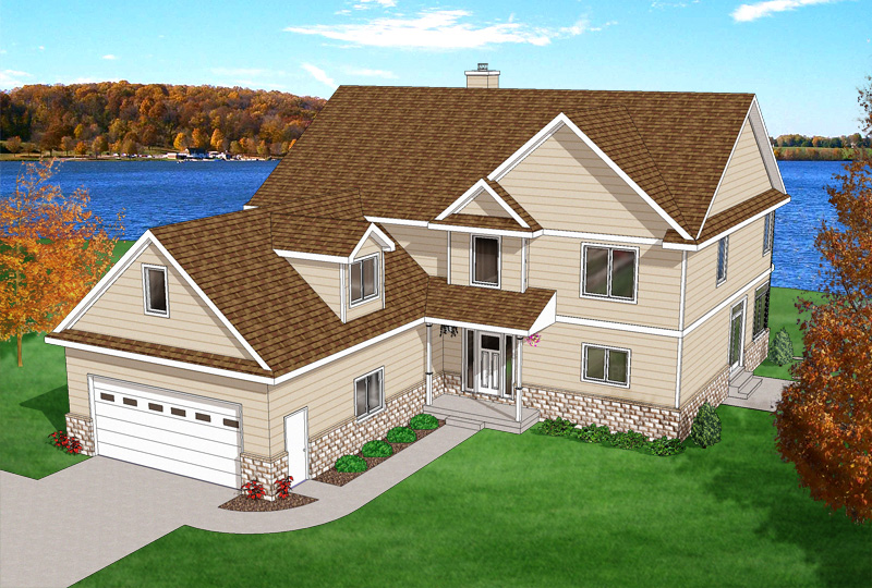
Lake House
-
Eric, wow. That's a great observation. Looking back at the image, I see how dead the windows look. Reflection of the world around, and possibly a hint of the interior would add a huge amount of life to the scene.
It's one of those artistic details that someone might miss.
justin
-
Nick,
here's a hint for you...
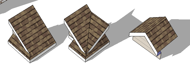
- make a small box in your model... say 5'x5'x5'... 2. now make it a group.
- now move it to each corner of your roof, and evelope the entire corner of the roof, the rafter tail, the soffit, the facia...
- next, use the cut command to cut the box out of the model.
- next open your "roof" group or component.
- now, use the Edit>Paste in Place command. this will put the box back in the model exactly where you cut it from.
- now, select all of the corner of the roof, the box the roofing the soffit all of it.
- next, right click and select intersect all selected.
- now select all the corner again, and right click, select create component.
- next, right click again on the new component, select saveas... navigate to your component library inside of the Sketchup folder. then navigate to the Roof area in Construction. and save this corner roof as "Gable_End_Pitch_8_12_w_Wrap" or whatever you want...
now you'll have this little corner in your roof component library, and if you do this on each corner, every time you make a roof, soon you'll have a little library of awesome roof corners, which can be then inserted and entire roofs extended from them.
that hint turned out a lot bigger than it was supposed too... lol but it is something that can same you loads of time later on...
anyway keep up the good work
-
Thank you all for your complements and helpful suggestions.
Justin, I agree totally that it could benefit from more lake view action.

Eric, thanks for the great artistic finish tips.

And Kris, thanks for the great workflow/library tip.

-
Kris, that was a very helpful tip for a young buck like me.
 And very much appreciated. I'm like a sponge... a really big, human-shaped sponge.
Thanks again! I learned a lot from everyone's responses.

-
perfecto... exactly what I meant... sometimes I wonder if people understand what I'm saying... I'm not Pro at training like Coen and some of the others here...
that's exactly what I intended. those look great.
I hope to build a free database of components here... we're working on it behind the scenes...
-
@nick w said:
...I'm like a sponge... a really big, human-shaped sponge.
I am just glad your name is not Bob.
Nice tip Kris.
-
rev1
Thanks for sharing your experience. It's pretty great to have specific suggestions to go back and work on. And techniques to add to my bag of tricks.


-
That is looking great! Way to go.
-
looks great... the background fit the drawing well.. although I might suggest... taking your grass texture and using the match color tool to make it not so green as it looks kind of out of season...
although with lawns nowadays it could easily be so green in fall...
great job making it look like a photo of a real perspective...
-
I faded down some of the saturation in the grass, trees, background, and bushes. And made some color balance adjustments to the grass. I think they were a bit overblown - in the context of the fall colors, but also in relation to the house they took your eye away from the house a bit, I think.
Thanks again for the tips, everyone. Very helpful.

-
ah this is looking awesome! crazy how you always think your first pass is great...and then you're able to take it so much further.
-
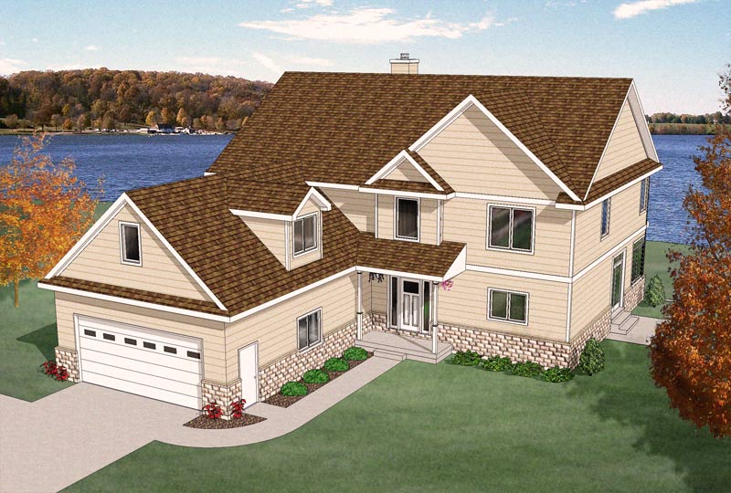
I dulled the background one more time and added a little noise overall - I think it ties it together nicely.
Thanks for the thorough review


-
Oh, and I added a warming filter overall, too.
-
Ah, all those picky eyes...
It's really getting nicer and nicer, Nick! Looking forward to further enhancements!

-
last changes for today... this time for sure!

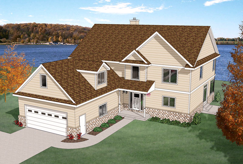
I removed the warming filter on the sky and dialed it back a little for the rest. James and others, thanks for the picky eyes.


-
I think this latest version really pops the house and looks less "cartoony". Thanks so much for your input, friends.

-
"the music of the pearly gates plays...."
looks very real... awesome job... I say DONE! send it to print...
-
-
Oops, somehow I missed the updates on this. Great work!
One thing I would tweak - put a soft blur on the tree line across the lake. Not a lot, but some. If you take a look at the fidelity of the detail on the rooftop and check it with the tree line, you'll see what I'm talking about. It looks like the background is more in focus than the house.
Looking good! When do I get to move in?
Hello! It looks like you're interested in this conversation, but you don't have an account yet.
Getting fed up of having to scroll through the same posts each visit? When you register for an account, you'll always come back to exactly where you were before, and choose to be notified of new replies (either via email, or push notification). You'll also be able to save bookmarks and upvote posts to show your appreciation to other community members.
With your input, this post could be even better 💗
Register LoginAdvertisement


