Shigeru Ban- Furniture House #1- VRay Rendering.
-
So here's some Vray renders of DigDoi's brilliant skp model of Shigeru Ban's Furniture House #1 (from pushpullbar).
Some retexturing and minor remodelling done in SU, materials adjusted and rendered with VRay. The forest background was used for rendering the environment for reflections in the glazing and then added as a background in Photoshop.
I love this house!
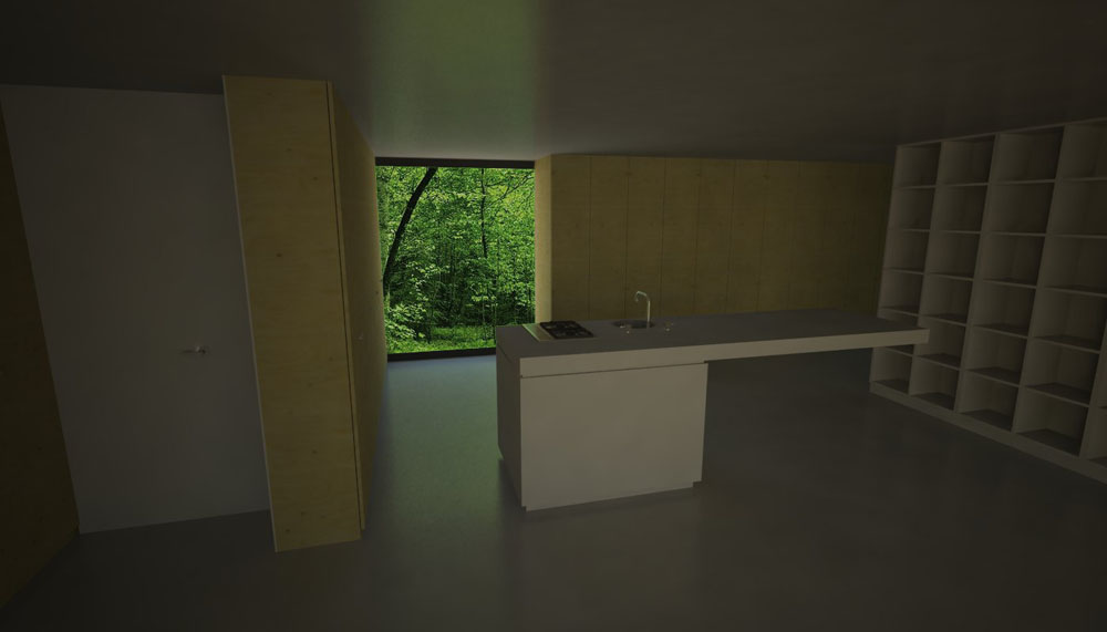
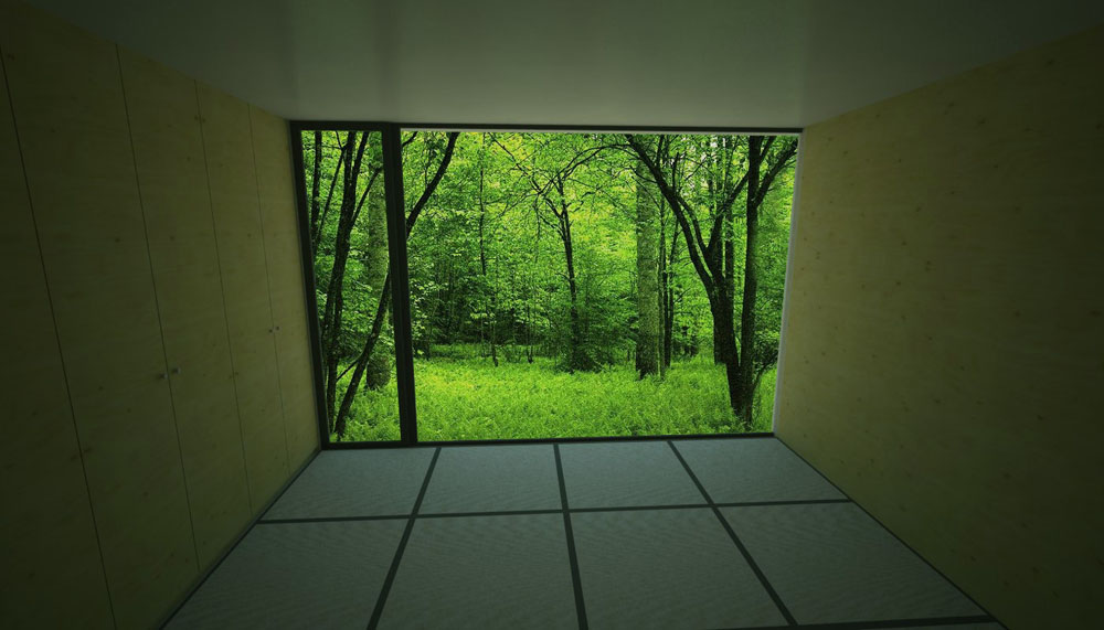
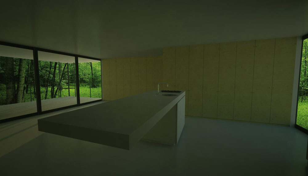
-
Looking good Jackson.
I love Bans design and you seem to have caught it well in those snapshots.
Maybe some leveling in Photoshop can 'spark' things up a little more.Nice work.
Cheers,
Kwistenbiebel -
Thanks guys,
James- you're right about it being dark, I've been striving for realism rather than a "good image", but I think I maybe went too far down this route at the expense of creating an attractive image. Likewise Kwist's suggestion, but rather than post-processing I thought I'd have another go at changing render settings. I re-rendered the first scene with Irradiance Map multiplier set at 5- I'm much happier with it, it's brighter, but hasn't lost the depth in the shadows. The plywood texture especially has come to life I think. Further comments and criticism welcome.
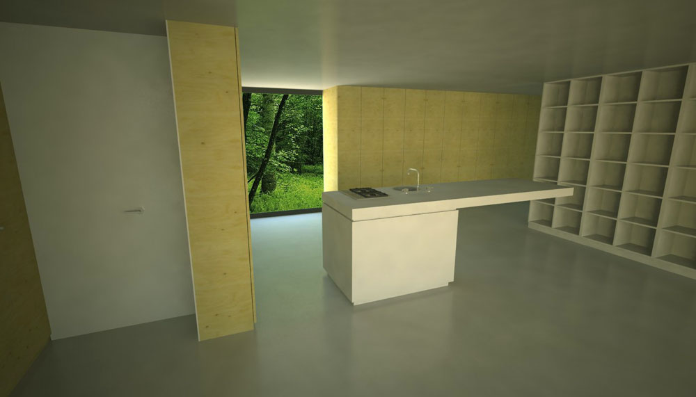
-
Oh yes jackson,
That definitely is an improvement.
Well done, the light is more balanced now. -
Cool, thanks for the feedback guys, it's much appreciated. I find if I look or mess around with an image long enough eventually I lose my objectivity, or to put it simpler, I forget what the heck I'm looking at and trying to achieve- your critiques are a huge help. I think I'll set up a batch render with the new settings overnight.
-
@unknownuser said:
Although ur final image is composed with a much better balance of lighting I feel ur originals are more realistic, which I like. :thup:
My guess is that in the last image the 'greeny' environment only casts pure white light on the interior, while the previous images had some nice color bleeding going on coming from that vegetation.
So yes, light levels have been improved, but color bleeding got worse.
My god, aren't we picky
sorry for that Jackson
 , actually the images all are really amazing. :ewink:
 -
@kwistenbiebel said:
My guess is that in the last image the 'greeny' environment only casts pure white light on the interior, while the previous images had some nice color bleeding going on coming from that vegetation.
So yes, light levels have been improved, but color bleeding got worse.
My god, aren't we pickysorry for that Jackson , actually the images all are really amazing.
No worries, I completely agree! After inserting the background I altered the colour balance in all the images in PS to make the interiors a little more green, but obviously in the brighter one that that has less effect. I thought about airbrushing the area and reflections around the window a bit more green.... but I'm lazy :egrin: Ideally I'd like to adjust VRay's settings so the interior is brighter, but with more lighting from the environment, but as you know, VRay's settings are complex in their simplicity. A little change can have a big effect.... and not always in ways you would expect. I did a batch render last night of 12 views of this model, but many of them have turned out blotchy, lightleaks and artefacts.

I may just try lowering the physical camera shutter speed or increasing the ISO with the original darker (Irrandiance Map set at 1) settings.
-
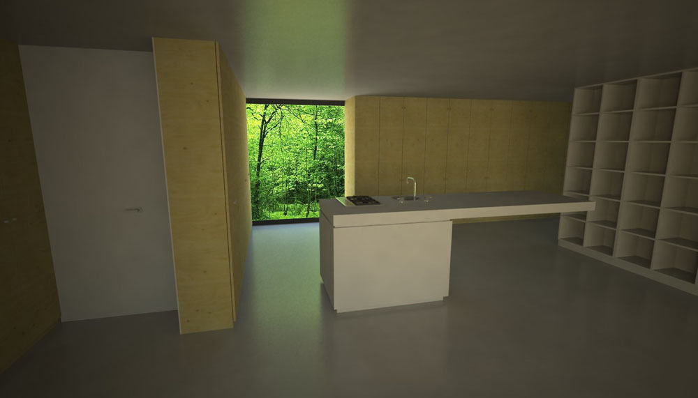
......and the same image (with original settings) but with ISO set at 500. I'm pretty happy with this one, artefacts and lightleaks are minimal, it's brighter (of course the shadows are also a bit bright now). Reflection on the ceiling and floor is pretty good, but (as background was photoshopped in later) the reflection on the hob is wrong.
-
Hi!i'm doing a work about this building and i need to know which is the material form the back of the closets.do anyone of you know what it is?
thanks
sorry for my english....[yero88]
Hello! It looks like you're interested in this conversation, but you don't have an account yet.
Getting fed up of having to scroll through the same posts each visit? When you register for an account, you'll always come back to exactly where you were before, and choose to be notified of new replies (either via email, or push notification). You'll also be able to save bookmarks and upvote posts to show your appreciation to other community members.
With your input, this post could be even better 💗
Register LoginAdvertisement


