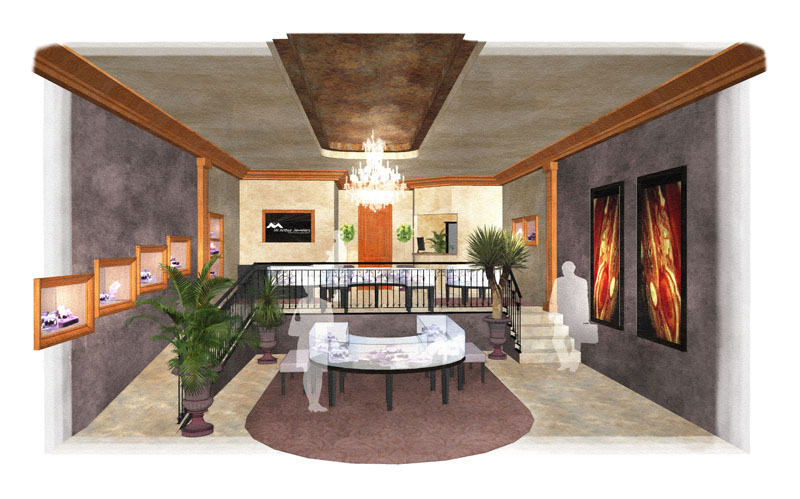
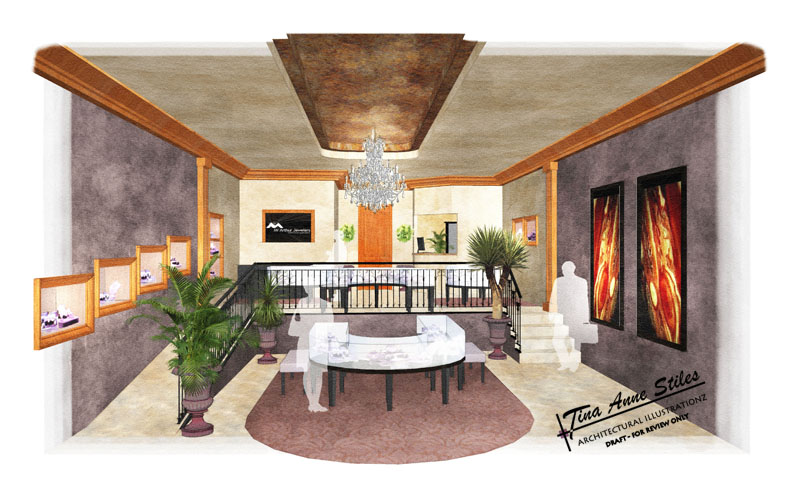
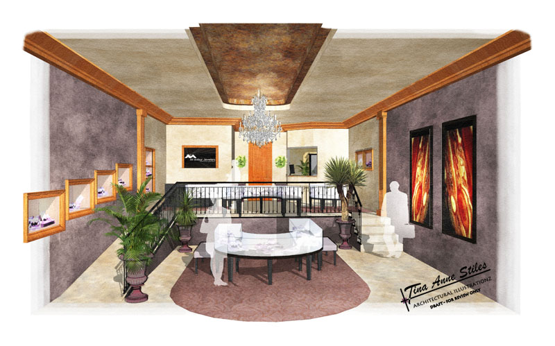
Jewelry store interior
-
That seem to help quite a bit!
-
Thank you both so much! That is great. The problem I see is that the image seems washed out to me. The colors the client chose are so rich and lighting it up that much has taken that away, but I think i see what you are getting at.
Juju, i didn't intend for the chandelier to be transparent, but for some reason no matter what i did that's how it looked.
 Also, I agree about the carpet. I'll have to watch for that on the next project.
PS. I made some adjustments to lighten it up, but hopefully keep some of the depth of the materials

-
Have you tried James' altered image and see if you saturate the colours a little more if you can obtain the richer colours you're looking for but not have it such a gloomy render. You don't want this looking like a cave of sorts...
What you posted above seems to head in the right direction.
-
Another try with the chandelier showing up better. Isn't amazing that I just couldn't think of how to make it work when I was loaded with the deadline, but know, the ideas are flowing. GGrr, I'll have to call the client back and give him a revised print.


-
modelhead, thank you. I'm ashamed that I missed that

What do you think?

-
I would be very happy with that Tina, looks great.
-
Thanks guys! What a great help that was. James, thanks for getting the ball rolling in the right direction. I so appreciate the generosity of time and talent in this forum.
I called the client and they were shocked that I wanted to give them a different print. They said they loved the first one and can't wait to see the revisions.
Thanks again!
-
I would like to add... that I enjoyed how it was laid out... simple, the way a gallery should be to focus on the jewelry... and yes I was thinking some pendant lights too...
-
Kris... thank you. We thought about adding more light fixtures but they would have been right in the foreground and we didn't want to detract from the chandelier. Thank you for your comments

-
Nice work,I ckecked out Your Web site
Some beautifull work over there and a great
original style. Keep it up.Mateo
-
Thank you all, very much

-
Bruce, et all...
Thank you very much for your critiques and comments! Everytime I come to this forum there is something for me to learn and grow as an artist.
Hugs to all!
-
Here are my thoughts for a slightly different result. It seems like the only light other than the chandelier is SU sunlight entering from the the removed wall or glass front of the store.
Before rendering anything I would figure out how the store is lit. There must be some wall washers or some minispots in the ceiling. And a good lighting designer would hit those paintings with some hidden projector spots with the light maked to stop right at the edge of the frame. All of this would create marketing drama by playing off pools of light against mysterious shadows.
Light can be a more important element than bricks and mortar.
Jewelry is all about sparkle and judicious lighting creates sparkle.
That is my two cents worth on how to improve and already good rendering.
-
tina,
while still in SU have you tried using the sun and making the ceiling not to cast shadows? in this way you get a very nice luminosity in interiors.
-
Roger, thank you for your thoughts. I know how important lighting is in an interior, but I am having the darndest time creating it. I was really hoping for this interior to "sparkle" as you said, but it never quite got there. I just had to stop working on it. The deadline had arrived and I still didn't know what I was doing.

Edson, thank you. I will try that next time too. I am just about finished with another interior (still have some of the same problems around lighting)
http://www.sketchucation.com/scf/viewtopic.php?f=24&t=2851&hilit=Thank you, I appreciate any advice I get.
-
Make a habit of reading architectural and interiors magazines and when you see a great photo tear it out and file it. Or even better tape it to a wall. Then when you are facing interior lighting problems take a look at the types of lighting fixtures and the effects. With enough references it should be easy for you to render from the examples.
-
Thanks Roger, that is a great idea!
PS Nice website

Hello! It looks like you're interested in this conversation, but you don't have an account yet.
Getting fed up of having to scroll through the same posts each visit? When you register for an account, you'll always come back to exactly where you were before, and choose to be notified of new replies (either via email, or push notification). You'll also be able to save bookmarks and upvote posts to show your appreciation to other community members.
With your input, this post could be even better 💗
Register LoginAdvertisement


