Art Gallery after hours
-
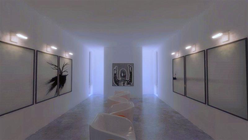
First decent output from Vray. Still needs some cleanup work but I am quite happy with the initial results. Comment welcome.
Scott

-
Wow! Could be a photo! Nice work...great light.
Cheers,
- CraigD
-
Thanks Craig.
Scott
-
why is that man throwing me the finger?! lol
anyways, I like the rendering, really well set up. The lights above the paintings seem a bit blurry, not entirely sure why, I might colour them a little cooler?
other than that great image!
-
"The guy" is not flipping anyone off, just a favorite image of mine. sums up my feelings some days.

Thanks for all your comments.
Scott
-
Scott,
I think the rendering is nice, but I think the lighting is a little too dim for a modern art gallery.
-
The image is very well done. Like Craig said, it could have been a photo.
For me however, the space just seems uncomfortable. Can't say exactly why but it does. -
Well, the render did it's job. It is meant to be a "after hours" art gallery.
Art galleries are typically "cold" spaces. Cold in the sense that the artwork is meant to stand out and the rest of building should never take away from it.
Thanks again. Great comments.
Scott
-
scott...
nice render!! i think reducing the resolution ate up some of the image quality... but i get the idea! neat!
neat!
is this done using vray for SU or Vray for 3DS Max?
thanx! -
Yes I am sure some of the clarity was lost downsizing the image.
This was done with Vray for SU.
I need to thank Ivica Valjak for his great artwork and chairs. All of which are available on FormFonts.
Scott
-
YEs like a photo.But for others,I like when images is not always perfect,I like when there is fog ro or some efects that will live you standing in fron tof image for long,kind of a dreamy.Nice work Scott
-
Nice one Scott good to see you making progress in V-Ray mine has come to a halt for now
 too busy. Anyway good to have you here!
 -
Thanks rob. I really feel like I am becoming more and more fluent with VRay. It is really nice having an outstanding renderer that works so well with Sketchup. The fact that it recognizes Su's smoothing (unlike many other programs) is an added bonus.
Thanks for everyones kind words.
Scott
-
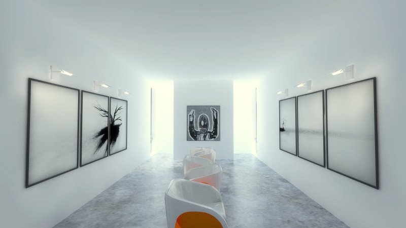
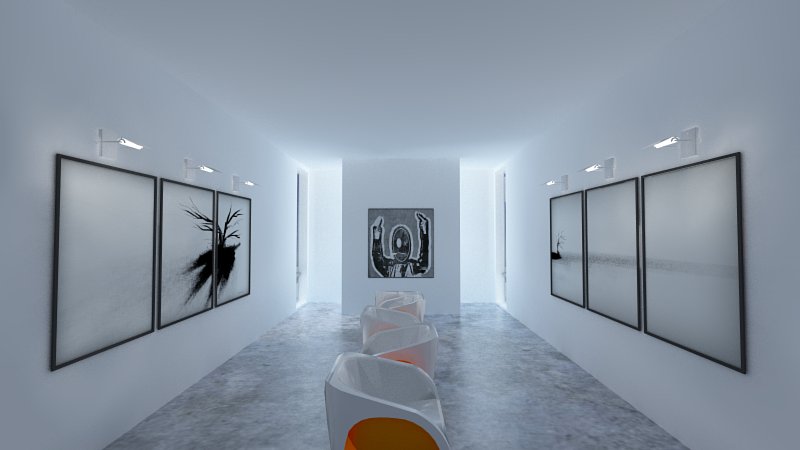
Just an update on the progress of this image. With some help from the Vray forum I think this image has come a long way. If you have not tried Vray for SU, it is well worth it. Not as much of a "black art" as some might think. Best advice...read the manual and go through the tutorials.
Best regards,
Scott


-
Those are great.
-
Thanks Eric.
-
Wow! Those are fantastic. I've got a lot of catching up to do to even get to that point.
Regarding the space, I love it. I don't think it feels uncomfortable in any of the lighting scenes. Unusual spaces, for me, trigger the feeling of something new and exciting, and I love that feeling. I think it would lend to an artistic atmosphere. An over-abundance of white is always a chilling, sterile experience, but it makes anything of color really pop. If I could access YouTube here from work I'd throw down a link to Blur's video for the song The Universal. Kind of Clockwork Orange meets White.
EDIT: Here it is: The Universal
[AcousticGarden]
-
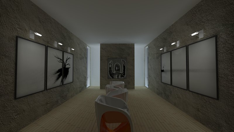
Just a quick update. I changed the floor and the walls now have a rough texture. Crits welcome.

-
Great work Scott.
-
Thanks Mateo.
Scott
Hello! It looks like you're interested in this conversation, but you don't have an account yet.
Getting fed up of having to scroll through the same posts each visit? When you register for an account, you'll always come back to exactly where you were before, and choose to be notified of new replies (either via email, or push notification). You'll also be able to save bookmarks and upvote posts to show your appreciation to other community members.
With your input, this post could be even better 💗
Register LoginAdvertisement


