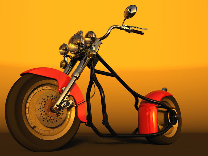
Scooter Wip
-
Hello All. I’m new to your forum and this looks like a good place to start. Nothing like a new person ta put a bad fix on things. I was recruited from http://www.3dallusions.com/forums/portal.php? By Jake He found my work interesting and thought I should come over here.
To see If I have this correct we are posting a link back to the file and not [Img] http:// link [img]
Delete fast if need be. I don’t like to screw up other peoples hard work .Let’s see if this works like it should http://members.cox.net/j.kell/Exhaust%20Pipe.jpg
Thank you for your Time
Joel / DB+++ EDIT +++
Split and moved from Making life easier for Coen (and his server!).- JujuP: Director Bob
-
@unknownuser said:
To see If I have this correct we are posting a link back to the file and not [Img] http:// link [img]
No, Joel, you should include the image tags so the forum software knows to render it (even though the url is on a different domain server), but don't forget the slash on the close tag, or it won't work.
Here's your image url using the image tags:

-Gully
Edit: Hey, nice model. You probably should crop some of that white margin from the left and right of the image.
-G
Posted by: Gully Foyle
-
Only it is a wrong way when the image is very big (pixel wise) and pushes the sides of the forum so that those with smaller monitors/resolutions need to side scroll.
-
@gaieus said:
Only it is a wrong way when the image is very big (pixel wise) and pushes the sides of the forum so that those with smaller monitors/resolutions need to side scroll.
Okay, Gaieus, I've made a copy, cropped it, uploaded it to imageshack.com, and changed the url in my previous post.
-Gully
-
Ok, thanks for the feedback That’s the information I was looking for. I would not like to improperly start doing actions that my harm the new community having a bandwidth issue.
495 x 524 look’s good thank you, I’ll keep them like that. I drop the slash to keep the server from trying to work with the tag with improper coding “the little red x” . The white margin I’ll have to work with that. The background colors on post alternates here. I’ll see if matching the background in SU works.
I’m just getting my feet wet here.
C&C always welcome.Posted by: Director Bob
-
Bob,
495 x 524 was strictly arbitrary. As long as you keep your images below 800 pixels wide you should be ok (your original image was exactly 800 wide, so Gaieus probably shouldn't have scolded us, but the side margins were just dead space anyway). There's no real bandwidth issue for the forum server itself since the image is hosted on a remote server, which is a fine way to do it, but some users who have slower internet connections would probably appreciate smaller images. You must include the slash on the end tag or the forum software won't recognize it and will think you're including attributes it never heard of inside the image tag and will probably not render it at all.
Don't you have an image editing program you can use to crop your images? There are many excellent ones out there, some of them free. Irfanview is an outstanding free image viewer, and it does basic things like cropping and resizing very well.
-Gully
-
Cool, I have some software that I can do image editing in
Paint.Net, PhotoImpress 3, Deep paint and a #2 pencilPosted by: Director Bob
-
Gully,
I haven't "scolded" you at all - just mentioned that wide images can push the right side off screen. Now at home, with my 17" monitos and 1024x762 resolution, that image was just fine. With a 15" monitor though (and most probably with a 800x600 pixel resolution) a 800 pixel wide image would push the right side anyway since you need to count the left column here (with the personal info, avatar etc) also.
Still it was just an advice or suggestion anyways.
Also, if you really try to care (but we cannot really "demand" that) you can even make a thumbnail of your image clicking onto which the real, full sized image comes into screen. But that's really too much so for instance I myself only do that when posting things with multiple attachments partly to let people see more detailes when needed and also saving download time for those with slower internet connection (as you mentioned above).Thanks for caring though and also for your helping advices.
Bob, that latter render is just perfect!
-
Glad you like the rendered version Gaieus. The Motor is just part of a larger project. 8O
Posted by: Director Bob
-
Especially my brother would like that stuff. He's got this motorbiker community (and his bike of course...)
Well, the modell - and the other parts - are nice, too, for sure! -
Outstanding SketchUp work Director Bob (Joel)! Evertime I see your work on this bike I'm amazed. The pipes are very impressive. I couldn't model something like that to save my life. Renders look great too.
Welcome to the forum! Let's see some more.
-
Wow Bob! That's fantastic work!
Did you make that all in SketchUp?
Cheers,
- CraigD -
@craigd said:
Wow Bob! That's fantastic work!
Did you make that all in SketchUp?
Cheers,
- CraigDI don't see Director Bob around so I will attempt to answer that. That's all SketchUp. Really, really nice SketchUp.
You need to go to this link and see the actual progress shots. Really nice work. Nice renderings too.

3DA Home
Specializing in the field of architectural visualization, automotive design and product illustration. An online portal and community for professional illustrators.
(www.3dallusions.com)
I'm going to post another sample. I hope Joel doesn't mind.

-
wow! hot damn those are some nice renders!
Posted by: CADken
-
Thanks Jeff. I’m back to work vacation is all over. No excess to a computer at work. But I have a nice set of torch tip’s and a T-Pull tool. I can say with confidence that all the work is a product of modeling in SU. Color rendering done in Bryce 6.1
@ Jeff I’ll have to put something together to explain how I did the pipes. Mostly used centerpoint.rb and TubeAlongPath.rb and bezier.rb and a lot of trial and error. I have to give a big thanks to the people who take the time to wright .rb script for us to use. I looked to see if I could find the authors name of the scripts and I can’t remember where I got them from.

Posted by: Director Bob
-
Wow... great, great, great stuff. Thanks for sharing.
-
DB,
Thanks for bringing it all here.
Terrific work. -
Thank’s all. I’m glad you like. Just hope the end holds up. I’m glad to be here I see a lot of vary original ideas being posted here.
See Have a Safe WeekPosted by: Director Bob
-
I’m back, took me some time to get the fuel tank to look good. I play with this for over two weeks I think it comes out to almost 70 hours of trying before I got what I think is good. The Tank emblem Crusader was just going to be Cruiser with a four pointed star. I was pulling the tips of a Gear from Involute Gears .rb and it looked like a sword and the word Crusader popped into my head.
I’m thinking that the emblem maybe to thick But I have looked at it for so long I can’t make up my mind. I can Scale in or a Coat of Arms in the background of the main emblem to even it out. Input from a fresh pear of eyes and a clear mind is always help full.

I changed the name of the thread to reflect the direction this is going.
"Scooter Wip"
Posted by: Director Bob
-
how can you call this a Scooter? it's and Iron Stallion... it's gorgeous.
Hello! It looks like you're interested in this conversation, but you don't have an account yet.
Getting fed up of having to scroll through the same posts each visit? When you register for an account, you'll always come back to exactly where you were before, and choose to be notified of new replies (either via email, or push notification). You'll also be able to save bookmarks and upvote posts to show your appreciation to other community members.
With your input, this post could be even better 💗
Register LoginAdvertisement


