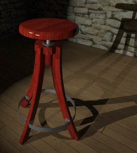
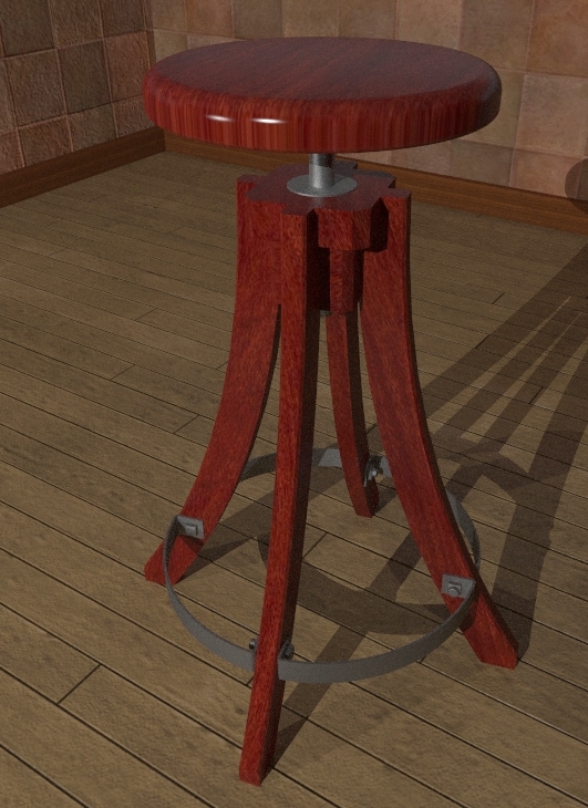
Red Stool in KT
-
Sort of dark and moody but I kind of like the stage-like lighting. 46 passes of MLT.

-
Dave while I like the stool (moody or not) and the fine tones on it, the back wall is outstandingly flat (and it is even emphasised by the straight shadow lines of the stool) and could be a bit higher res, too (if you don't mind me saying this).
It wouldn't matter however - it's just a bit distracting. Why don't you just put the same material as a bumpmap over there? Even if not an ultimate solution, would help big time.
As said, the stool is really nice!

-
Thank you gai. I know that stone is too flat. I had tried adding som bump to the wall but it looked pretty awful. I suppose I should try something other than the stone but I was looking for a nice contrast to the wood and steel.
I'll give it another shot, though, with some bump.
thanks again.
Dave
-
Maybe you can give it a light colour (almost white) as diffuse but keep the stone as a bumpmap. It would look like a whitewashed, rough stone wall without smototh plastering. That would look nice as a contrast, too.
-
Thanks for the suggestion Gai. I did change the color and started it cooking. I like the stone being more white but the shadow still looks like it is falling on a flat surface. I set the bump to 6.00. Problem is, I have no idea what sort of range there is or what sort of scale there is to the bump map level. I'm going to stop the render and increase the bump more to see what happens.
-
Bump is illusion and shadow will always look flat-ish. I supose if you have softer shadows you can enhance the illusion. Only displacement could create 3d shadow...but Kerky does not support it as far as I am aware.
-
@unknownuser said:
Only displacement could create 3d shadow...but Kerky does not support it as far as I am aware.
That's true - I wasn't sure about the shadows being also "bumped" or not...
 - thanks for clearing this up.
 -
The work around is to pull the face a bit and create extra geometry.
The bump illusion also depends on viewing angle. Some angles enhance this more. -
Ah yeah, modeling something is always better than tweaking with bumpmaps...

-
True, but also render time encreases with more geometry, so one has to be careful and do it in strategic places

-
Sure, plus you are just simply unable to model every little details...
-
In this case I would put skirting board on the junction with wall. It would look better IMO.
-
"In this case I would put skirting board on the junction with wall."
So you'll be over to scribe the skirting board to fit the stone?

Here's a new version with the white stone with bump cranked up. I also got a bit more strategic about cropping.


-
It does look better now for sure (and the "cropping wand" is the most friendly tool as well
 )
) -
We are talking renders, right? So no scribing

-
OK, I'm talking about the wall in fact. I does look better than in the first piscure.
-
@sepo said:
We are talking renders, right? So no scribing

Well, I was hoping you'd come over and scribe the wood to fit the stone wall for real.

-
I am no good at DIY...and you are over the pond I believe

btw. cool avatar Gai

-

Wall changed. Skirting board added. Cropped to hide most of the shadow on the stone. I alsso a ceiling to the set to keep some light in. -
Nice Dave, really. Now the wall looks really different!
How about some soft shadows (like sepo suggested) and you won't need that crop any more?

Hello! It looks like you're interested in this conversation, but you don't have an account yet.
Getting fed up of having to scroll through the same posts each visit? When you register for an account, you'll always come back to exactly where you were before, and choose to be notified of new replies (either via email, or push notification). You'll also be able to save bookmarks and upvote posts to show your appreciation to other community members.
With your input, this post could be even better 💗
Register LoginAdvertisement


