Before and afters
-
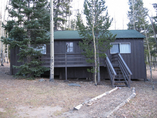
before and afters courtesy sketchup + photoshop- trying to cheaply dress up some buildings using porches.
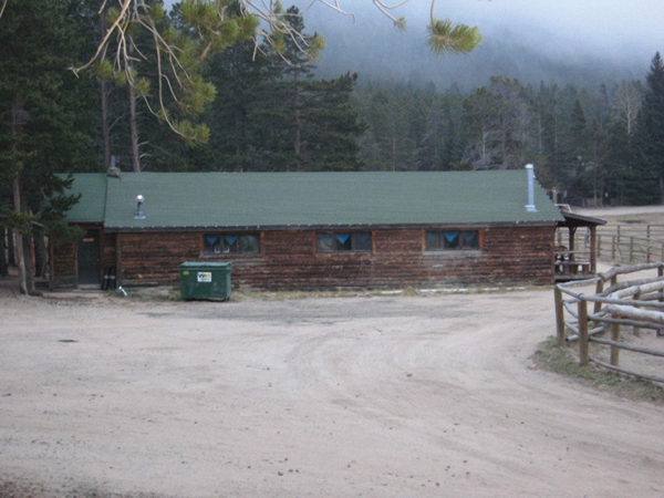
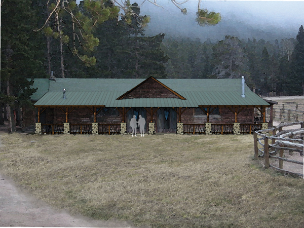
-
continued
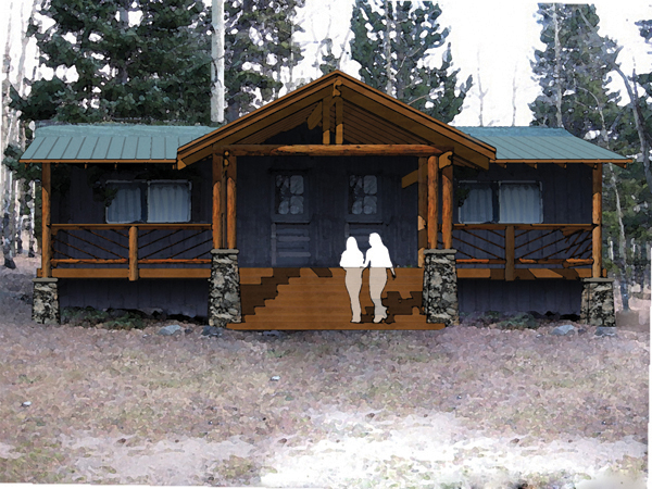
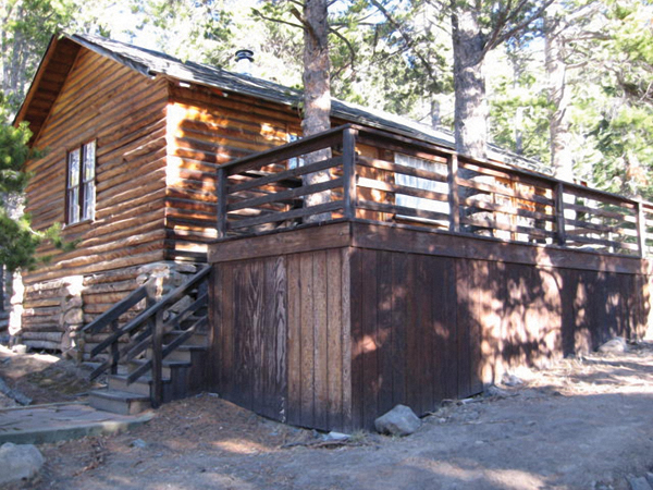
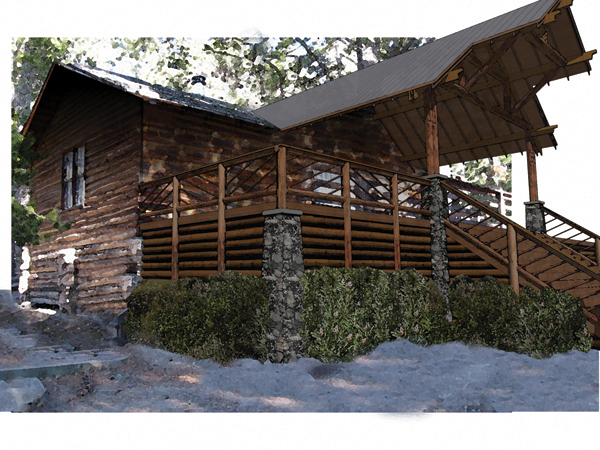
-
The beauty and simplicity of SketchUp right here

Very nice. -
Wow, that rocks! I especially like the very last one (maybe because I like the building itself the best).
This could be turned into a really cool Flash animation as the porch is appearing slowly!

-
The beauty of SU. It's like I can see it instead of just look at some plans
 .
. -
very cool..its always tough to use native sketchup output and photos..but this blends really really nicely!
-
One of the hardest things when doing these is always blending in the SU image with the photo. You have managed to do this very well.
I think the people in the second image would look better without being transparent from the waist down, or probably losing them altogether.
-
nicely done It's amazing what a simple program an a clear idea can create. I agree on the trans-peeps having the steps alter thier color halfway down is distracting. Try moving them all the way to the top of the steps.
Hello! It looks like you're interested in this conversation, but you don't have an account yet.
Getting fed up of having to scroll through the same posts each visit? When you register for an account, you'll always come back to exactly where you were before, and choose to be notified of new replies (either via email, or push notification). You'll also be able to save bookmarks and upvote posts to show your appreciation to other community members.
With your input, this post could be even better 💗
Register LoginAdvertisement


