Hotel Sketch
-
Hotel sketch
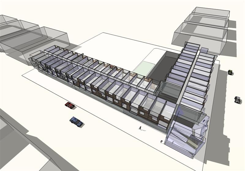
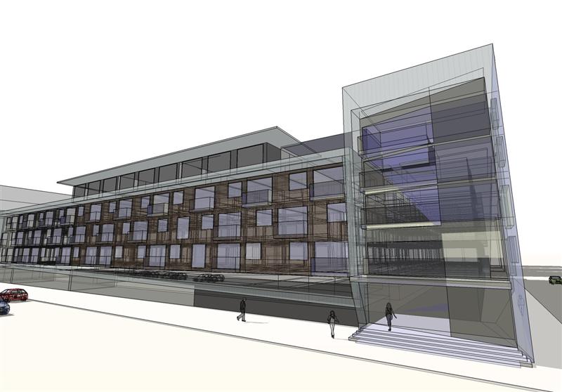
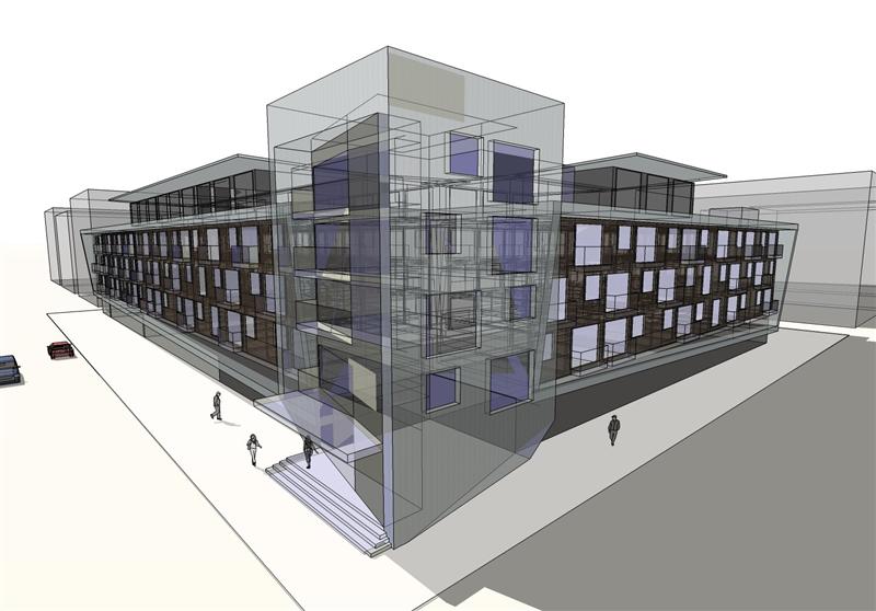
-
Nice work but I think xray mode is making this harder to look at and get a good feel for what is there.
Scott
-
the convergence of perspective lines bothers me a little. you could easily get rid of it.
-
Edson, you make an interesting point about perspective and perceptions. Although it is a very basic question I have been doing soem thinking about what is an acceptable cone of vision. SketchUp defaults to 35 degrees. The guy that wrote SketchUp for dummies recommneds 45 degrees. In some experiments I have done the true amount seems far less, but in reality our eyes move constantly and stitch the accumulated experience together in our memories which make it seem wider. I put my face two feet from the screen and concentrated on not moving my eyes. Without eye movement I could only read five words with relative clarity. (By the way lock the door if you try the experiment. My wife walked in and I am still trying to convince her that I am not crazy or blind). I did a render of a very small condo and the developer kept on insisting on seeing more. I backed up to the wall. Not enough. I removed the wall and backed up until the end of the room began to show. Not enough. I suggested the devoper start selling larger condos. "That wasn't funny." I zoomed through 35 deegrees, 45 degrees, 55 degrees, and on out to 70 degrees. The developer loved it. Artist friends took me to task for improper perspective. I insisted the perspective was correct but it was something that flys could see better than humans. Where do you call it quits in tight spaces and do you ever accept "distorted" perspective as a dramatic tool?
-
At university we were told 65 degrees is the maximum before things starts to look really silly but it depends on the size of the subject.
-
roger and jon,
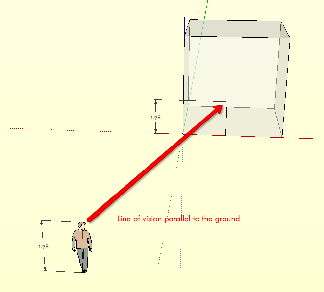
what i meant is a different thing. no matter how narrow or wide the field of view is, you can still get rid of the convergence of the lines.
one way is to make the line of view parallel to the ground, as shown in the skippy attached.
the other consists on selecting Camera-->Two-Point Perspective after you set your view up, as in the render below. doesn't it look much better?
in both cases you get rid of this unconfortable effect. the only case when this becomes impossible is when you are too close up and looking upwards.
regards.
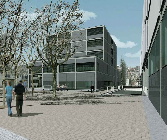
-
Oh I see Edsun, yes I see your point.
-
I think it is 60 degrees (not 65) that is the outside limit before you get distortion; which also happens to coincide with a person's cone of vision where the rest is all peripheral and hazy.
-
The topic of perspective angles and FOV is really interesting and I'd like to discuss it further. So not to hijack Stuart's thread, follow me here....
-
I am taking Tina's suggestion as I don't want to hijack the conversation, but I am totally with you Edson, I have more view and technical cameras than I have digital cameras so rise, falls, swings, shifts,tilts, Scheimpflug rule and Hinge Rule are all familiar territory for me. However I could never spell Scheimpflug so I just looked it up and found something new and ironic. The Scheimpflug rule was discovered by Jules Carpentier, and the Hinge rule was discovered by Schiempflug and I am not sure if Hinge was a person or a thing.
Regarding the hotel. I am somewhat of an iconoclast and don't feel bound by one set of rules in regard to "distortion." I prefer to choose between what the mind sees and the brain remembers on a case-by-case basis. For a conservative banker I would choose corrected perspective and for a head-banging aficionado of graphic novel I would go with extreme perspective. For a head-banging far-out banker??????
OK I am off to follow Tina to the new spot for now.
Bom dia.
-
Nice to see the discussion on perspective. Edson, the little example image you posted is definately working better with the verticals parallel, but for many views, I find that forcing parallel verticals generates a 'top-heavy' image. Your eye 'expects' perspective. In our office we have constant battles with professional architectural photographers who (without asking) supply images to us with parellax correction as 'that is the traditional way'. My view has relaxed somewhat over the years and I have Sketchups FOV on a shortcut key and change it constantly for artistic 'punch'. I do think its important though for people to understand that in 'reality' our brain expects convergance (in ALL directions . .not just to the horizon) but that variable FOV, 2-point, axonometric, planometric and isometric projections all have their uses when appropriate.
Just by rotating an image a view degrees and tweaking the FOV can make or break an image . . .as every photographer knows. At least in Sketchup we dont have depth of field to contend with as well! Maybe soon though . . .
-
yes, stuart, i agree. there is no universal recipe. sometimes, after "correcting" a view, i find myself moving it a little bit so that it gets out of what seems to be a straight jacket.
my suggestion works fine for many situations but certainly not for all.
regards.
Hello! It looks like you're interested in this conversation, but you don't have an account yet.
Getting fed up of having to scroll through the same posts each visit? When you register for an account, you'll always come back to exactly where you were before, and choose to be notified of new replies (either via email, or push notification). You'll also be able to save bookmarks and upvote posts to show your appreciation to other community members.
With your input, this post could be even better 💗
Register LoginAdvertisement


