Furniture and exploded view
-
I am working on learning and using layout for furniture and I like using exploded views, so I am looking for opinions and comments on how best to use this view.
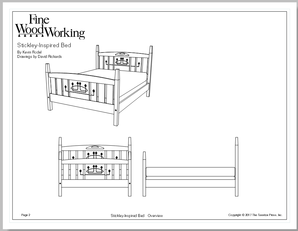
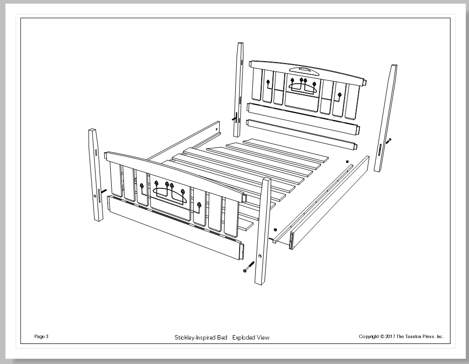
My current thinking is the layout cover page is the beauty shot, next page will be elevations with only a few overall dimensions and an exploded view showing the sub assemblies.
Next page (s) will be a sub assembly further exploded and each piece of the sub assembly then shown with all elevations with detailed dimensions and enlarged details.
As you can see I am not proposing to use traditional sections. Is this a good idea?
Also would it be too cluttered to put dimensions in the exploded view?
How do you guys organize your drawings for furniture and what are your thoughts.
Thanks
Jeff -
A lot of ground to cover here, jtri. I won't pretend to be an expert at LayOut (that's Dave Richards's department), but I can offer some suggestions.
First, I assume you want the final LayOut document to be clear and readable when you're in the shop or with a client. For that reason, I wouldn't add dimensions to an exploded view. They can be hard to decipher when they're angled along three axes. Instead, I'd create some parallel projection views in SketchUp for the dimensions.
Second, I'd create different scenes in SketchUp--one scene for each view you want to present in LayOut. If you aren't familiar with SketchUp's Scenes function, you can find plenty of tutorials in the SketchUp help center and other online sites. So, for example, a front elevation becomes one scene; a side elevation, another. Parallel projection views go into a third scene (maybe more than one, depending on the complexity of the project). Exploded views go into additional scenes. Here, too, keep the goal of clarity in mind. If an exploded view of the overall project won't show what you want it to, create additional scenes for exploded views of sub-assemblies.
When you import the scenes into LayOut, you can then add all the dimensions you need as well as labels and captions to identify pieces, construction details, and so on. Dimensioning in LayOut is way better than in SketchUp. You have much more control over the look of the dimension numbers and leaders. LayOut, like SketchUp, allows you to assign various elements to different layers; it's generally a good practice to create a layer for dimensions and assign them to that layer.
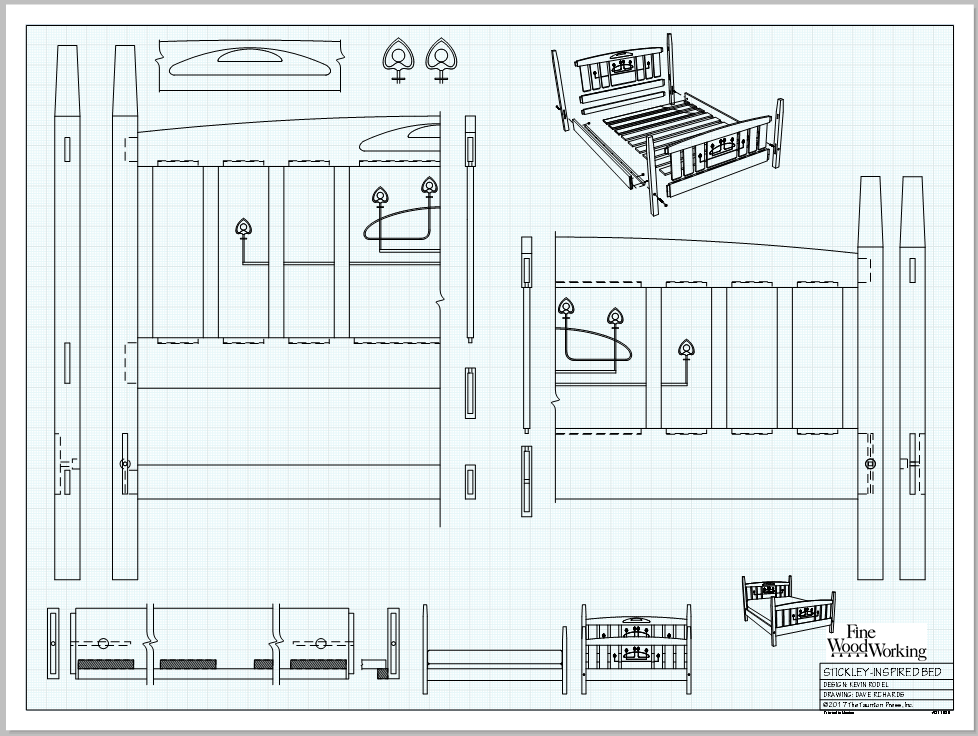
I've attached a PDF of a LayOut document that I created a couple of years ago. It should give you an idea of the approach I'd take. I imported various SketchUp views to create each page, and added dimensions and labels to the parallel-projection views of the parts.
Hope this helps.
Best
dh -
You have a little plugin Exploded View by CPlassais and me!

-
Thanks guys. I have no issues with creating scenes ( David thanks for your insights) or exploded views (I like to create them manually pilou). Also I am doing OK with learning layout. What I am trying to do is set up a set of rules for myself on how my final product, the shop drawings will look.
Where best to present the information? Do people like it when all the details are on the detail pages? With this method you start with detail one and just go till your done. You might fill up many pages of details.
The other approach is to have as many details with the elevations on the same page so there is a lot less flipping drawings.
I am looking to start a discussion as to why people organize drawing sets the way they do rather than the how to aspect of sketchup.
I read architectural drawings all day at work. No 2 are the same most are not even alike. I certainly have my preferences and would like to hear from others
Jeff -
My advice: Let the piece you want to build determine how many details you put into a LayOut document. If it's a simple Arts & Crafts-style coffee table, for instance, you might need only a side and end elevation, perhaps some close-up details of the mortises and tenons, dimensioned drawings for the individual parts, plus exploded and assembled views.
By contrast, something like a reproduction of an 18th century secretary will require many more views: details of the crown molding and bonnet; measured drawings for any turned finials, details of the drawers--the fronts and dovetail joinery, carvings on the legs, and so on and so on. Tim Killen, one of the "design.click.build" bloggers on FineWoodworking.com, may do 20 scenes or more to fully document a piece he wants to build.
Again, as I said, the overall goal is clarity. However many scenes it takes to achieve clarity is the number of scenes you need.
Hope this helps.
dh -
I do different things depending upon the project but for the most part follow the same basic layout. For plans on larger paper (36x48 in the first example) I do something like this. I've turned of layers for text and dimensions for these images.

And for plans intended to print on smaller paper they look something like this. This doesn't show all the pages for this plan.


-
David I agree lots of scenes are need, thanks for pointing out Tim's approach. Dave 36 x 48 paper is my choice as well and thanks for the examples, they very clearly present what is required and are easy to read.
I found that sketch up and layout make it very easy to present a great deal of information. I needed to pause my drawing and revamp my presentation flow before I get too deep into a set of drawings.
Thanks
Jeff -
Good luck with the plans, Jeff.
A couple of bits of advice for you:
- Make sure that you don't create modified scenes when adjusting viewports. That is, you never want to see a scene listed in the SketchUp Model window in LO showing modified.
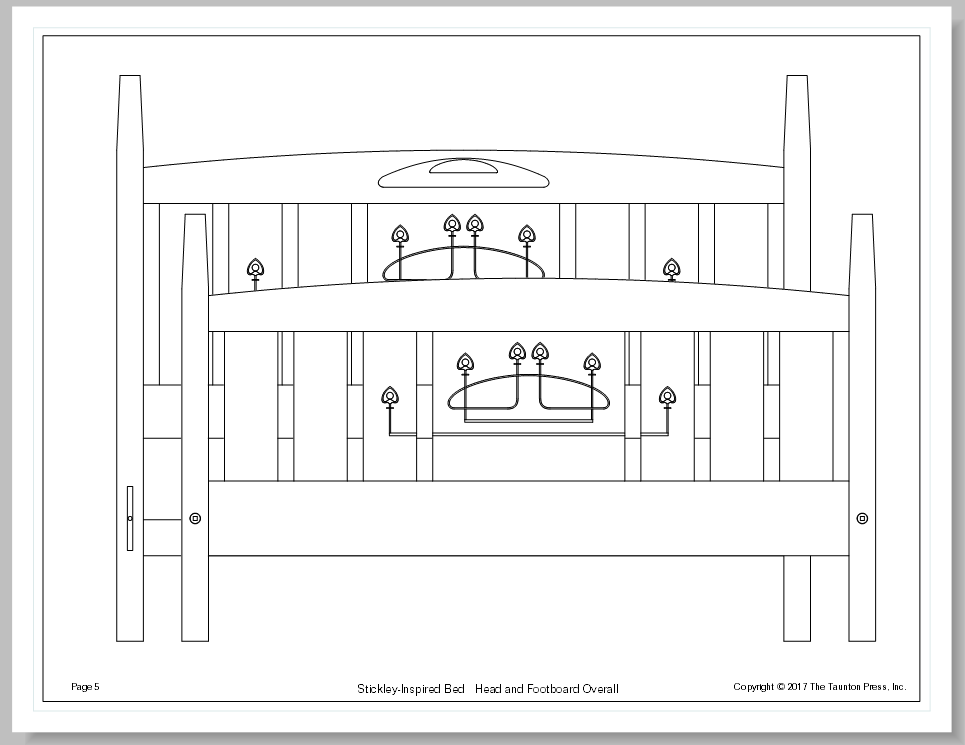
- Remember that you can crop the view in the viewport to limit what is shown. For example, the halves of the head and footboard for the bed in the first image are cropped in LO. The scenes in SU show the entire assembly.
- You can use the same scene for multiple viewports. This will allow you to reduce the number of scenes you create. For example if you want to show a closeup detail of the mortises on the top of a table leg, you can use the same scene that shows the entire leg. Just change the scale for the detail view. No need to make a scene for each of them.
Hello! It looks like you're interested in this conversation, but you don't have an account yet.
Getting fed up of having to scroll through the same posts each visit? When you register for an account, you'll always come back to exactly where you were before, and choose to be notified of new replies (either via email, or push notification). You'll also be able to save bookmarks and upvote posts to show your appreciation to other community members.
With your input, this post could be even better 💗
Register LoginAdvertisement


