LAYOUT Line dashes and arrows
-
More options or ways to create arrows for text and dimensions would be nice. The current ones don't go with any style I use. The ability to create heavy arrow strokes, independent of line weight would be great.
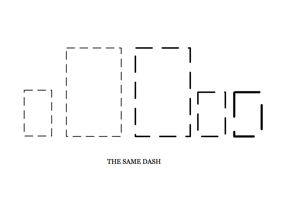
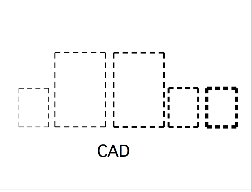
The dashes are mostly unusable. Why are the dashes linked to line weight? I can't get anything resembling the dashes I typically use in CAD, dashes that provide a reasonable image. The very many patterns provided are not nice even if they did work with heavier line weights.
I realize the true rendering of dashes is a convoluted task, but it's something that LayOut needs. Dashes should be solid at intersections (points on a polygon), they need to be cosistent though fit to the line length.
-
+1
-
Adding to that that dashes and other line styles should also display as they are printed. They change scale when zooming.
-
+1!!!!
-
@jql said:
Adding to that that dashes and other line styles should also display as they are printed. They change scale when zooming.

Also, I hate that my carefully chosen Typeface appears bolder when printed to PDF. -
@baz said:
Also, I hate that my carefully chosen Typeface appears bolder when printed to PDF.
I've never noticed that, but I only use 2 "carefully chosen Typefaces" in Layout.
Let's not talk about text here though! There's so much to say about that too!

-
I think we may be seeing some effects that will be different on different platforms or computers. I don't see quite the same things others are mentioning but the way the line dashes cannot be adjusted, depending on the line thickness, seems universal. Draw a rectangle and try to give it some thickness and a dash, and it doesn't look like anything but some random short lines.


-
-
When this happens you clearly know something is wrong and needs fixing. This is bad.
-
However when this happens, people don't notice the tiny deviation and look at the error like it's correct. Much worse imho.
-
Hello! It looks like you're interested in this conversation, but you don't have an account yet.
Getting fed up of having to scroll through the same posts each visit? When you register for an account, you'll always come back to exactly where you were before, and choose to be notified of new replies (either via email, or push notification). You'll also be able to save bookmarks and upvote posts to show your appreciation to other community members.
With your input, this post could be even better 💗
Register LoginAdvertisement


