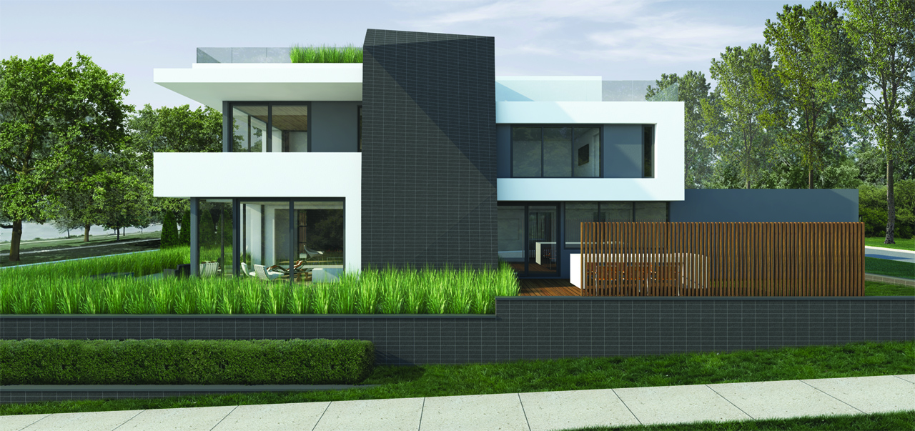
Any suggestions to improve this render.
-
Any suggestions to improve this render.
Created with V-ray and PS


-
First of all, desaturate the very green vegetation which catches too much the eye, much more than the building itself. Then add some street accessories, like light poles, grunge paving textures. You also can add some interior apparent lights to give a visual impact.
-
It's a beautiful render... The focal point cannot be denied.
I'm not much for the grunge and grime on new construction renders as omiKron suggested. I can see the point of doing it, but to me if you were going to do that, you should also age the building and no one wants to see that in new construction renders. It a great thing to be able to do, but I don't see the reason in putting so much effort into such things on new construction.
-
I might agree the grass is too green, but I'm not landscape architect and I don't know the species or the natural color. I would check... It definitely pops, but I kinda like the modern feel of the grass.
-
I do, because I'm looking for it, notice some identically placed plants, though they are spaced away from each other...
-
The trees on either side look to be very similar in size and structure, while it's not obvious they are the same, it seems the might be. Rarely do trees stand the same height without human assistance.
great job...
-
-
I like the building, glass looks fine, first plan grass really good...
I would tweak:- Trees to the right - you can see the repetitiveness, I would add shadow from the trunk
- Tall grass - too strong for me, and you can see the repetitiveness
- Wooden Screen - variation of wood texture for each slat would be appreciated
-
I think I would change the composition. The straight on center shot is kinda dull. Look at it slightly from the left, at an angle (not from the right, the wood fence would block too much). And if you could, add some life to it. And a smidgen more sky above.
It's still a nice rendering, as it is. -
i think the problem with the tall grass is that its too repetitive, like copied blocks of grass...
just like the tiles on the sidewalk, they are all the same texture, and it shows
also some sky and ground elements, like the guys said: light fixtures, urban elements, some birds in the sky, etc
about the colors, i would tweak it to a little bit warmer colors
it is actually pretty nice as is, but you asked for sugestions to improve, theres my 2 cents
Hello! It looks like you're interested in this conversation, but you don't have an account yet.
Getting fed up of having to scroll through the same posts each visit? When you register for an account, you'll always come back to exactly where you were before, and choose to be notified of new replies (either via email, or push notification). You'll also be able to save bookmarks and upvote posts to show your appreciation to other community members.
With your input, this post could be even better 💗
Register LoginAdvertisement


