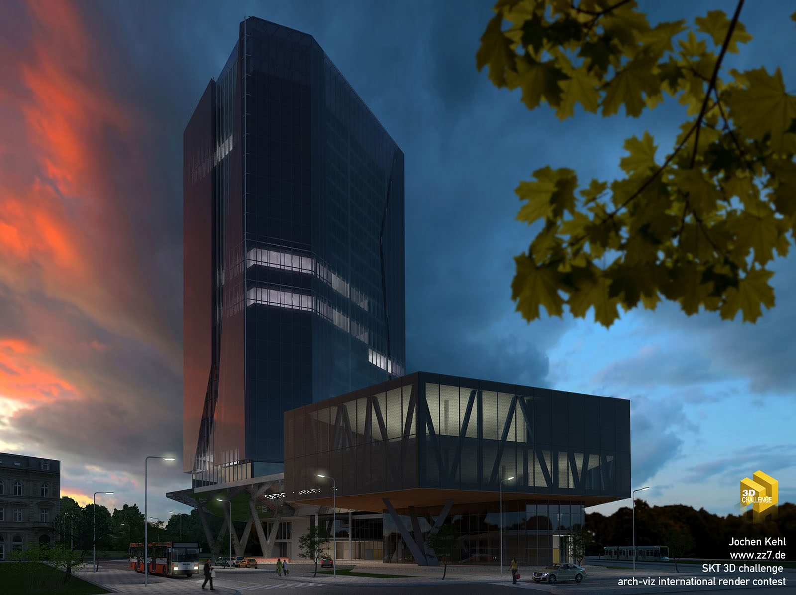
3d Render challenge
-
Hello,
please vote for my entry at the render challenge:

Sketchuptexture 3D Challenge - MODERN OFFICE BUILDING - Artworks - Jochen Kehl
ARCH-VIZ MODERN OFFICE BUILDING RENDER CONTEST - by SKT-3D CHALLENGE - Artworks - Jochen Kehl
Sketchuptexture 3D Challenge - MODERN OFFICE BUILDING (www.sketchuptextureclub.com)
here's an additional video:
[youtube]8FHtE8ojtDk[/youtube]

-
SU 2012?

Nice video.

-
2015 of course.

-
Done
-
Thank you
-
Hi Jochen,
Very cool render and video.
I have two comments if you don't mind:
-
It's good to frame the image with trees, branches, leaves, etc. However, the foliage border should not take away the main focus which is the building. It would be better, composition wise, if the branches on the right were smaller. They almost take up 1/4 of the image and attract my eyes to them first rather than the building.
-
Maybe make the interior lights brighter to attract the viewers' attention and make it clear that the main focus of the image if the building.
Best of luck!
_KN
-
-
Thanks Ken,
you are absolutely right with your comments. I thought that by my self, while uploading the image. Unfortunately I've only had one day to do all the work and renderings and after uploading no more freetime was left, to fix these problems. But it was fun to take part anyway.
-
Last day today.
Please vote for me.

Sketchuptexture 3D Challenge - MODERN OFFICE BUILDING - Artworks - Jochen Kehl
ARCH-VIZ MODERN OFFICE BUILDING RENDER CONTEST - by SKT-3D CHALLENGE - Artworks - Jochen Kehl
Sketchuptexture 3D Challenge - MODERN OFFICE BUILDING (www.sketchuptextureclub.com)
Hello! It looks like you're interested in this conversation, but you don't have an account yet.
Getting fed up of having to scroll through the same posts each visit? When you register for an account, you'll always come back to exactly where you were before, and choose to be notified of new replies (either via email, or push notification). You'll also be able to save bookmarks and upvote posts to show your appreciation to other community members.
With your input, this post could be even better 💗
Register LoginAdvertisement


