Product Branding and Render (LAUNCHED)
-
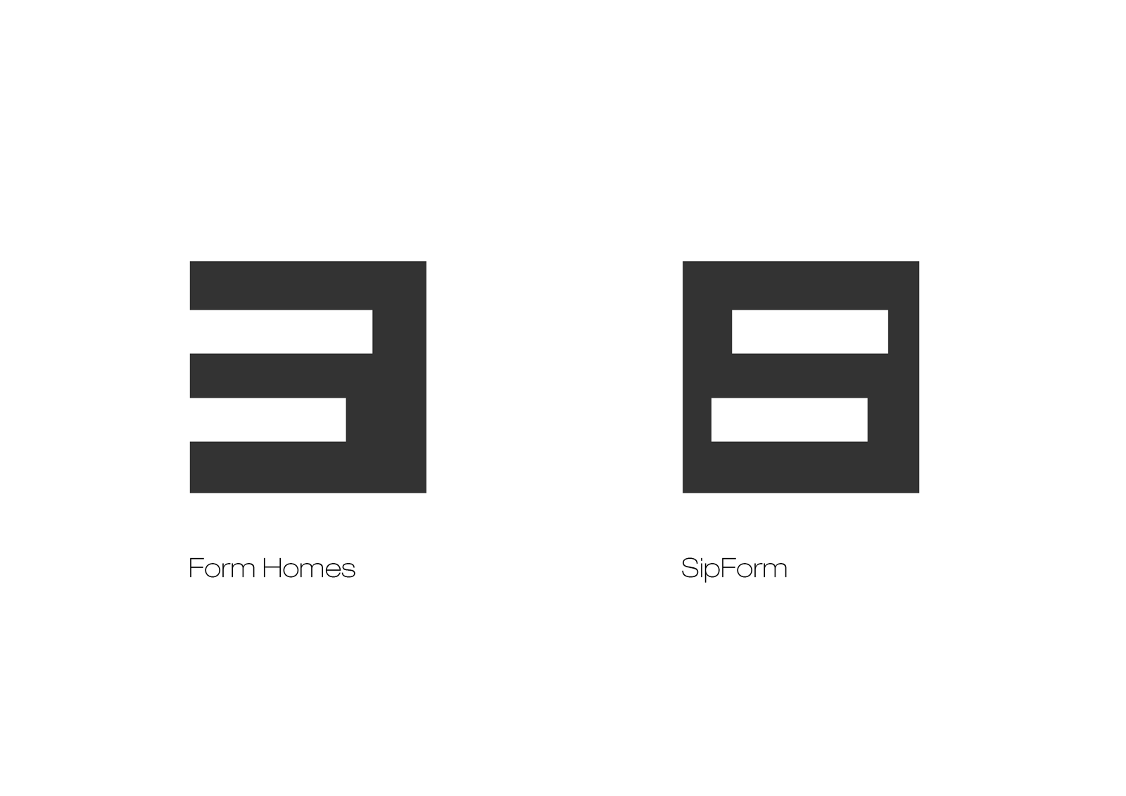
An existing home building client has asked me to brand and present their SIP panel products.
I've start with a simple morphing of their current "F" brand icon into an alternative form that maintains continuity, simplicity and somewhat representative of the new brand and product. Not that the product itself is at all new but the methods of assembly is.
I'd love some feedback as to whether this simple morphing and representation is working and effective?
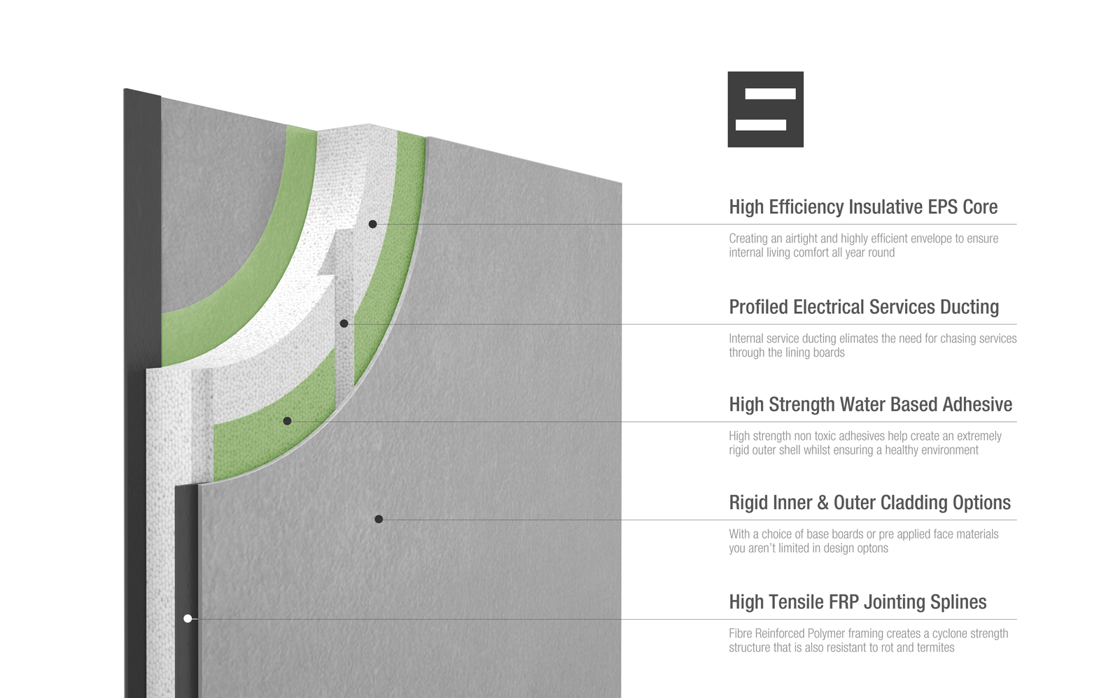
Here also is an example of it's use supporting a render of the panel construction.
The website has finally been launched http://www.sipform.com.au/
-
very nice and clean branding and presentation..
i have a question:
when creating a new logo/brand for a company, how can i be sure that there isnt already some other company, somewhere in the world with a similar logo/brand?
for example: if i lived in some remote place where no one uses Sketchup and i had never seen it before, i could have the perfectly good and original idea of creating a logo that would be similar to the Trimble one (because its so simple)
how and where could i search if there is already some logo/brand similar to the one i am creating?sorry if it seems a noob question

-
the first step could be ,do a google picture search for "logo"
Upload your design ,and let google do search for a simular picture.Bep
-
i see... i thought there was some kind of "oficial database" with all the registered logos/brands, so we could consult
sorry for the offtopic, Richard
great work, as always -
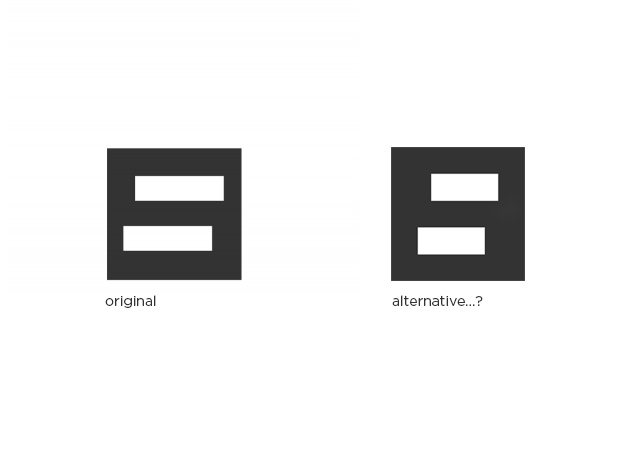
Richard: really strong as ever. If I could make a suggestion though- for me, the left- right spacing between the white rectangles and the dark grey square feels a little awkward. I think perhaps the smallest gap left- right should be the same as the gap top and bottom, keeping the border width consistent. This would mean making the white rectangles narrower than they are now of course. Hope that makes sense. Feel free to ignore, because what you have already works well.
Cheers,
A
-
@jonfar said:
very nice and clean branding and presentation..
i have a question:
when creating a new logo/brand for a company, how can i be sure that there isnt already some other company, somewhere in the world with a similar logo/brand?
for example: if i lived in some remote place where no one uses Sketchup and i had never seen it before, i could have the perfectly good and original idea of creating a logo that would be similar to the Trimble one (because its so simple)
how and where could i search if there is already some logo/brand similar to the one i am creating?sorry if it seems a noob question
Near impossible mate!!! The important thing is to do a trademark search in the classification you are designing for!
-
@andyc said:
Richard: really strong as ever. If I could make a suggestion though- for me, the left- right spacing between the white rectangles and the dark grey square feels a little awkward. I think perhaps the smallest gap left- right should be the same as the gap top and bottom, keeping the border width consistent. This would mean making the white rectangles narrower than they are now of course. Hope that makes sense. Feel free to ignore, because what you have already works well.
Cheers,
A
As always thanks Andy!!!
Mate the point of the offset whites is to function in a way as an "S" in a similar vein as the two varied length whites in the former icon form an "F".
-
Hey Richard,
Sorry mate -I didn't explain myself properly
I get the offset idea - and I like it.It was the width of the border that didn't feel quite right to me... I've attached a quick sketch of what I meant.
cheers
A
-
@andyc said:
Hey Richard,
Sorry mate -I didn't explain myself properly
I get the offset idea - and I like it.It was the width of the border that didn't feel quite right to me... I've attached a quick sketch of what I meant.
Ahhhh! Yeah that's better for sure mate! You're right. with the original if I stood back a bit and focused behind the screen the "S" created was ugly. I think you nailed it!!!!!
-
No worries mate.
If I worked for a branding agency that little sketch would have cost you a couple of thousand, but since it's you.......


-
@andyc said:
No worries mate.
If I worked for a branding agency that little sketch would have cost you a couple of thousand, but since it's you.......
How did you know how much I charge???
Funnily enough I decided against the whole idea in the end!

-
Looks great! Love the style.
-
The website has finally been launched http://www.sipform.com.au/
Hello! It looks like you're interested in this conversation, but you don't have an account yet.
Getting fed up of having to scroll through the same posts each visit? When you register for an account, you'll always come back to exactly where you were before, and choose to be notified of new replies (either via email, or push notification). You'll also be able to save bookmarks and upvote posts to show your appreciation to other community members.
With your input, this post could be even better 💗
Register Login


Advertisement