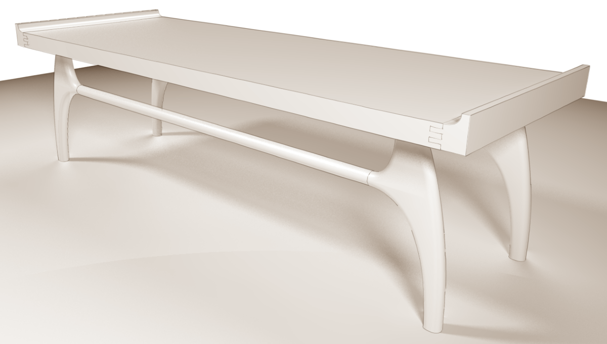
Mid-Century Modern
-
The legs might be a bit heavier at the top than they should be.

-
Dave,
Very nice, as usual. I like the finger joints for the turned-up ends on the top. To my eye, though, the long stretcher might look better if it flared slightly at each end, rather than run straight its entire length. Easy for me to say, 'cause I don't have to model the piece.
Best,
dh -
Thank you, David. I think you're right about the stretchers. They'd be easy enough to draw with the flare using Follow Me. On the original table the stretcher is a cylinder as I've drawn it but there are blocks a third of the way along that join it to the top. The original table is so long that the legs wouldn't show very well in the model so I made the table shorter and omitted the blocks. There's also some brass L brackets with scroll work wrapped over the top and down onto the blocks. I don't think they really fit with the table. Besides, I was too lazy to draw them.

-
Too lazy?! You had time to do a blog post http://www.finewoodworking.com/item/113435/a-transition-from-leg-to-stretcherabout making the legs
-

-
Nice video!
-
Thank you.
Hello! It looks like you're interested in this conversation, but you don't have an account yet.
Getting fed up of having to scroll through the same posts each visit? When you register for an account, you'll always come back to exactly where you were before, and choose to be notified of new replies (either via email, or push notification). You'll also be able to save bookmarks and upvote posts to show your appreciation to other community members.
With your input, this post could be even better 💗
Register LoginAdvertisement


