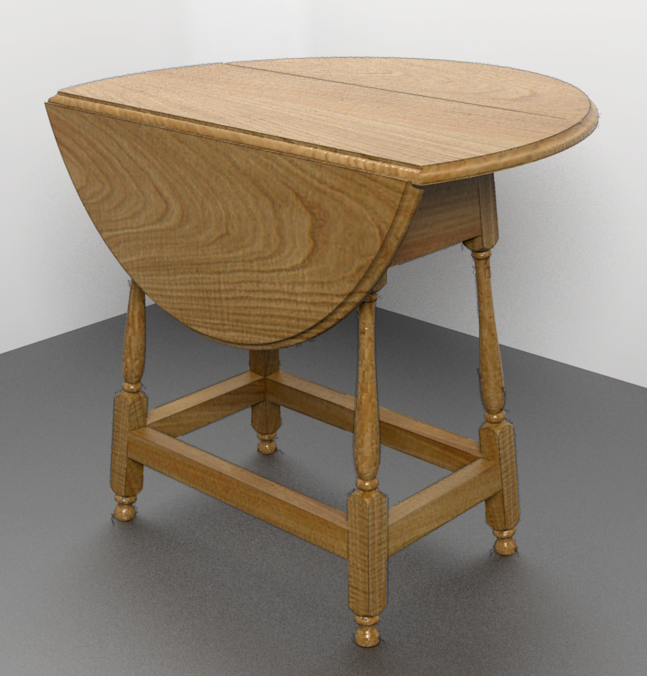
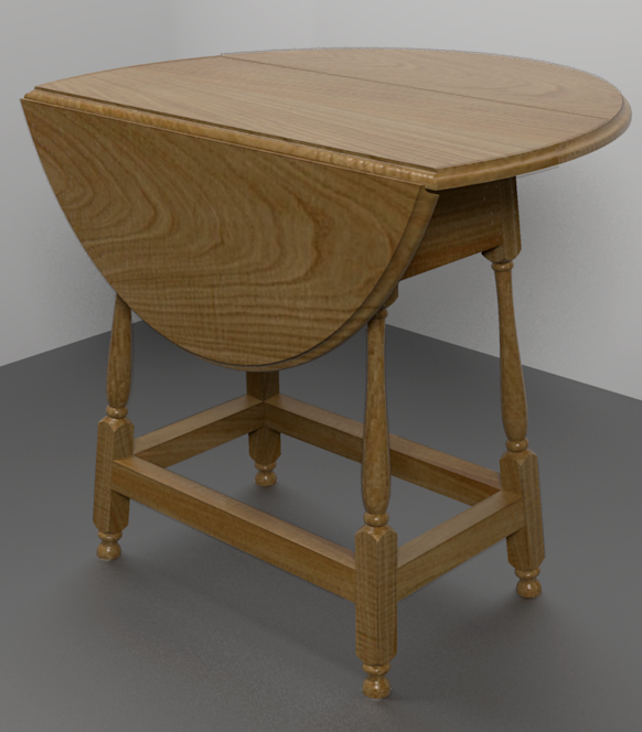
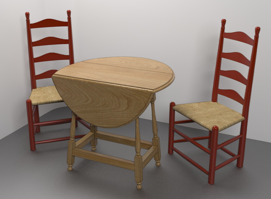
A Colonial Style Drop Leaf Table
-

In European chestnut. I was lucky to find a few boards around 12" wide. -
Nice mix of rendered image and sketchy line style. Perhaps the texture is a bit tall?
-
A bit tall? The real board from which I made the texture is over 12" wide. The leaf is a bit under 12" wide. It does look a bit large but it is accurate based on the real thing.
-

(It was only my first impression, I never thought you would scale a texture wrong
 )
) -
Very nice result Dave.
You always find nice textures. -
Lovely work and lovely style

-
Thank you gentlemen.
I gave the rendering another shot after moving the top light and making it smaller. I also used a more subtle line export.

Those heavy stretchers between the legs are accurate to the original but not really my cup of tea. I suppose since this was intended to be used in a tavern, the stretchers were made heavy to support the hob nailed boots of those men sitting around the table with their flagons of ale. -
I'm with Cotty a bit on this, it might be accurate but it does look large. I think it's the proportions that are throwing the eye off.
You're saying the drop leaf is only 12" which makes the table only around 2' tall but the eye tells me it is dinner table height and therefore the grain is huge. When i look again and work out how big the whole thing is the grain makes sense.Perhaps it needs something else in the image to see the scale right.
-
I'm sure you're right about needing something to provide context for the size. If I get some time I'll add a couple of ladder back chairs as reference.
-
And a flagon of ale.
-
Good idea. I need to find a flagon. there's one in the warehouse but it's awful. (or is that offal?)
-
I'm sure I can model one for you, but I will have to do extensive research, I may be some time.
-
No worries. I can probably come up with something. I don't want to put a lot of detail into it, anyway. It'll just make the render time longer.
-
I'm sure you can, and far better than me, it was the research I was interested in. Come to think of it, put in a couple of Octoberfest serving wenches and nobody will care what your table looks like.
-


-

For what it's worth I prefer the lighting of the first image.
-
@olishea said:
:lol:
For what it's worth I prefer the lighting of the first image.
Thank you. Can you say what you like better?
-
Just brighter. I know the second one has sharper shadows and less noise which is nice, but needs more brightness IMO. It looks quite dim on my screen. Could just be different monitors, of course, but it's looking flatter to me.
A quick exposure adjustments would improve it, or increasing intesnity of the light above if you can be arsed rendering again.
 Hope this helps.
 -
You're right, the second one isn't quite as bright as the first. I didn't make as much of an adjustment in the image editor on that one as I could have. I'll probably render it again with a couple of chairs and maybe a flagon of ale. For that I'll probably add a couple more lights, too, but I'll bump up the intensity of the top light a little more.
Thanks for the crit. -

Hello! It looks like you're interested in this conversation, but you don't have an account yet.
Getting fed up of having to scroll through the same posts each visit? When you register for an account, you'll always come back to exactly where you were before, and choose to be notified of new replies (either via email, or push notification). You'll also be able to save bookmarks and upvote posts to show your appreciation to other community members.
With your input, this post could be even better 💗
Register LoginAdvertisement


