Medical Space
-
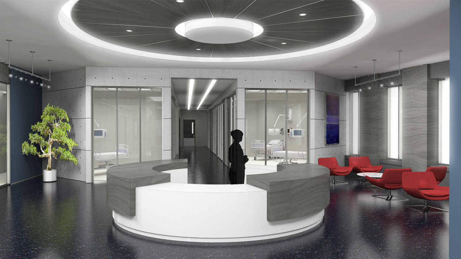
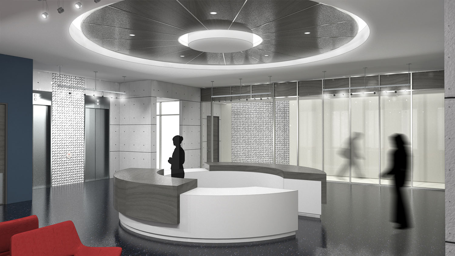
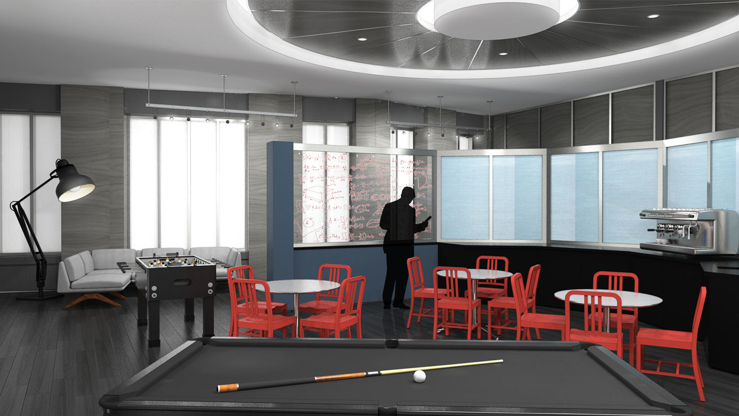
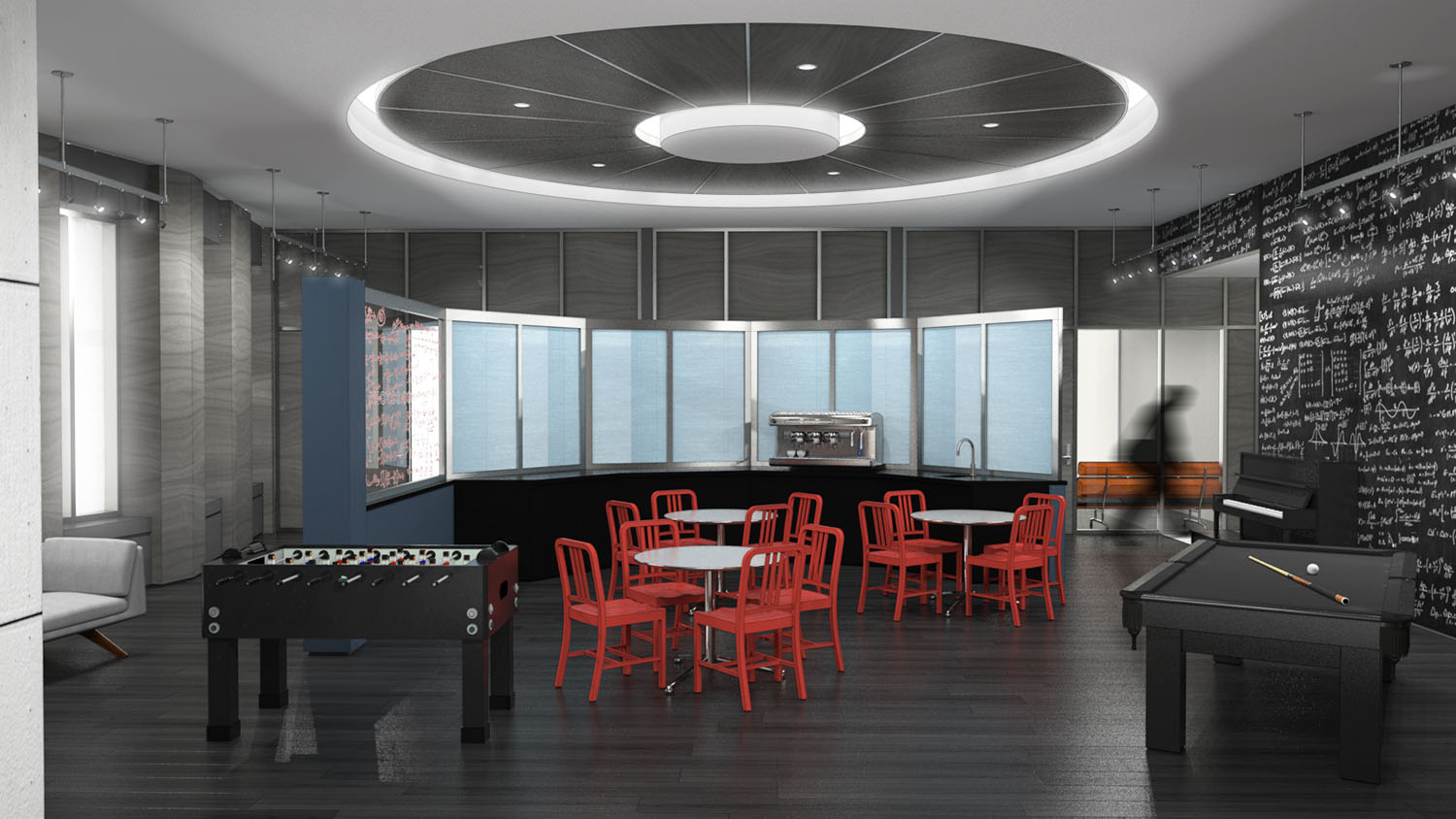
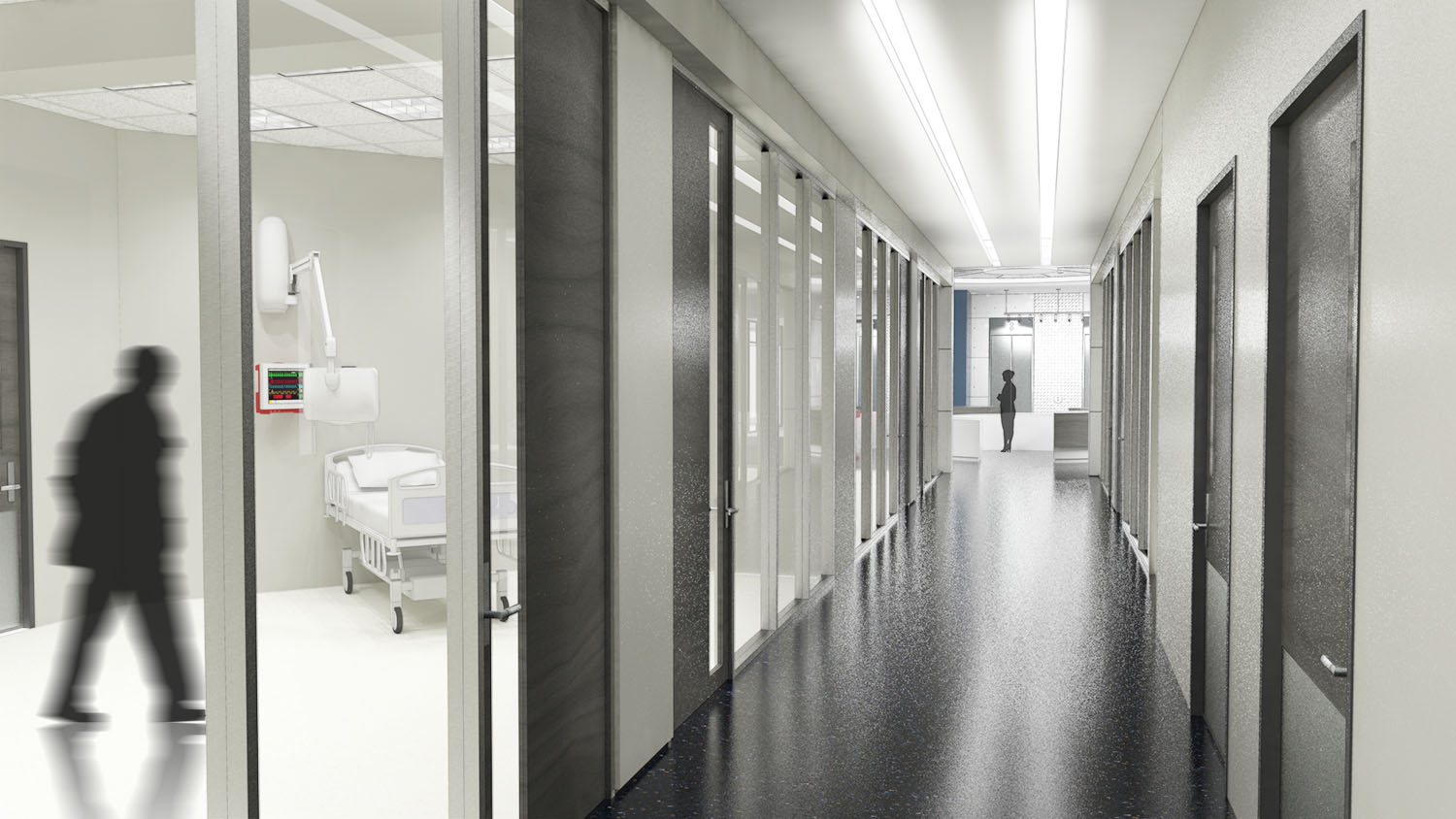
Not sure what to title this... its a fictional space for a new tv series being produced and is supposed to be a high end exam space and a doctor's lounge on another floor. These aren't actually the final design, because that circular ceiling piece got nixed because of lighting concerns. But portfolio-wise, these are the better images

SketchUp/Thea/Pshop
-
Nice modeling and rendering, Mark.

How long did it take you to do all of them?
My only concern is the lamp in the third image. That type of lamp looks like a small desk lamp. I was like, wow that's a huge lamp with a giant bulb.


Good day to you!
_KN
-
I should have adjusted the bulb, but those lights do, in fact, exist... http://www.maxinc.co.uk/images/maxfrontpagelamp.jpg
I worked on these for three 8 hour days with a bunch of revisions... Trying to make the studio happy.
-
Love them all Jason, my only comment is I hope you used real images of people instead of silhouettes and that lamp is huge! Great work as always...
allanx
-
Outstanding as always!
-
@marked001 said:
I should have adjusted the bulb, but those lights do, in fact, exist... http://www.maxinc.co.uk/images/maxfrontpagelamp.jpg
I worked on these for three 8 hour days with a bunch of revisions... Trying to make the studio happy.
Thanks for the lamp info, Jason. And sorry for the wrong name. I somehow had Mark from marked001 in my head.

Yes, reducing the bulb will bring it to a more human scale.
Three days working full time on it is pretty fast. How much did you have to build from scratch?
Cheers!
_KN
-
No worries, Ken... happens alot. Just the architecture is from scratch, all of the furniture/etc is all downloaded in the interest of time. This definitely could've been knocked out in under 2 days if there weren't so many changes.
Silhouette people are there to stay
 Otherwise, they get distracted and make comparisons to the actors, blah blah and lose focus on what they're supposed to be focusing on.
Hello! It looks like you're interested in this conversation, but you don't have an account yet.
Getting fed up of having to scroll through the same posts each visit? When you register for an account, you'll always come back to exactly where you were before, and choose to be notified of new replies (either via email, or push notification). You'll also be able to save bookmarks and upvote posts to show your appreciation to other community members.
With your input, this post could be even better 💗
Register LoginAdvertisement


