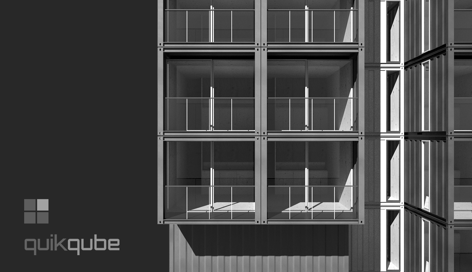
QuikQube - New brand logo developed with Layout
-
I quite like this one (must be getting better) - again developed as a custom font using Layout.
The background image was developed using a container model from the warehouse and modified then a quick render run with Maxwell Fire and then post edited to greyscale in PS.

-
Nice one Richard, love the font and the render...
allanx
-
Clean. Easy to read. Friendly.
Looks good.

-
Nice and clean. Good show.
-
Class Act as is to be expected from you Richard. Always inspiring to see your work.
Cheers. -
Thanks Allan, Bryan, Eric and Dale!! Just back from a 2 month break so big sorry for my lazy response!
Luckily this was one of the easier ones I've done as the placed cube icons are so simple and descriptive!
Hello! It looks like you're interested in this conversation, but you don't have an account yet.
Getting fed up of having to scroll through the same posts each visit? When you register for an account, you'll always come back to exactly where you were before, and choose to be notified of new replies (either via email, or push notification). You'll also be able to save bookmarks and upvote posts to show your appreciation to other community members.
With your input, this post could be even better 💗
Register LoginAdvertisement


