Whiskey Bar
-
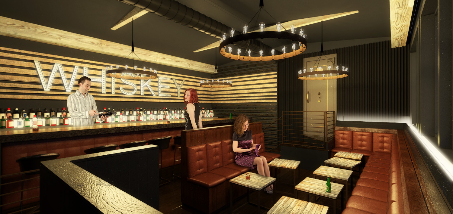
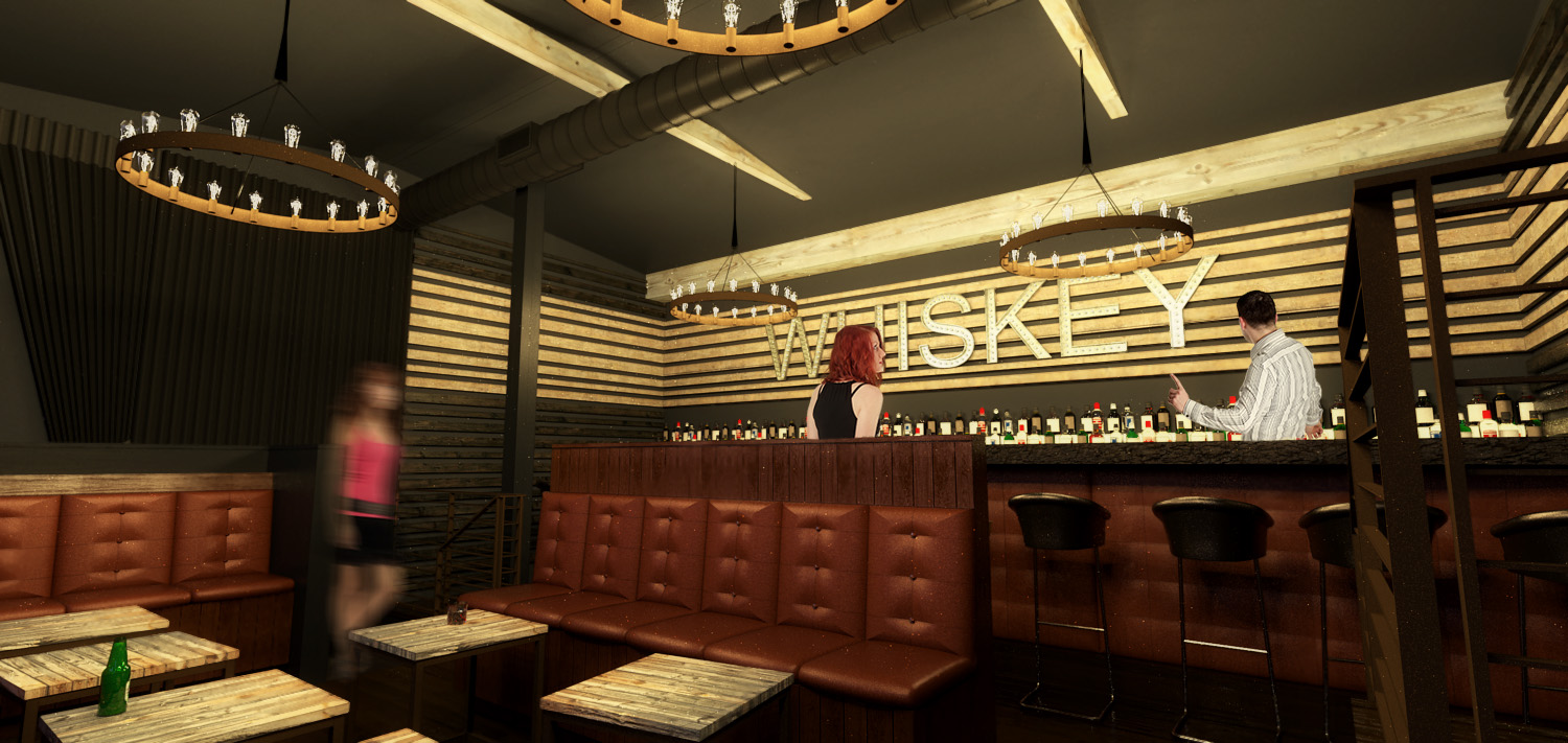
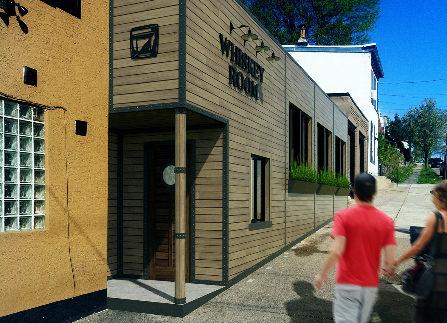
renovation of the exterior/interior of a back room of a bar in philly.. SketchUp/Thea/Photoshop
I don't love how yellow/warm the images are...but that's what the client wanted. Had some issues with fireflies in this one. Had to use blur alot to try to fix them in pshop.


-
Nice renderings, Jason. but why is Red hidding behind the seat? You've got to highlight a project's assets.
-
Looks good!
-
Nice space but I think your drink tables should be a bit higher. You will hit your knees on these when you move them.
-
yeah, agreed.. they are a bit low. blame the interior designer!

-
@marked001 said:
yeah, agreed.. they are a bit low. blame the interior designer!

Yes, I fully understand. I had that happen to me before too. I completed a Hampton Inn "Perfect Mix Lobby Interior" and the interior designer changed chairs out on me after I designed a permanent (millwork) table for lobby space. The chairs where too tall for the people to get their legs under it and the table was already on their way to the shop for production. What can you do? Nice work though!
-
Hi. Renders are pretty good, but there are still many things which can improve quality. First of all, in interior there are so many dark zones, which are not giving any information. And of course that dark corners makes image less cosy

What about exterior. I like that it is well illuminated. But composition is not that good: if I were you, I would zoom out the camera to see overall building view, how it looks in environment. And cuting top af the building is not good desicion in my opinion
-
well i typically get 24 hours to turn these around, so there are always a million things that can be better!
thanks for the helpful commments.
Hello! It looks like you're interested in this conversation, but you don't have an account yet.
Getting fed up of having to scroll through the same posts each visit? When you register for an account, you'll always come back to exactly where you were before, and choose to be notified of new replies (either via email, or push notification). You'll also be able to save bookmarks and upvote posts to show your appreciation to other community members.
With your input, this post could be even better 💗
Register LoginAdvertisement


