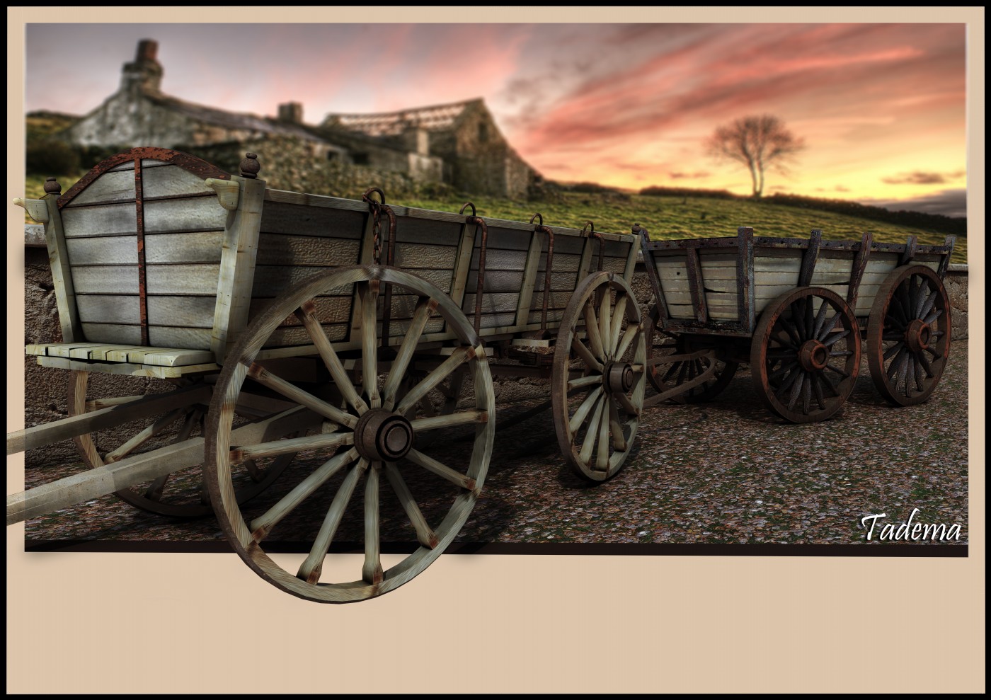
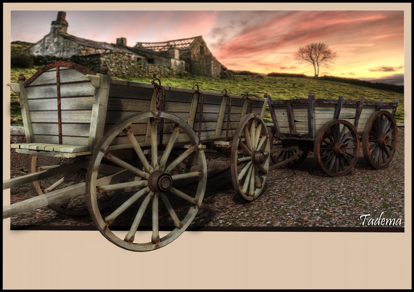
Harvest time..
-
John, looks lovely, your texturing is so great!
@hellnbak said:
From now on you are allowed to post a model only if it sucks.
are you sure you want that? What if his sucky models are still way better than mine or yours
-
-
Hmmm... Not what I was expecting when I clicked this...
-
Just to make myself feel a little better, I do have one small criticism -
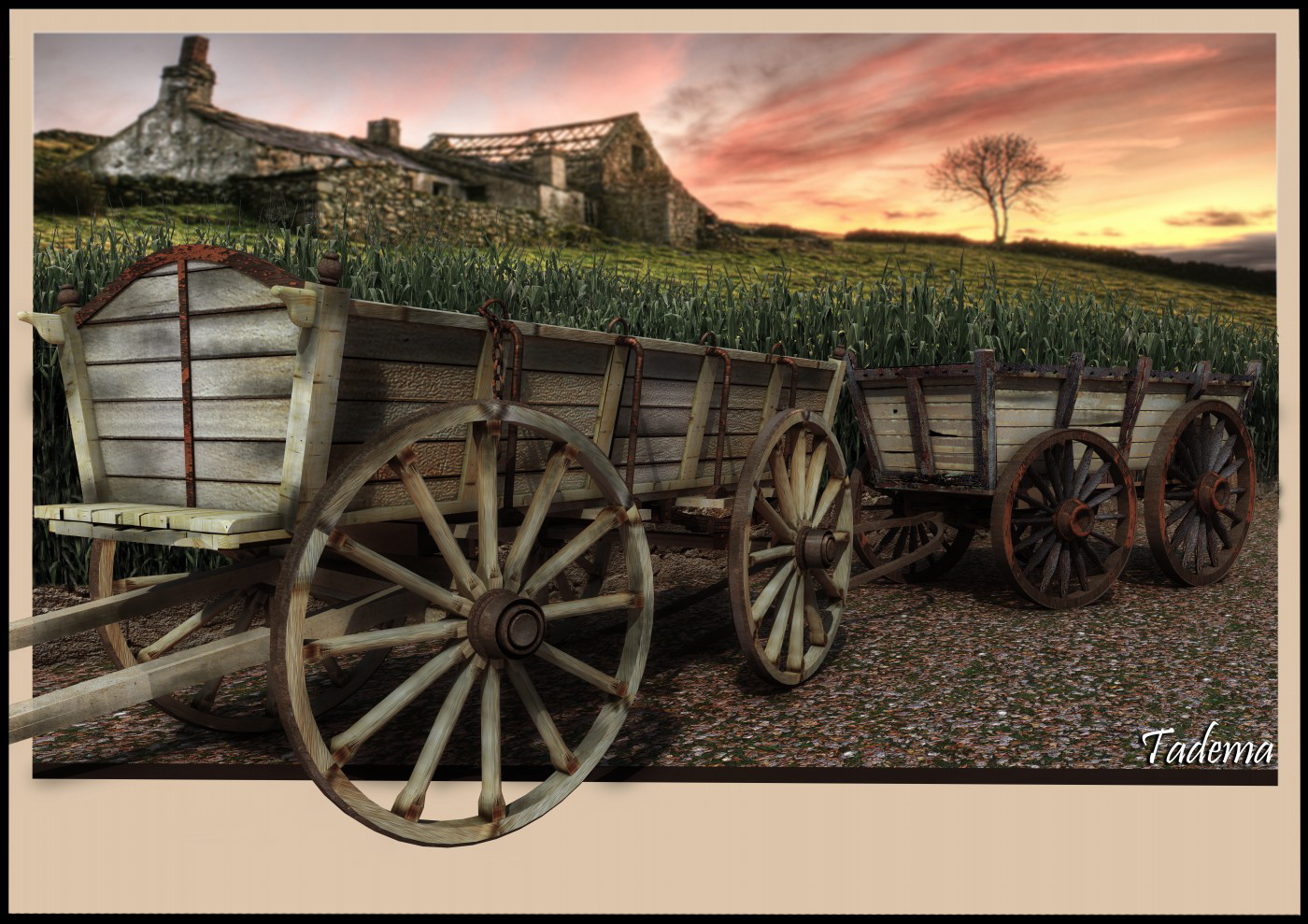
because of the placement, to me it looks like the corn is growing out of the wagons

-
Thanks for the comments everyone.
Steve I thought the same after it was posted, the crop looks as if it's growing from the carts!even more so when it's pointed out.
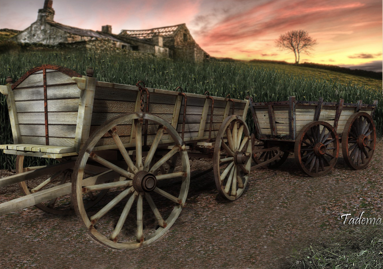
A little change of background.
John

-
Nice change. I like the DOF effect.
-
@tadema said:
Thanks for the comments everyone.
Steve I thought the same after it was posted, the crop looks as if it's growing from the carts!even more so when it's pointed out.
A little change of background.
JohnJohn,
I think it may have more to do with the perspective you chose. Maybe if you could see more background between the carts. Right now, the horizon line is completely covered by the two carts. It's hard to tell what's behind or what's on top of the carts.Andy
-
Hello Andy, I've taken the easy way out and lowered the wall

This is what happens when you model off the cuff.
John

-
Me likey the first with the crops. If you could remove the wall, and let the bare plants near the carts . I haven't actually seen walls near the crops in the fields !
Anyway, as always, wonderful compositions !
-
Thanks Elisei, removed the wall as low as I can.
John

-
I hope you don't mind !
Leaving away the bad retouch, what do you think about it ?

Hello! It looks like you're interested in this conversation, but you don't have an account yet.
Getting fed up of having to scroll through the same posts each visit? When you register for an account, you'll always come back to exactly where you were before, and choose to be notified of new replies (either via email, or push notification). You'll also be able to save bookmarks and upvote posts to show your appreciation to other community members.
With your input, this post could be even better 💗
Register LoginAdvertisement


