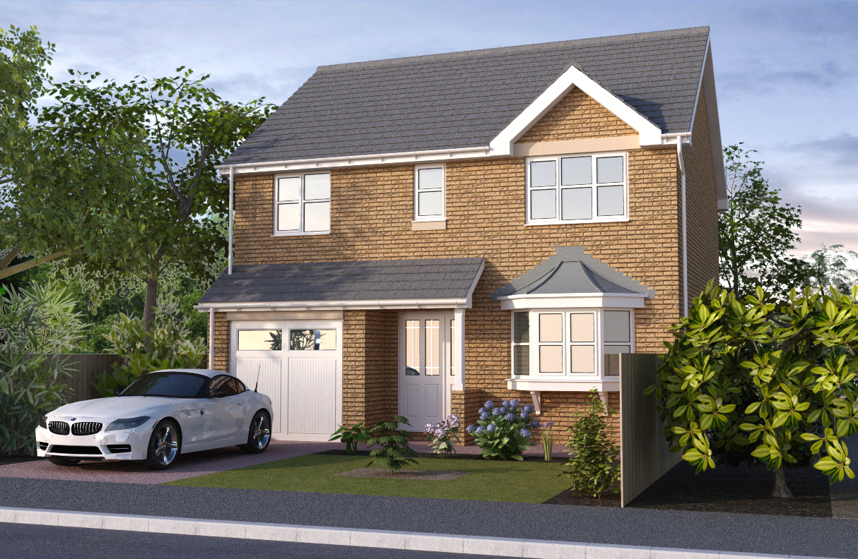
UK Residential Exterior - Revised
-
After receiving some helpful feedback from one or two posters on here (thanks, guys), I decided to redo the residential exterior I put up on the gallery some days ago.
Heres the link to the original: http://sketchucation.com/forums/viewtopic.php?f=81&t=51280
The main criticism I received was that the rendering was too flat, so I decided to see if I can do anything to make it less so.
Gone are the 2D trees which I felt partly contributed to the overall flatness of the image. In their place are some 3D trees and plants from Podium's paid browser content.
As well, I made the brick and slate roof tile materials more bumpy (went nuts with it, in fact) and put it through Podium.
Whole thing rendered quicker than I expected at 47 minutes on QMC settings, despite containing so many 3D trees and plants.
Decided I was going to make a real effort with GIMP and so I put in a sky, some background trees and generally messed around with the main render until I got something I was satisfied with.
Result?

It's still not finished though. The windows definitely need some reflections (clouds, houses, that sort of thing) and I might want to use something that simulates real grass. I just wanted to post this here first to hopefully get some more feedback on it so I can improve it even further before putting it up on the main gallery.
Critiques welcome as always.
-
Like it. Windows glass needs some work. Maybe less reflection?
Lighting real nice,. -
Cheers, John.
I think the windows just need to reflect something as well. At the moment, it's just reflecting the model space/physical sky in Sketchup.
But aside from that, I think you're right. They do look like mirrors at the moment. I'll tone the reflections down and add a bit more transparency. Maybe add a few curtains as well...
Thanks.
-
Hello Ken, that's a lot better. A few small things let the image down :- A lack of curtains/blinds and a reflection (place a couple of trees behind the camera). The roof is still too flat and as there's not too much variation in the texture why not make a component out of a single tile.
A little overhang of the roof tiles to form a shadow, the down pipes to the left would never be like that, add fittings and clips. The garage roof needs lead and the doors need furniture, grass needs a little work and the plant/shrub to the right is out of scale! that sounds like a lot of nit-picking but it's certainly not meant that way, it's the small details that people notice and make a more complete image.
John
-
Hi John,
Don't worry about being nit-picky. Nit-pick to your heart's content as this is the type of critique I'm looking for. I'm thinking of going freelance so any tips anyone can give me can only help me perform better. Plus it prepares me for future nit-picky clients
 .
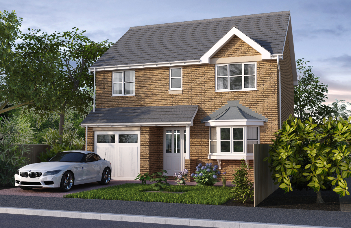
.I actually updated the image before you posted your message. It's still missing the small details that you suggested, but I've fixed the windows and added curtains behind them. Hopefully you'll agree it looks better now.
Here's the image:

I posted this on the SU Podium forums and they said some of the same things you did. I guess it's times like these I realise how much I still have left to learn about rendering.
I'll be back with a new update some time in the (hopefully) near future.
Regards,
Ken.
Hello! It looks like you're interested in this conversation, but you don't have an account yet.
Getting fed up of having to scroll through the same posts each visit? When you register for an account, you'll always come back to exactly where you were before, and choose to be notified of new replies (either via email, or push notification). You'll also be able to save bookmarks and upvote posts to show your appreciation to other community members.
With your input, this post could be even better 💗
Register LoginAdvertisement


