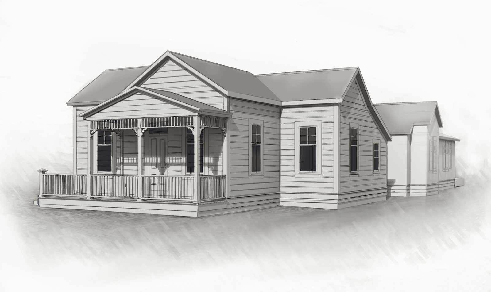
WIP Little Historic House
-
This style is using Dave R 's pencil style plus suggestion by him in using ambient occlusion shading. My idea is to save time modelling and rendering but come up with something that will show the general feel of an addition in the rear (not developed yet). Maybe the style sort of goes with the house. Most of this is not actually modeled. the siding and windows and many of the lines are just transferred from a CAD drawing based on field measurements. So anyway I spent more hours playing with the style
 , but maybe it'll save time down the road with multiple views

-
What is your thought on adding a shingle texture?
-
Yeah. It'd have to be a suggestive one and not too busy. Might add some lines in PP. I am trying to keep it more along sketched lines and washes. the roofs are a very dark element on the white house but I still wanted light shading. Want it to be a relatively quick process when I do the final views.
-
nice clean model peter

-
Very nice... has that quaint old look too.
-
Thanks! Encouraging words coming from you guys!
I've worked on fleshing out the porch some and with the addition design done, I'll give it another shot. Want to make the "interior" look better at the windows.
Sorry, Oli, I made this sketchy because I did NOT do a careful modelling of this one--to get a quick image from 2d CAD imported elevations. (If you are not pulling my leg) I guess it works in some way.

-
Well it looks pretty authentic, frontone and porch look much like the colonial American style with some classical architecture influences
 I'm using the same CAD drawing technique when building the facades of surrounding buildings on historical site insertions.
Hello! It looks like you're interested in this conversation, but you don't have an account yet.
Getting fed up of having to scroll through the same posts each visit? When you register for an account, you'll always come back to exactly where you were before, and choose to be notified of new replies (either via email, or push notification). You'll also be able to save bookmarks and upvote posts to show your appreciation to other community members.
With your input, this post could be even better 💗
Register LoginAdvertisement


