Invisible Cities- Diomira
-
Here's the first in a series of images I intend to produce illustrating Italo Calvino's 'Invisible Cities'. The first is Diomira, 'a city with sixty silver domes, bronze statues of all the gods, streets paved with lead, a crystal theatre, a golden cock that crows each morning on a tower.....when the days are growing shorter and the multicoloured lamps are lit all at once at the doors of the food stalls"
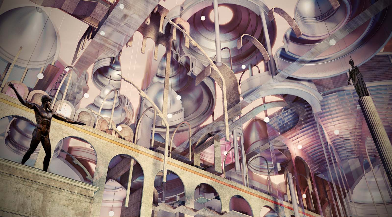
I've been trying to strike a balance between the concrete nature of some of the descriptions and the more poetic allusions to time and space given in the chapter by playing with recognised architectural forms in an abstract fashion. The aim of this is to give the images scope for multiple interpretations, as the original text provokes in the reader. -
Interesting idea and a nice image.
-
Cool challenge!

-
James
I will certainly be following your posts, as this is a really refreshing use of SketchUp.
I do have a critique though..
You have an image that can only, I feel, be discussed on its artistic merit, since the personal interpretation of the subject matter, is the essence of the work.
Artistically, you have created something with an almost Escher-ist flatness to it. In itself this is a really interesting "perspective". But because of the amount and complexity of the objects, (and within this flat terrain), I find my eye with not enough contrast, and this makes my eye 'skitterish", searching in the work for something to anchor it.
I feel therefore you need to devise a way to express to me what it is you would like me to take away from this image.
I recall a quote, and I cannot remember by whom, that " in regards to materials and sense, the artist can only do what structure allows".
If you could provoke mood, I keep wanting to say with the likes of chiaroscuro in its most literal sense, which is disambiguation, I think you could take this image from really good, to absolutely beautiful.
It will take a light and thoughtful touch though.
Any way, thanks for doing what art does best, stimulating my senses.
Cheers -
Very interesting approach and subject. Though I can't completely disagree with Dale - he has a point to some degree at least, and for sure he has some good advice in his reply. I'm not sure if I would hang this first image on my wall, but one thing I know for certain - I will impatiently wait for the rest of the series!
-
Thanks for your comments, I hear what you're saying Dale, this image does have an equivalency of composition which flattens it out. It could perhaps do with some larger blocks or foreground element to up the contrast so that it might hold up as a value study, or (dare I say) achieve the chiaroscuro effect. Composition isn't my strong suit though I've been sketching a lot of Hokusai prints which should inform future images. I do still want to retain some sense of it being an worms eye architectural illustration with lines and a feeling of a technical assemblage of bits so I guess the key is finding a balance point.
It's been quite educational creating this so far and hopefully in time I can learn the light and thoughtful touch you speak of
-
Well, I really think this image is worth the effort, and hope you continue on.
I am sure others, as well as myself, would love to know your workflow on this. What software was involved, and how much is post pro, etc?
Dale
-
Model wise the first thing I fixed on were the 'sixty silver domes' so I drafted around 15 sections in CAD loosely based on domes such as Pantheon, Florence, Santa Sophia, then used 'follow me' to make quarter, half and full domes of the sections, then copied them to various scales and arranged. Same for the greek theatre type affair in glass on the right.
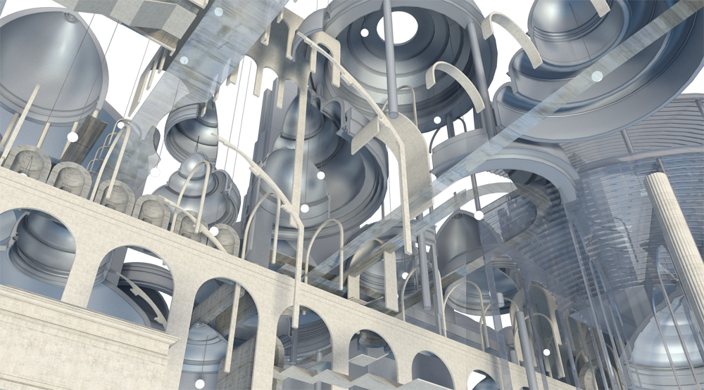
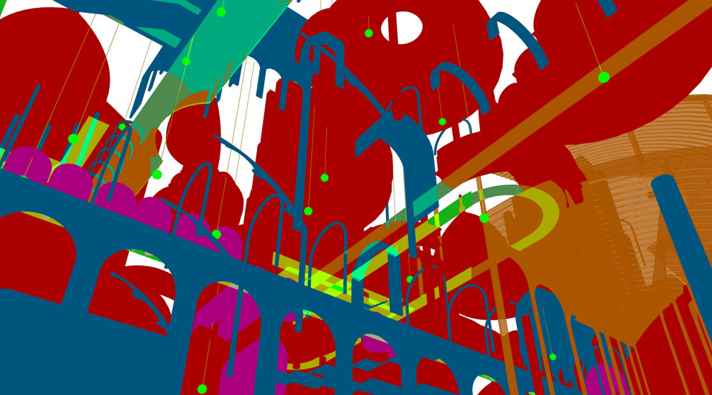
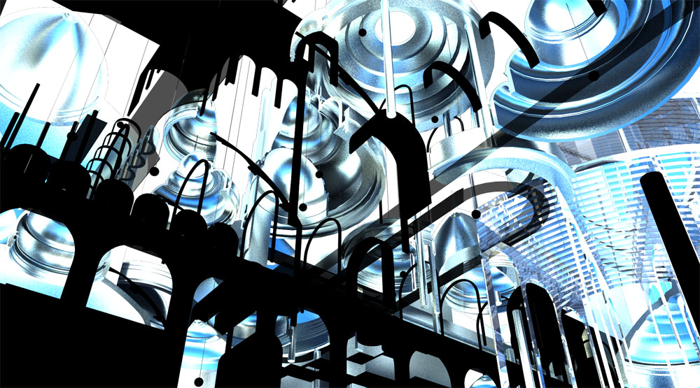
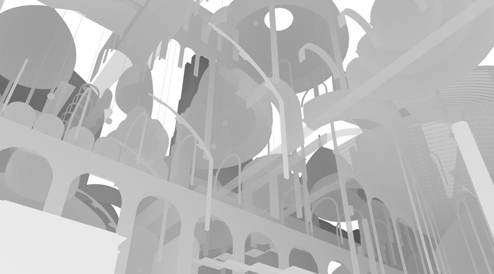
The scene was rendered in vray, to play about I turned the model upside down so the sun would shine into it from below. Materials are basic glass and metal. I rendered out reflection, zdepth and material ID and lighting channels then layered in photoshop something like this;
Reflection- blend mode overlay 20%
Zdepth- tinted purple to get evening haze effect, blend mode lighten 100%
Lighting- blend mode soft light 10%I made a couple of dirt layers using the mat ID layer for masks and painted in with grunge brushes and decals from CGtextures. I also added some different coloured gradients to elements using the ID again. There's a dusky sky in the background which was adjusted to match the edge haze from the zdepth. People are brushed in using this technique;
http://vyonyx.com/tutorial01-creating-a-realistic-crowd-in-photoshop/
and statues are images I sourced and cropped adjusted etc to suit. I would like to draw my own statues in using the tablet but I fear my wacom skills might not be up to scratch yet!
Here's what the channels looked like;
-
Wow! Very nice work ATLA Studio! I love the textures and the color palette you use. Well done.
-
This is a nice little tutorial. Thanks, very nice approach.
Hello! It looks like you're interested in this conversation, but you don't have an account yet.
Getting fed up of having to scroll through the same posts each visit? When you register for an account, you'll always come back to exactly where you were before, and choose to be notified of new replies (either via email, or push notification). You'll also be able to save bookmarks and upvote posts to show your appreciation to other community members.
With your input, this post could be even better 💗
Register LoginAdvertisement


