From Skp to Reality 02
-
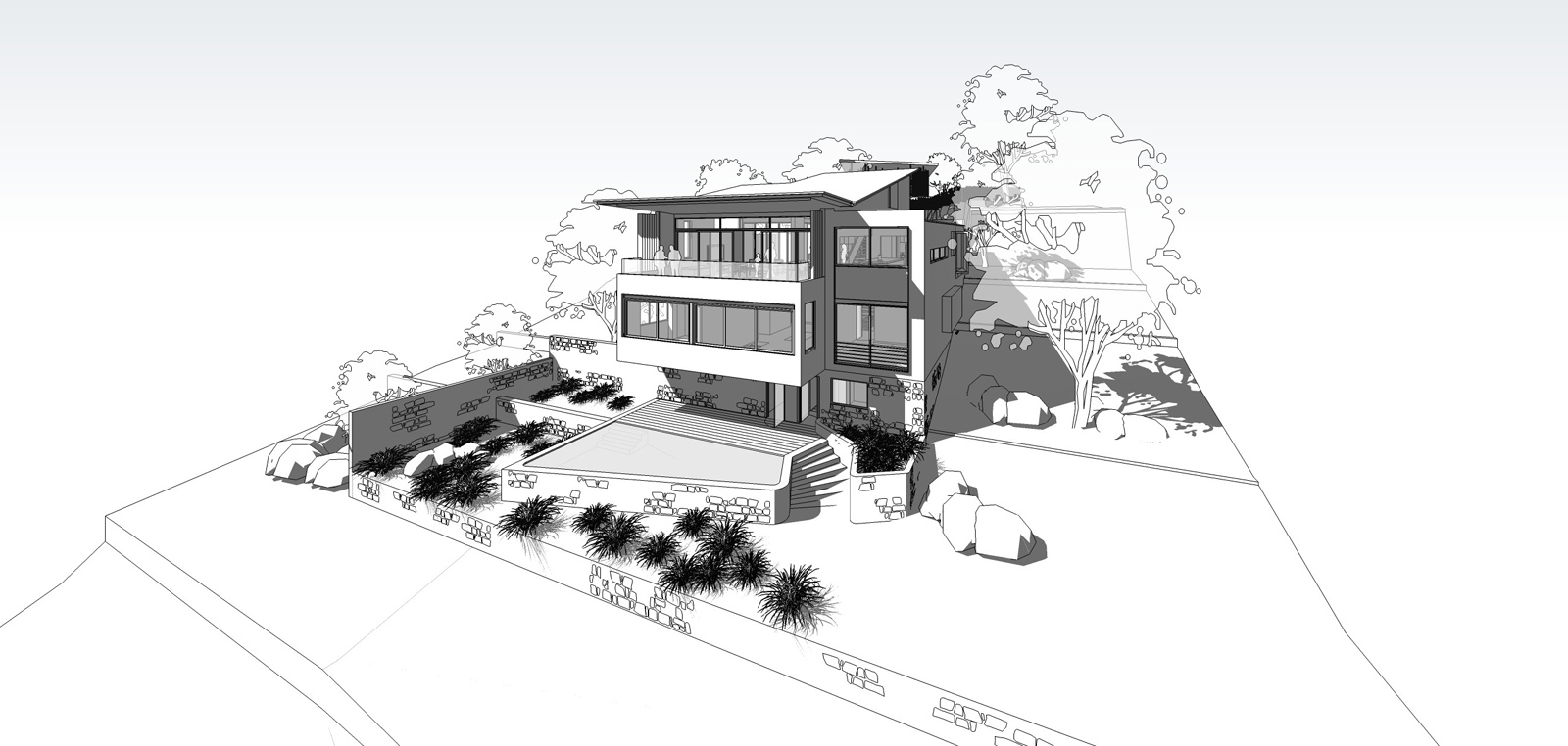
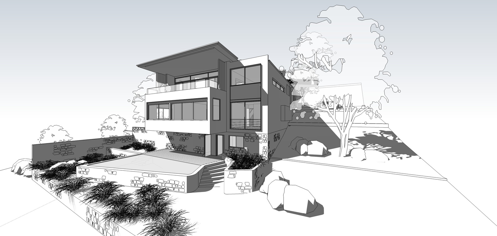
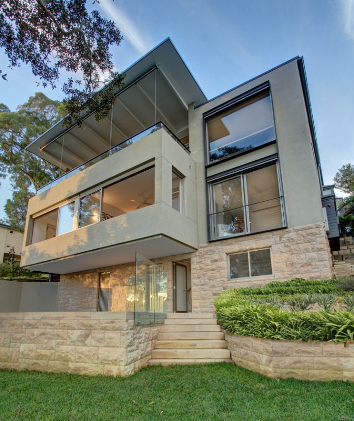
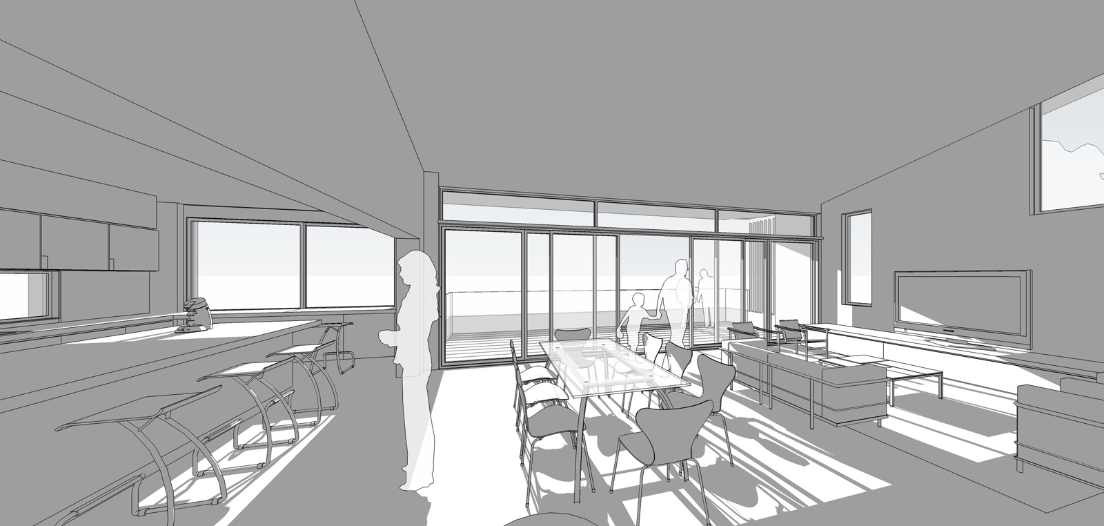
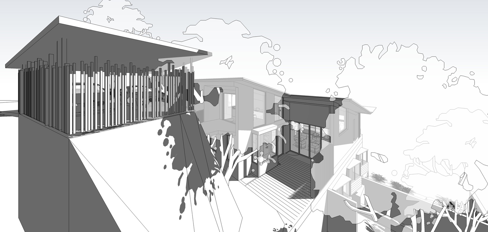
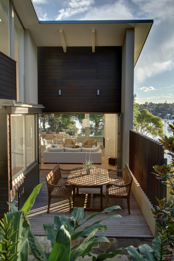
Woodford Bay House Sydney Australia : From Skp to Reality
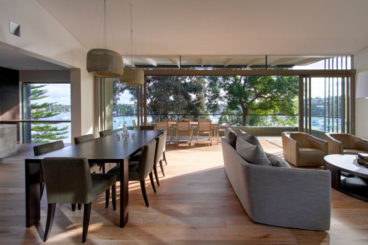
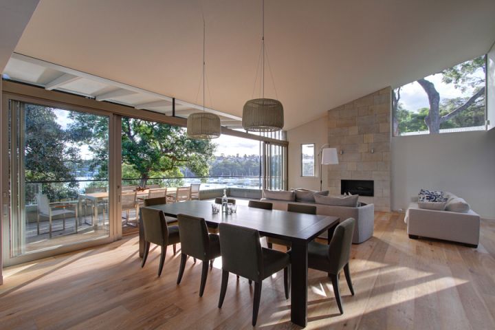
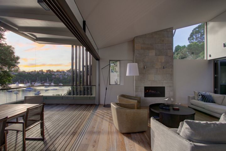
Project i ve been working on in 2010.
Architecture : MacCormick Simonian Architects
http://www.maccormickarchitects.com.au/
-
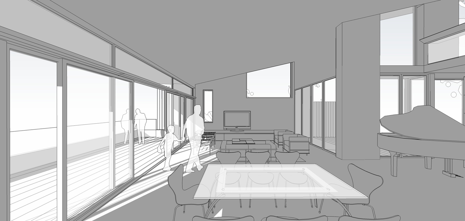
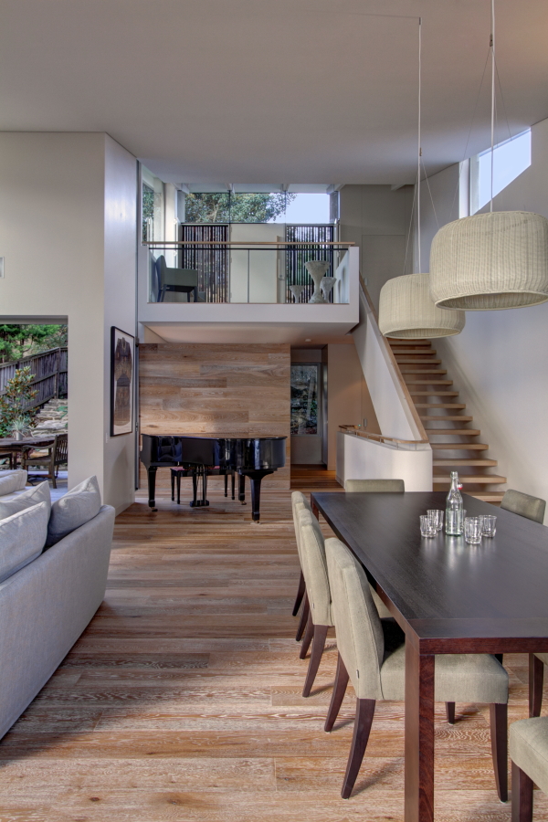
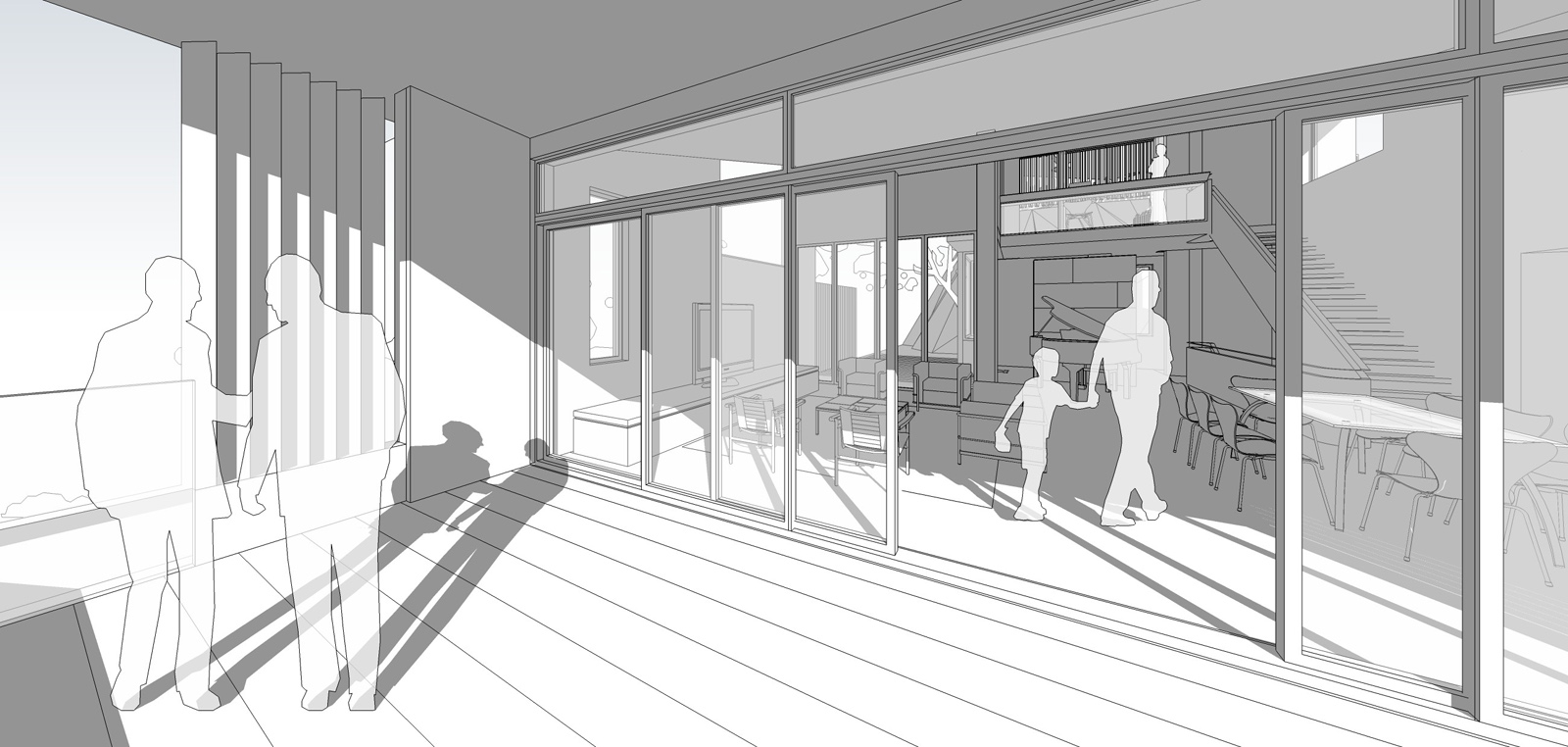
Awesome. I like the stone and glass combination in the first photo. It is also nice to see straight up b&w SketchUp utilized. Great work.
-
Great work! What sliding doors are they?
-
beautiful work!
love the use of shadows in the SU renders. The way you present it they contrast the photos so well. And the photos themselves are a great job, too - for a moment I thought they were high class renders, lol. -
Great work Carrasco. Can you show us some floor plans as it makes viewing / appreciating muchore interesting.
Mike
-
Excellent renders!
Oh wait...

-
What a class act. Love to see more, and agree with Mike re: floorplans.

-
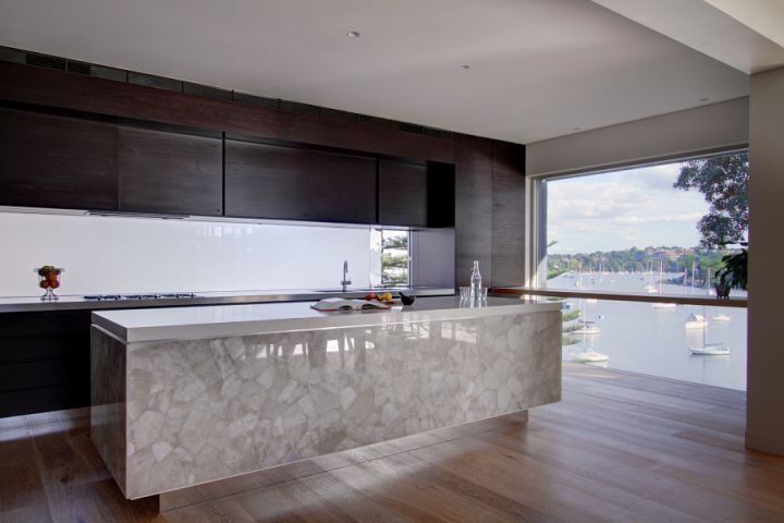
I was listening to the news today and it said Austrailia was not greatly effected by the world economic crisis. These beautiful renders over the yacht filled bay seem to support that concept.
-
..... Great work!

-
Very impressive Project.
I like it a lot!
-
on revisiting this thread I am again stunned by the perfection of your work. And again for a moment I thought it could be be possible that you sneaked in at least one or two photographies. Or is it just the title that made me believe something like that?
Would you be so generous to share how you did that puddle full of rubble in the last picture (terrace)? -
Shura these are photographies
 There are no renderings...
 -
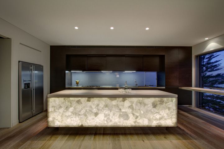
maybe I am working always too late and this compromizes my abilities. You should see me now grinning like bananas. Hm, after all there is no better laugh than to laugh about oneself. But the truth is I wasn't sure at all if these were only photos. The resoution provided may have made it difficult to judge, but in the end I saw a few things that made me say "naw, must be a render". The shinyness of the wooden surfaceses is all so soft, and the furniture is too perfectly alligned. In the end I went with that discovery that the glasses and the bottle appeared in two shots just as if you copy/pasted them.
Of course you or the photographer put quite some effort into postpro, Sharpening, levels and such.
Luckily this error of mine only enhances the praising of your work, otherwise I would feel ashamed. Gotta think about that a little more, but somehow this looks like a damn good lesson on human perception to me. -
Yeah no worries i have to say these photos are really too perfect and you can think they are renderings but no...If it was renderings it would be some pretty good one

Hello! It looks like you're interested in this conversation, but you don't have an account yet.
Getting fed up of having to scroll through the same posts each visit? When you register for an account, you'll always come back to exactly where you were before, and choose to be notified of new replies (either via email, or push notification). You'll also be able to save bookmarks and upvote posts to show your appreciation to other community members.
With your input, this post could be even better 💗
Register LoginAdvertisement


