Family House
-
hello all,
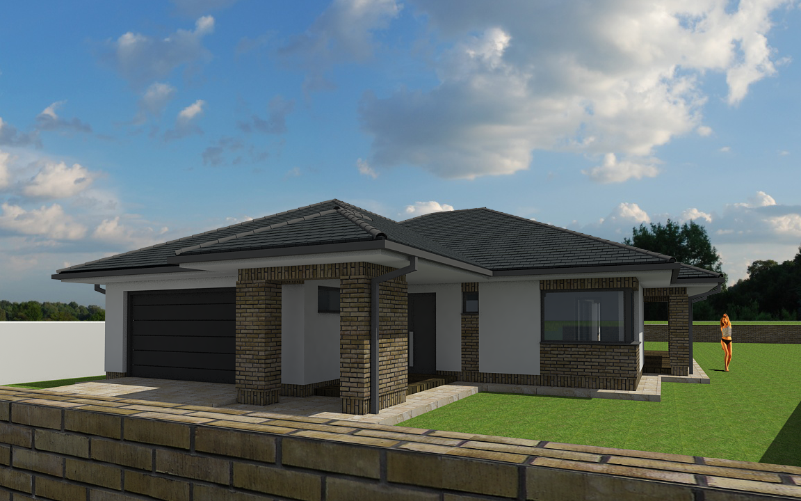
on friday i finished the renderings of a family house. i've made more pictures, but they aren't published yet, so i would like to post only one picture now and ask around.
software used: SketchUp 8 and VRay 1.49.01 with Photoshop.
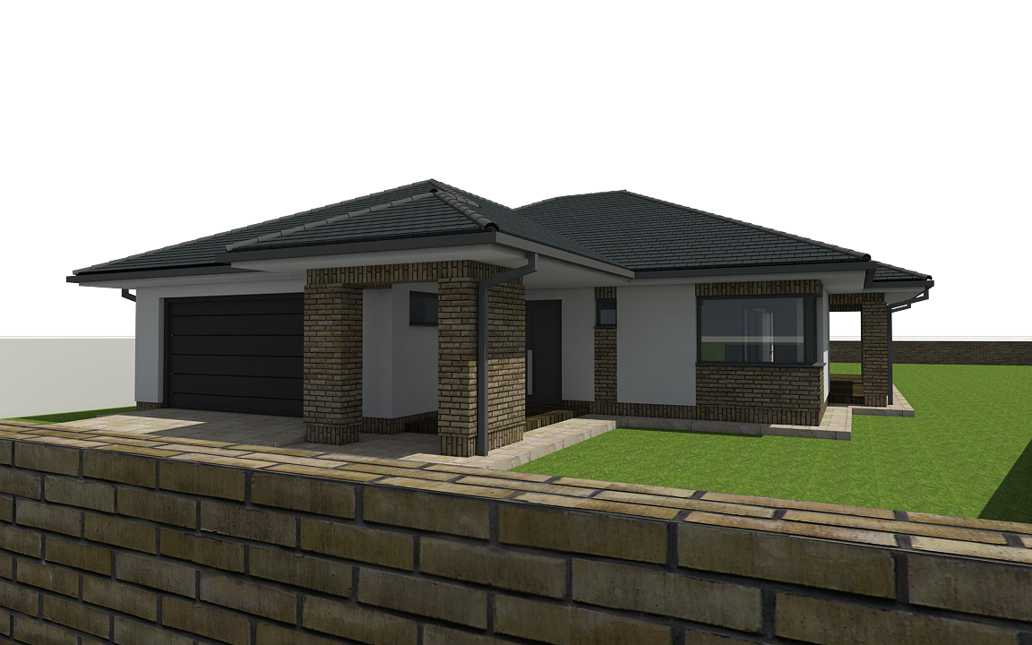
the modelling (and texturing) part took 16 hours, the rendering and post-processing took some 8-9 hours more (counting all of the 18 images made). any comments and critiques regarding any part of the modelling/texturing/lighting/rendering/post-processing are most welcome.
i would especially like to ask, how would you suggest getting the light into the interiors? if there was more light inside, i guess that the windows' reflections wouldn't be so visible and it would look more real.
what i plan to learn/practice as a next step is rendering/workflow with a HDRi image (thus getting sky into the windows at rendering time) and inserting realistic grass with photoshop (through MaterialID channel).
so, thanks again for viewing; criticize away, please


-
Overall, good modeling and rendering, but there a few things you can do to bump it up a notch.
- Better grass texture
- Your brick texture/model needs adjusting. The first stretcher course above the soldier course base is half a course. Also, some of the vertical mortar joints are too close tothe corners. If need be, adjust the brick texture to real world dims, and then adjust the model to conform to the brick.
- On the foreground wall, the mortar joints on the top do not align with the joints on the vertical face. However, I think a rowlock course would be a better cap for the wall.
- Lose the girl. Or replace her. Her coloring does not match the rest of the rendering, making her stand out like a sore thumb (I'm assuming the object of attention should be the building?). Also, what is she doing? It looks like she is throwing something.
- You might try moving the sun around so it is coming from the right front (over the viewers shoulder) - you might get some more interesting shadows on the front of the building.
- Add some landscaping around the building, but be careful it compliments and does not detract.
-
The people beside the house seems a little needless. All in all, nice works!
-
hi and thanks for the comments,
somehow i had a lot of school to do and didn't get to update this thread; now i had the time.
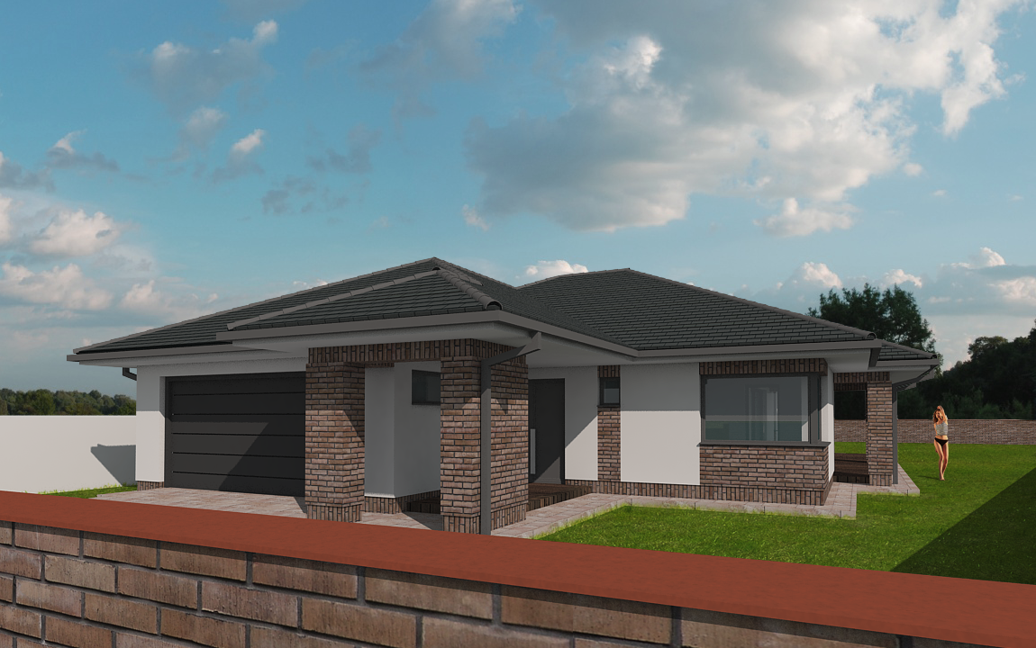
i have re-rendered the image and replaced the grass and adjusted the colors in post production, i think it's a bit more realistic now.
i now know that the bricks are not like in real life and that more precise texturing would be needed, but somehow i got stuck with finding a good capping solution (and texture) for the fence so i didn't continue.
and i think that people are essential for architectural visualisation, as they provide a sense of scale, so the person stays. although i may have used a more 'real-person-like' figure, this one seems calm enough to believe her that she's in her garden.
anyway, here's the new version; i hope it was changed for the better


-
i would change the color of the cap stone...it doesn't fit the wall stones. I also would whiten the person and make it a little transparent. Placing a person walking towards the entrance door could also be a solution, that it doesn't look out of place.
-
My suggestion is find a view without the fence blocking the house and pick a good sun location/time of the day so you have a better shadows for your render..
Another one is pick another shade that will compliment your brown color but will stand out with the rest of the colors...
Play around with the materials and colors and you'll surely have a wonderful scene here....
allanx
Hello! It looks like you're interested in this conversation, but you don't have an account yet.
Getting fed up of having to scroll through the same posts each visit? When you register for an account, you'll always come back to exactly where you were before, and choose to be notified of new replies (either via email, or push notification). You'll also be able to save bookmarks and upvote posts to show your appreciation to other community members.
With your input, this post could be even better 💗
Register LoginAdvertisement


