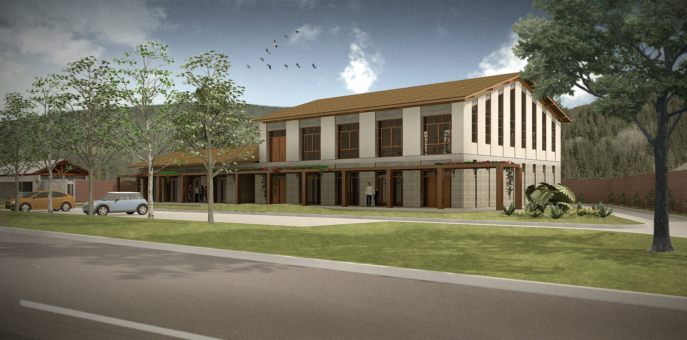
Small Comercial Bldg in the countryside
-
over time i have been publishing pictures from a long standing project of mine: a subdivision for 105 houses in the countryside, bang in the heart of the wine-making region of my state.
now I posted the design for a small commercial building placed beside the entrance to that project. it will house a couple of stores, a restaurant and a multipurpose hall on the top floor. i had to accommodate the habits of the region and went for a sloping roof style.
if you feel like checking the other posts over, they are the gatehouse, the club house, a modern-looking house and a more traditional one (for Brazilian standards, of course).

-
Nice render Edson...
-
'nother beautiful one, Edson.
I noticed there isn't any signage, which would be important to any retail establishment. We've learned (the hard way) that when we don't incorporate it, leaving it up to the owner, the results are less than satisfactory. -
thanks, kris.
daniel,
you are absolutely right. I thought of that when I was post-processing the render. my excuse for not including the signage is the fact that the design is a teaser: its purpose was to convince the owner that we could do it. it seems to have worked so when it comes to develop the design I will be sure to include the signage. -
This is a very nice image, has a good colour balance and feel to it. Enough contrast but not overdone. The birds flying over bring the scene to life. I've often thought a still render could be enhanced by animated elements such as this as a kind of short animation clip, maybe that loops.
-
@seven.sides said:
This is a very nice image, has a good colour balance and feel to it. Enough contrast but not overdone. The birds flying over bring the scene to life. I've often thought a still render could be enhanced by animated elements such as this as a kind of short animation clip, maybe that loops.
thanks, seven.
Hello! It looks like you're interested in this conversation, but you don't have an account yet.
Getting fed up of having to scroll through the same posts each visit? When you register for an account, you'll always come back to exactly where you were before, and choose to be notified of new replies (either via email, or push notification). You'll also be able to save bookmarks and upvote posts to show your appreciation to other community members.
With your input, this post could be even better 💗
Register LoginAdvertisement


