Night shot
-
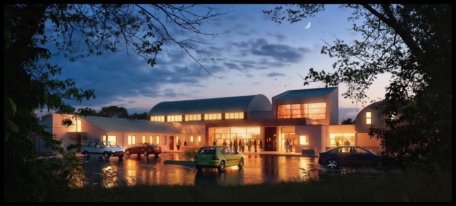
A night shot ,rendered in maxwell and post processed in photoshop

-
Nice shot, looks like a work of art...
Thanks for sharing,
allanx
-
Wonderful "night shot". Never thought Maxwell could get through this!
-
Excellent work, although you could have spared the paper texture.
-
Really nice feel to this one. FWIW, the paper texture helps it feel a bit more "artsy" to me. Does the yellow car have it's headlights turned on? I'd think there would be some visible light spill in front of the car.
-
Very nice.
-
The reflection lighting is exquisite! Beautiful overall composition and tonality!
-
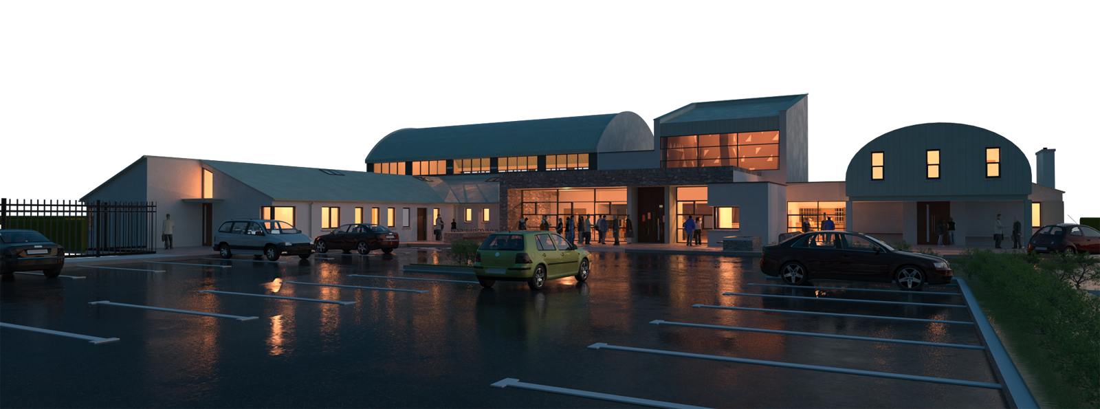
Attached is the raw mawell render.
Most,if not all of my recent renders are NPR(Non photorealistic).I like to take an original render and play with it,adding the planting etc,I much prefer this to a straight forward realistic approach.Here,I edited the parking lines and added the sky,moon,trees etc and played around with the lighting/saturation/curves.
As I have said before,most of my work is rendering straight forward high sun/noon images and while I understand why the client wants to show off the building on its own,I like to "creep up" on mine and see them as if you have just discovered them.The main problem I find is that a lot of the projects I work on are urban so most of what I upload are buildings out of their place,but there is something I really love about landscape and trees and water.This is why so many of my images are the same building but in a more rural environment(in this case the real car park is about 100 meters long and the trees shown in the first image are way,way back).
The 3 main elements as far as I'm concerned are composition,lighting and movement.By movement I mean lots of conflicting angles i.e. diagonals.In this instance the perspective is one angle,the parked cars are one,the central green car pointing towards the building is one,and the number of people gathering at the front of the main entrance is another.The only thing that isnt working is the car on the right hand side that is moving out of frame,it should ideally be moving into frame.Thats why ,to obscure this, I added a tree to the right hand side.
As much as I like adding vegetation/planting,in this instance I wanted to bring the attention to the center of the image.I tried adding a dark vignette but it left the edges of the image very bare.By adding the trees and plants and darkening them it helps to frame the building more organically.(helped by the main branches pointing towards the entrance).I also lightened/burned the leaves on the left to suggest some reflected high-lights from the main lighting.

-
@allanx said:
Nice shot, looks like a work of art...
Thanks for sharing,
allanx
I think it is . . . . a work of art.
-
It is sooo impressive! You
ve done great work. The only thing I dont like is the green car in the front. But that`s just a cavil.)) -
It seems I like the raw maxwell render better.

-
Beautiful.
-
Very nice. Did you use the SU-integrated version of Maxwell?
-
Great rendering !
How did you get the glow effect in Photoshop ? (around the windows)
Hello! It looks like you're interested in this conversation, but you don't have an account yet.
Getting fed up of having to scroll through the same posts each visit? When you register for an account, you'll always come back to exactly where you were before, and choose to be notified of new replies (either via email, or push notification). You'll also be able to save bookmarks and upvote posts to show your appreciation to other community members.
With your input, this post could be even better 💗
Register LoginAdvertisement


