Some recent work
-
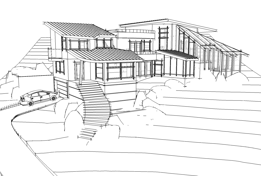
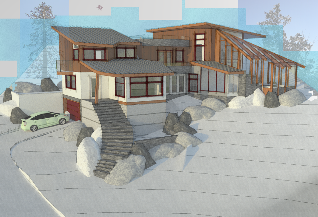
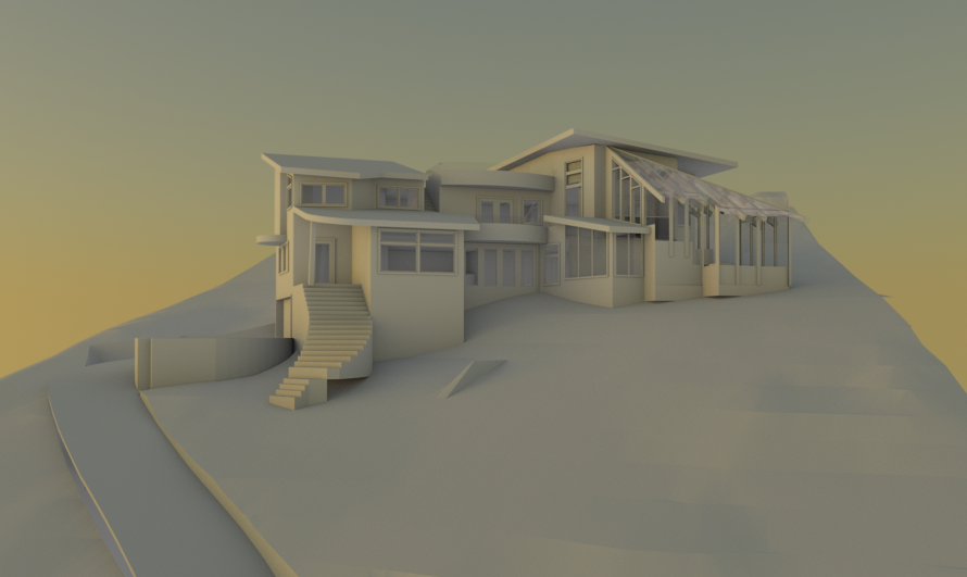
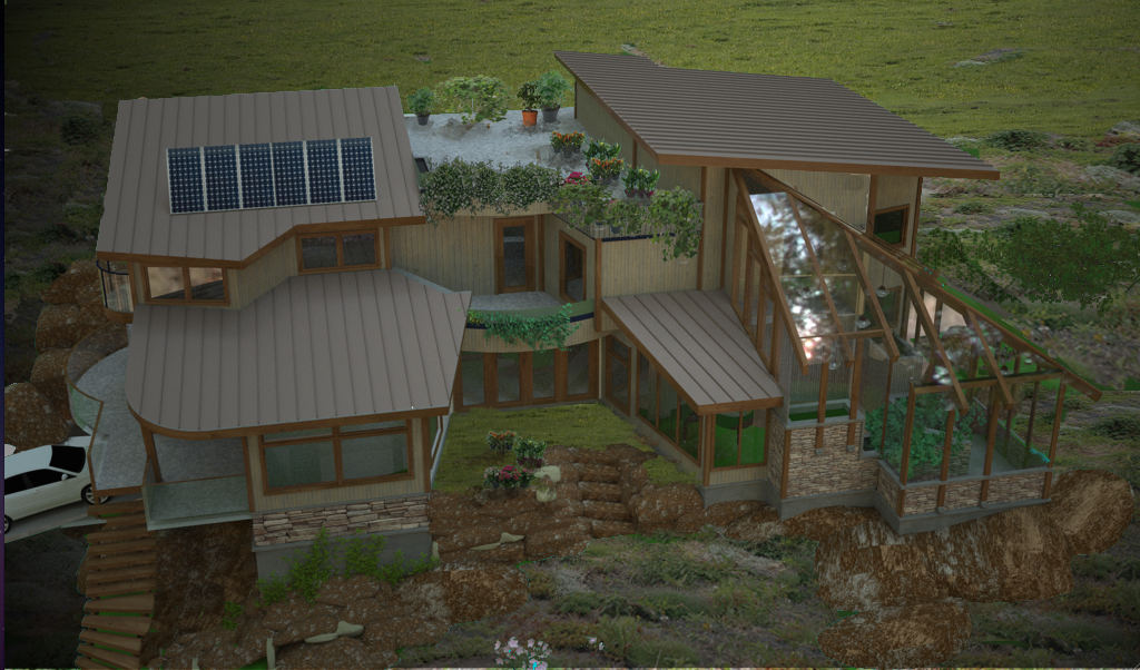
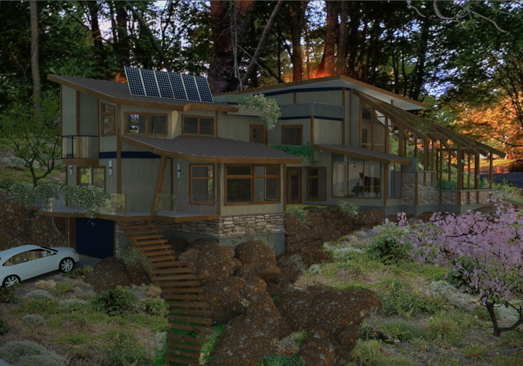
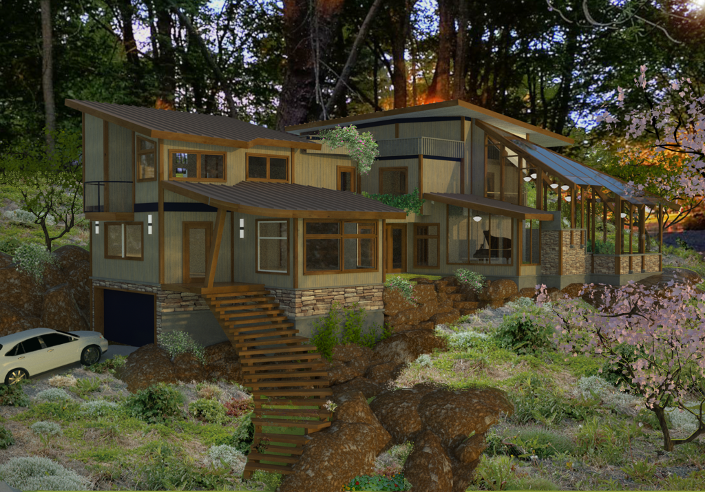
Some recent work for a residence on the West Coast of Canada. Some different presentation ideas.
-
Very well done Dale. I love it.
-
Hey Dale!!
Sweet modeling mate! Render wise though the house is not "punching out", seems lacking contrast and somewhat swamped by the landscape if not actually out of scale with it!
Can I urge you to keep pushing!!!
-
Dale, that's some good modeling! The little touches like the piano make all the difference.
John -
Eric, Richard, John
Thanks for the comments.
Richard
I have been following your work for years so I appreciate the push. (Maybe it should be a shove)
-
I like the variety of shapes in the roof forms. It makes this a very playful design. The openness provides excellent views. You could do a piano shaped room for the piano. Or not

-
Dear Dale,
I like this house style: imbricated levels, various poles: each one with its own personality. A house under the sign of the squirrel seems to me.Concerning the various renders, my vote goes with no doubt on the second one! Very nice style to show just enough reality to integrate the house plans and let imagine a world around and us living into it.
+++ Simon
-
@simon le bon said:
A house under the sign of the squirrel seems to me.

From my point of view it always depends on the clients likings, the concept and the environment.
The house itself is a very nice, cosy, diversified concept fitting great onto it's site.
The trees and the landscape as well fit the overall "embedded ito nature" concept- if that's what it should represent.Therefor my vote goes to no. 4 but keeping no.3 with you as a "model visualisation".
Maybe the POV of no. 4 should be a different one.
No. 2 is different but nice as well.Btw, likings of presentation really differ between countries, cultures and continents.
Probably Canada is closer to America concerning this (i hope you don't mind me expecting this)
as eg. Europe, where visualisations are presented very differently.No. 5 and 6 are a little bit overdose and as said maybe a bit out of scale as well

If no. 5 was showing a little more of the environment and wasn't completely covered with dark, shady trees all around
it would be a nice one too.The road towards the garage seems to be a bit narrow- hard to get back down the hill backwards..
You say it's located at the west coast of canada- with a view opening to the sea??
Anyway, i would show more light, maybe show trees and so on one side, light and view down the slope on the other..
-
Tim, Simon, harnstein
Thank you for your thoughts.
Sometimes, clients, and even colleagues don't really critique. And being from an Art school background, I am very much appreciative of others critical opinions. Sometimes even the smallest of observations can be a real eye opener.
A little background.
The site is actually modeled from the survey, and if you are on the rooftop deck and looking back toward the trees you can see the ocean. It has minimal soil coverage, and those lichen covered boulders are everywhere, and the will be more to deal with upon excavation.
The client design ice breakers, so I used this context as a basis for the roof element, kind of thinking of the bridges on ships.
Again Thanks everyone. -
This might be something to consider: Using hull plate as roof elements. If it's thick enough, you won't need to reroof for quite a long time. But you might have to use additional thermal insulation. The logistics of installation in this site might be a problem.
-
Very nice! Is it legal to have those steps without railing in Canada?
-
Hell, stairs are so regulated here that all the stairways I really love could never be built here.
Actually (good observation)when the house is built these will probably be a landscape element.
No real excuse for omitting them
Hello! It looks like you're interested in this conversation, but you don't have an account yet.
Getting fed up of having to scroll through the same posts each visit? When you register for an account, you'll always come back to exactly where you were before, and choose to be notified of new replies (either via email, or push notification). You'll also be able to save bookmarks and upvote posts to show your appreciation to other community members.
With your input, this post could be even better 💗
Register LoginAdvertisement


