28 Church Street, Wellingborough
-
-
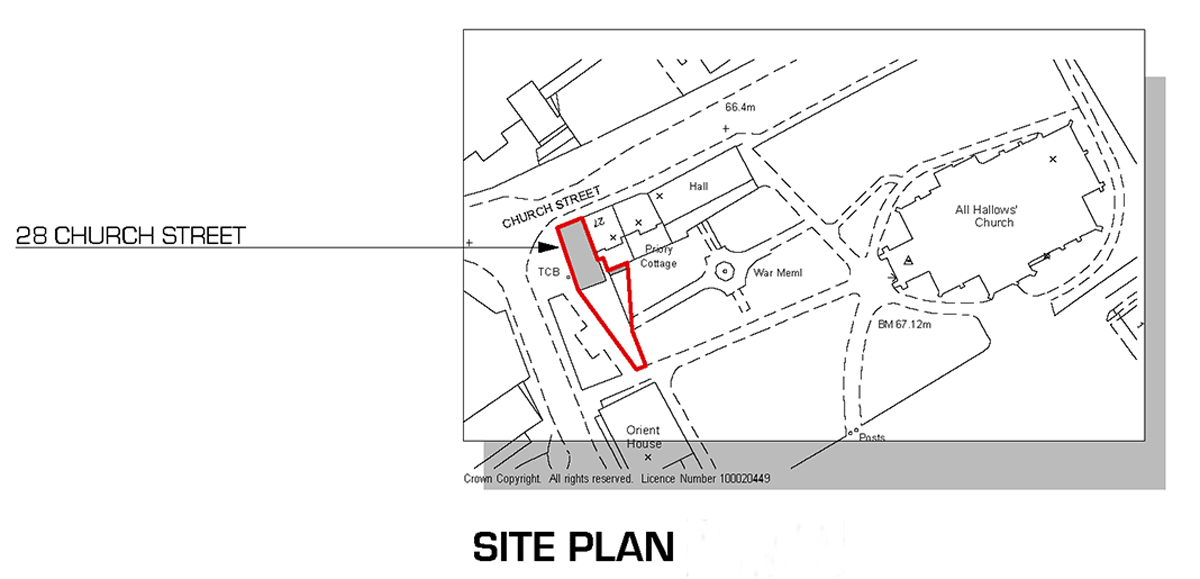
As promissed here are some plans. If you have any question , please do not hesitate to ask.
-
Ground Floor Plan

-
wow. the finished architecture is just awesome. one thing i really like is your attention of fusing the old with the modern. The design is so inspiring, the use of space and lighting is truly a masterpiece of a great master.
-
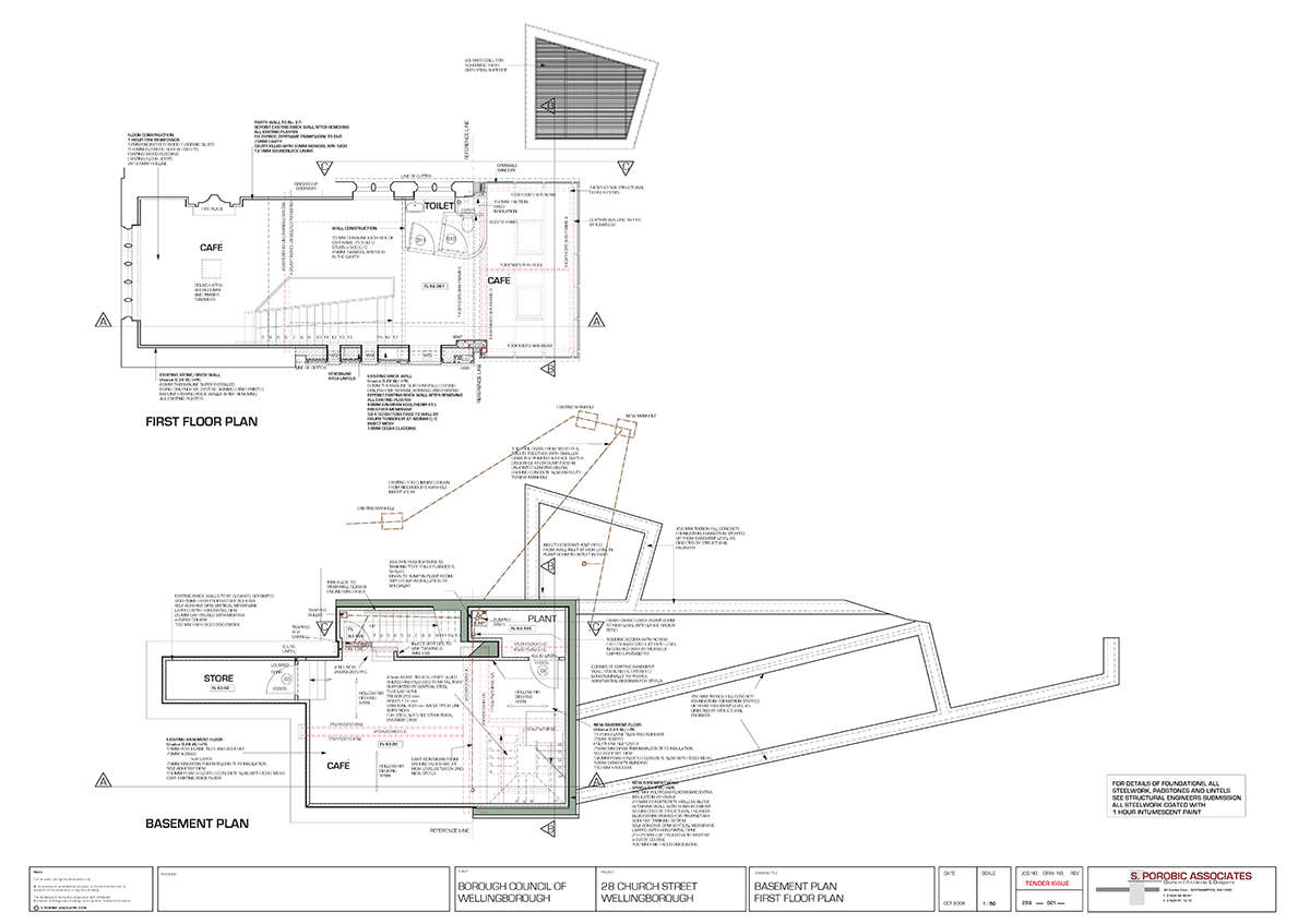
Basement and First Floor plans
-
Thank you Nomer. This is very kind comment.
-
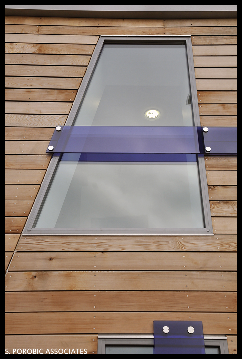
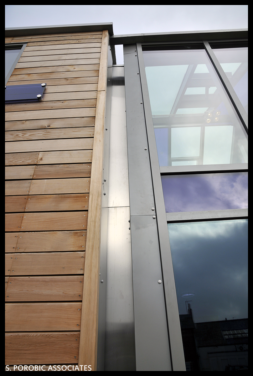
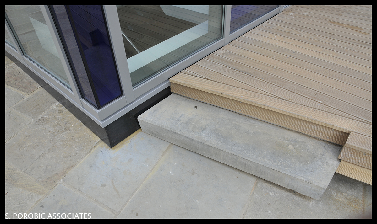
Some details...
-
The best renders I've ever seen.
The real rendering engine.
How helpful your renders were sid? I remember that they were impressive renders, very useful for presentations, but I'll ask again. How useful to you? Or even to me, (not an architect) ? To have a clear vision of this wonderful concept? A simple raw SU export could serve well. (with some magic touch - you know how)
Just because we're here, in SU forum. Just saying. -
I really appreciate the detail picture posts. This is where so many decisions are made.
Could you possibly post some glazing details.
You have really handled this with sensitivity, and I would love to see the treatments you have used.
Cheers.
Dale -
Hi Dale
Would .pdf section be good enough, or you had something else in mind?
-
Milking it..... I know...
 but we have been published on ArchDaily
http://www.archdaily.com/171797/28-church-street-s-porobic-associates/ -
how did you make such fantastic wood texture? I am going to be making a bunch of furniture in sketchup in the next few weeks and anything I can do to improve my style is greatly appreciated. I'm lovin the design of the windows, grade A work.
-
Here's my two cents. I like this project. The details are well done, and I like the quick transition from wood to glass.
-
@blah11 said:
how did you make such fantastic wood texture? I am going to be making a bunch of furniture in sketchup in the next few weeks and anything I can do to improve my style is greatly appreciated. I'm lovin the design of the windows, grade A work.
The wood texture is image from my other built project....
Thanks for the comments regarding design. -
@mitcorb said:
Here's my two cents. I like this project. The details are well done, and I like the quick transition from wood to glass.
Thanks Mitcorb

-
Great stuff, Sepo.
Those blue tinted panes cleverly break it up visually. Inspired.
Hello! It looks like you're interested in this conversation, but you don't have an account yet.
Getting fed up of having to scroll through the same posts each visit? When you register for an account, you'll always come back to exactly where you were before, and choose to be notified of new replies (either via email, or push notification). You'll also be able to save bookmarks and upvote posts to show your appreciation to other community members.
With your input, this post could be even better 💗
Register LoginAdvertisement


