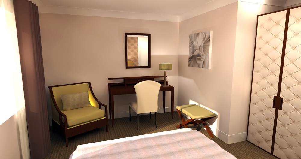
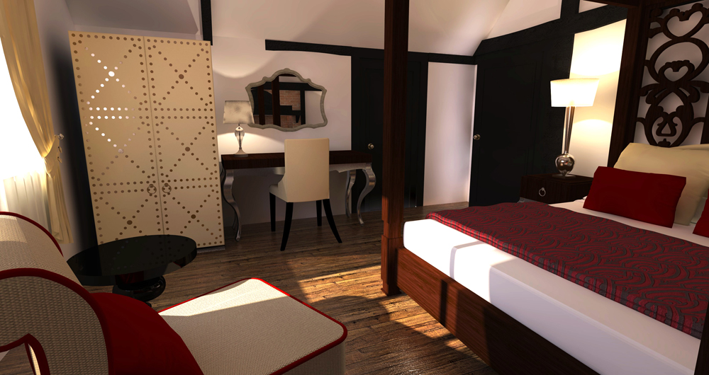
Interior Hotel Room Shots
-
Hi There
Following lots of help from users on this forum I've just completed one of my first freelance jobs for an interior design firm . Here a a couple of room shots. They are rendered in SU Podium V2, and it was my first time using it, so the project was a bit of a test run.
For a first attempt I'm pretty happy with the results but there's lots of room for improvement. I think this is partly down to my texture library, I'm not for example happy with the wood texture for the 4 poster bed but had to get it to match the sample as much as possible. Maybe it needs more bump and reflection but the renderings kept coming put too noisy so I removed them . For anyone familiar with Podium V2 I used the standard interior preset. The QMC one came out way to grainy and I couldn't work out how to fix it in the timeframe available
Anyway am I'm relative newbie any constructive criticism /comments welcome, it can only help me improve! !
Thanks
Peter


-
What's up with the light bleeding in chair? (top image)
-
Solo- I dont know - its up by the top of the wardrobe as well. I was really pushed for time so didnt have much time to investigate or do much touch up in pp. I cant work out where its coming from, the model is sealed apart from the window on the left !
-
The light is easy to explain. This room is for condemned prisoners and that is an electric chair.
-
-
wow. Thanks, that's useful feedback

-
In the image with the light in the chair, there seems to be a reflection along the top of the baseboard under the desk. This makes me think the "board" is polished marble or other solid surface material. I would not be able to say if that is a desired condition, nor would I be concerned about the light in the chair, if the intent was a more "photojournalistic" approach. Both of these conditions could be justified as plausible occurrences. I see the wardrobe door as perforated with a lamp inside, and less plausible. Just my two cents.
-
Thaks Mitcorb, i see what you mean about the wardrobe! should reduce the reflection, it should be brass studs!
Im a little confused about the reflection youre refering to under the desk, are you talking about the top image?
thanks
-
Hi, Zootsuit:
Your question about which image: yes the first image was where I saw what looked like spurious reflection. After clicking on the image and the enlarge function, I applied Control+Scroll to zoom in tighter. Obviously, the general observer would not necessarily look this close. I was just commenting in case it would concern you about that feature.
EDIT: Perhaps print out the image for proofing?
Hello! It looks like you're interested in this conversation, but you don't have an account yet.
Getting fed up of having to scroll through the same posts each visit? When you register for an account, you'll always come back to exactly where you were before, and choose to be notified of new replies (either via email, or push notification). You'll also be able to save bookmarks and upvote posts to show your appreciation to other community members.
With your input, this post could be even better 💗
Register LoginAdvertisement


