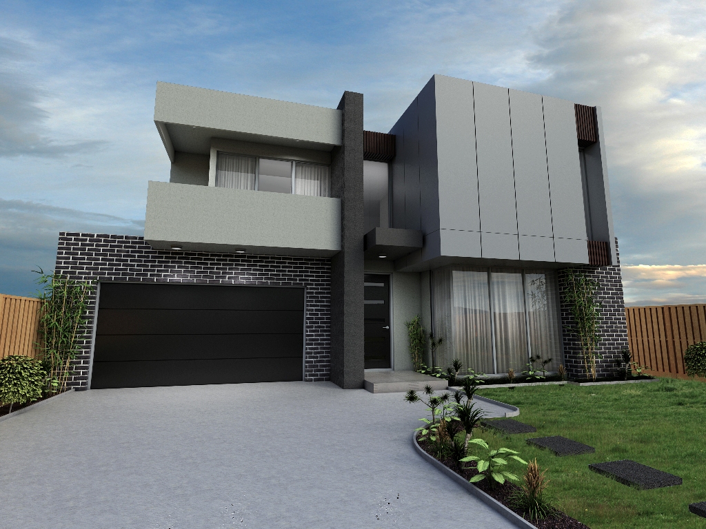
Exterior House
-
Hi
Just thought id share an exterior image i modelled for a friend and rendered with vray... your comments are welcome

-
Nice job. Main thing that stands out to me are the verticals. Typically for arch-viz, you'd adjust those to be parallel, either via camera techniques like a shift lens, or through post process editing. I think the converging verticals can look good on a tall building but particularly for residential work they seem distracting.
-Brodie
-
Looks good, scotsumatu.
You might try a view from the right corner, so that wide concrete driveway isn't so prominent. Also, why are the exterior lights on during the daytime? -
Thanks for the replies...
Brodie... thanks for the feedback although i have absolutely no idea what youre talking about hehe... im not very camera savvy and i guess thats an area i need to work on...
Daniel thanks also... youre right and i did another view showing less of the driveway... no idea why the lights were on.. silly me wasting electricity he he

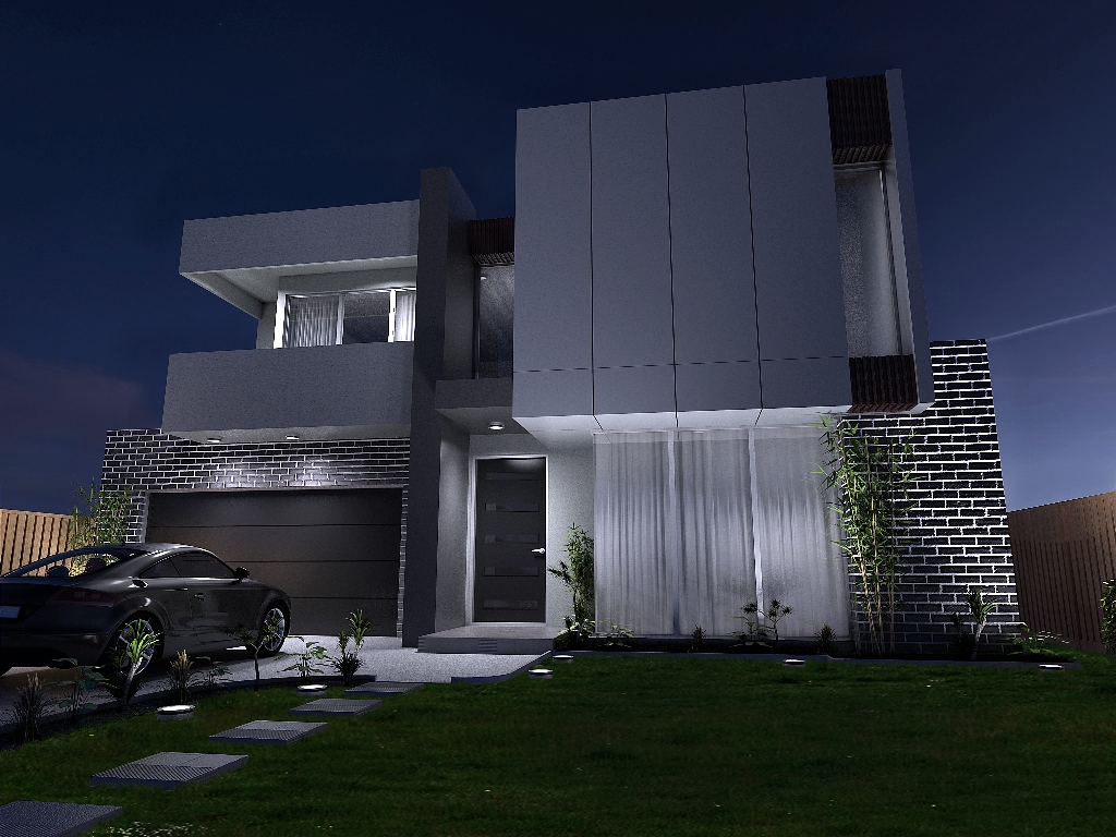
anyways, heres another view (night).... im in desperate need of grass materials from eye level... i put that in post in PS...

-
Looks good, but there does seem to be a problem with anti-aliasing of the vertical lines.
Have you looked into the controls of your video card if it has them? You might try to set any 3D settings to their max.
-
Hi Bryan
ITs actually due to me resizing the image to upload it here, i used office picture manager and just resized it and thats how the jagged lines occured.. the full res image doesnt suffer from anti aliasing.
-
Hi there, nice renders!
As brodie said: go in Menù Camera and select 2 point perspective. In that way vertical lines appear parallel and the visualization becomes more tidy.
Eye level grass could be obtained with diplacement.. have you tried it? Problem is, displacement wants very powerful computers..
Anyway, good job

-
Very nice night shot. Yes, learning more about cameras and architectural photography will definitely help your renders. I'm not a photographer by any means but I've been picking up stuff here and there for awhile now. If you look at most architectural photography you'll notice that the vertical lines are...well, straight up and down. In Sketchup this is basically the 2 point perspective mode that Broomstick mentioned (in a 3 point perspective like you've got, the vertical lines are converging to an imaginary point somewhere above your building rather than being parallel). If your renderer lets you render in 2 point perspective, that's all fine and good. If not, then you have to understand how real photography works.
Without getting into detail, the only way to keep your verticals straight up and down when you're photographing a building is to hold your camera lens completely parallel to the ground (not pointing up or down at all). The problem, then, becomes that holding your camera in such a way usually shows a lot of ground and often cuts off the top of your building. So there's something called a 'shift lens' that attaches to the camera and works some magic in order to fix this problem. Some renderers, like Maxwell, will have an option for adjusting your shift lens parameters in order to do this.
-Brodie
-
Looks much better. I know this sounds nitpicky, but it looks like the sky has a plane's contrail on the right, and it is lined up directly with the corner of the building. You should shift the camera slightly so it's off the corner.
Hello! It looks like you're interested in this conversation, but you don't have an account yet.
Getting fed up of having to scroll through the same posts each visit? When you register for an account, you'll always come back to exactly where you were before, and choose to be notified of new replies (either via email, or push notification). You'll also be able to save bookmarks and upvote posts to show your appreciation to other community members.
With your input, this post could be even better 💗
Register LoginAdvertisement


